median_income <- read.csv("data/median_income_acs_23.csv")
median_age <- read.csv("data/median_age_acs_23.csv")

median_income <- select(median_income,-c(X, variable))
median_age <- select(median_age,-c(X, variable))An Analysis of Median Income in the ACS 2023
Question to Ask: Amongst Age, Education, and Race, what is the most significant factor influencing higher median salaries across counties in Missouri? (does a correlation exist?)
First, let’s futher define the factors
- Age
- Median Age
- Education
- Bachelors Degree or Above (%)
- Race
- White only (%)
Side Note: I picked Missouri because that’s where I’m from and chose to use estimates (ACS) because it’s more reliable for small geographies.
Age
Let’s start by examining age. Using the ACS, we identify Table B01002 as the source for median age data. To analyze this alongside income, we extract two separate tables: one for median age and another for median income. We then create two distinct variables, median_age and median_income, corresponding to each dataset.
Since these are two separate datasets, we need to combine them before analysis. Using dplyr’s full_join(), we can merge the datasets based on their shared columns: GEOID and NAME.
combined_tables = full_join(median_age, median_income, by = c("GEOID", "NAME"))
head(combined_tables)
GEOID NAME estimate.x moe.x estimate.y moe.y
1 29001 Adair County, Missouri 29.8 0.7 56583 5235
2 29001 Adair County, Missouri 29.8 0.7 56583 5235
3 29001 Adair County, Missouri 30.0 1.3 56583 5235
4 29003 Andrew County, Missouri 42.1 0.7 74007 5338
5 29003 Andrew County, Missouri 40.8 1.2 74007 5338
6 29003 Andrew County, Missouri 44.1 0.9 74007 5338The only two columns we need to focus on are estimate.x and estimate.y, which represent median age and median income, respectively. Using these two variables, we can create a plot to explore whether a correlation exists between median age and median income across counties in Missouri.
model = lm(estimate.y ~ estimate.x, data = combined_tables)
print(model)
Call:
lm(formula = estimate.y ~ estimate.x, data = combined_tables)

Coefficients:
(Intercept)   estimate.x
    91515.3       -771.5
r2 = summary(model)$r.squared
ggplot(combined_tables, aes(x = estimate.x, y = estimate.y)) +
geom_point() + labs(x = "Median Age", y = "Median Income",title = "Median Age vs Median Income") + geom_smooth(method = "lm", se = FALSE) + annotate("text", x = 30, y = 90000, label = paste0("R² = ", round(r2, 3)), size = 4)`geom_smooth()` using formula = 'y ~ x'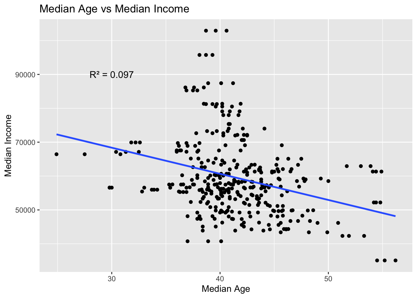
From the scatterplot and also the \(R^2\) value, we observe that there appears to be no correlation between median age and median income. Several factors could explain this. For instance, counties with a higher median age may have a larger retired population, which would naturally lower the median income.
Education
Let’s now move on to the next factor: education, specifically, the percentage of people with a Bachelor’s Degree or higher. Browsing the ACS, we identify Table B15003 as the appropriate source for measuring educational attainment among individuals aged 25 and over. To calculate the percentage of the population with a bachelor’s degree or higher, we sum the values from variables B15003_022E to B15003_025E, and divide this total by B15003_001E, which represents the total population aged 25 and above in the county. We then add this computed percentage as a new column in our dataset and remove all unnecessary columns to retain only the relevant information.
edu_data <- read.csv("data/edu_data_acs_23.csv")

edu_data = mutate(edu_data, percent_bachelors_or_higher = 100 * ( B15003_022E + B15003_023E + B15003_024E + B15003_025E ) / B15003_001E)
edu_simple = transmute(edu_data, GEOID, NAME, percent_bachelors_or_higher)
GEOID NAME percent_bachelors_or_higher
1 29001 Adair County, Missouri 35.04846
2 29003 Andrew County, Missouri 26.92247
3 29005 Atchison County, Missouri 22.04498
4 29007 Audrain County, Missouri 16.12020
5 29009 Barry County, Missouri 13.38080
6 29011 Barton County, Missouri 17.95604Next, we combine the educational attainment data with the median income data. Using dplyr’s full_join() function, we merge the two datasets based on their shared columns: GEOID and NAME.
combine_age_education = full_join(median_income, edu_simple, by = c("GEOID", "NAME"))
head(combine_age_education)
GEOID NAME estimate moe percent_bachelors_or_higher
1 29001 Adair County, Missouri 56583 5235 35.04846
2 29003 Andrew County, Missouri 74007 5338 26.92247
3 29005 Atchison County, Missouri 59260 5314 22.04498
4 29007 Audrain County, Missouri 56232 4379 16.12020
5 29009 Barry County, Missouri 56611 4204 13.38080
6 29011 Barton County, Missouri 49503 5066 17.95604The only two columns we need to focus on are percent_bachelors_or_higher and estimate, which represent percent of bachelors or higher and median income, respectively. Using these two variables, we can create a plot to explore whether a correlation exists between education and median income across counties in Missouri.
model = lm(estimate ~ percent_bachelors_or_higher, data = combine_age_education)
r2 = summary(model)$r.squared
print(model)
Call:
lm(formula = estimate ~ percent_bachelors_or_higher, data = combine_age_education)

Coefficients:
                (Intercept)  percent_bachelors_or_higher
39863 958 ggplot(combine_age_education, aes(x = percent_bachelors_or_higher, y = estimate)) +
geom_point() + labs(x = "Bachelors or Higher (%)", y = "Median Income",title = "Percent of Bachelors or Higher vs Median Income") + geom_smooth(method = "lm", se = FALSE) + annotate("text", x = 15, y = 100000, label = paste0("R² = ", round(r2, 3)), size = 4)`geom_smooth()` using formula = 'y ~ x'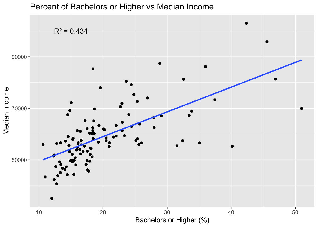
From the scatterplot, we observe a moderate correlation between educational attainment and median income. With an \(R^2\) value of 0.43, the relationship is not strong enough to be conclusive, but it does suggest a meaningful association. While other factors may also influence income levels, education appears to be a significant predictor of higher median salaries.
Race
Next, let’s look at race. The ACS provides the Table BO2001 for the race of each location. Using this we can repeat what we did in previous steps to come up with the following:
race_data <- read.csv("data/race_data_acs_23.csv")

race_data = mutate(race_data, percent_white = 100 * (B02001_002E) / B02001_001E)
race_simple = transmute(race_data, GEOID, NAME, percent_white)
GEOID NAME percent_white
1 29001 Adair County, Missouri 88.89946
2 29003 Andrew County, Missouri 93.75207
3 29005 Atchison County, Missouri 94.30598
4 29007 Audrain County, Missouri 89.12022
5 29009 Barry County, Missouri 81.90979
6 29011 Barton County, Missouri 92.07531Next, we combine the race data with the median income data. Using dplyr’s full_join() function, we merge the two datasets based on their shared columns: GEOID and NAME.
combine_race_income = full_join(median_income, race_simple, by = c("GEOID", "NAME"))
head(combine_race_income)
GEOID NAME estimate moe percent_white
1 29001 Adair County, Missouri 56583 5235 88.89946
2 29003 Andrew County, Missouri 74007 5338 93.75207
3 29005 Atchison County, Missouri 59260 5314 94.30598
4 29007 Audrain County, Missouri 56232 4379 89.12022
5 29009 Barry County, Missouri 56611 4204 81.90979
6 29011 Barton County, Missouri 49503 5066 92.07531The only two columns we need to focus on are percent_white and estimate, which represent percent of white people and median income, respectively. Using these two variables, we can create a plot to explore whether a correlation exists between race and median income across counties in Missouri.
model = lm(estimate ~ percent_white, data = combine_race_income)
r2 = summary(model)$r.squared
print(model)
Call:
lm(formula = estimate ~ percent_white, data = combine_race_income)

Coefficients:
  (Intercept)  percent_white
77712.1 -203.7 ggplot(combine_race_income, aes(x = percent_white, y = estimate)) +
geom_point() + labs(x = "Percent of White People", y = "Median Income",title = "Percent of White People vs Median Income") + annotate("text", x = 50, y = 100000, label = paste0("R² = ", round(r2, 3)), size = 4) + geom_smooth(method = "lm", se = FALSE)`geom_smooth()` using formula = 'y ~ x'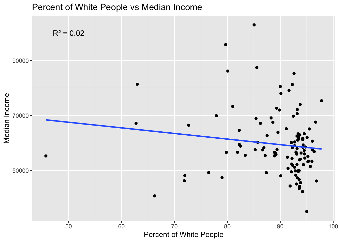
From the scatterplot and also the \(R^2\) value, we observe that there appears to be no correlation between race and median income.
Conclusion
Among the three factors we examined, education appears to be the most significant predictor of higher median income. In other words, counties in Missouri tend to have higher median salaries as the percentage of residents with a college degree or higher increases.
Limitations
- Correlation doesn’t imply Causation
- Simplification of Race
- Estimates (Margin of Error)
- Spatial Limitation (only limited to Missouri)
- Multi-factor problem