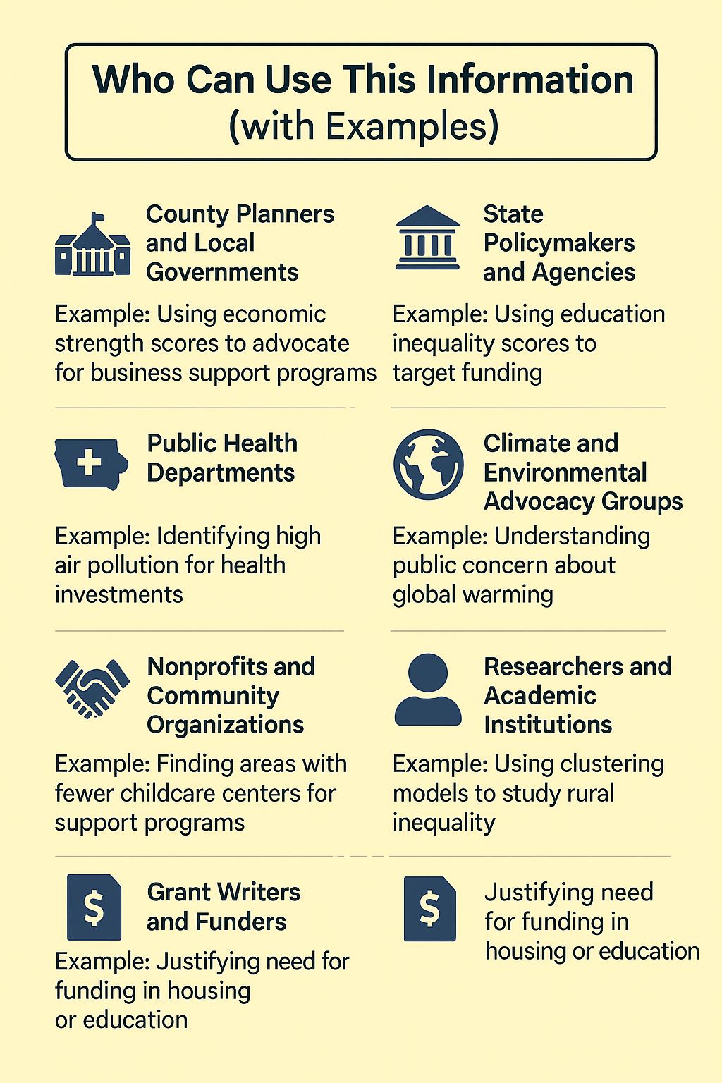
Introduction
Built County-Level Strength Scores
We created six strength scores for all 99 Iowa counties: Human, Economic, Civic, Infrastructure, Stability, and Environmental. Each score was based on multiple indicators and ranked using percentiles.
Why: To understand each county’s key strengths and where they might need improvement across different areas of community life.
Created County Inequality and Well-Being Scores
We built five types of inequality scores: Economic, Family & Social, Education & Access, Health, and Disaster/Infrastructure. We also created a separate Well-Being Score that includes indicators like volunteering, trust, and public safety.
Why: To explore whether counties that are strong overall still struggle with inequality or well-being issues under the surface.
Analyzed Patterns in Climate Beliefs
We added data on climate change beliefs and demand for government action. We explored how beliefs differ across counties by education levels, political engagement, and exposure to climate risks.
Ran Clustering Models to Group Similar Counties
We used hierarchical clustering and latent class analysis (LCA) to group counties with similar profiles.
Why: To identify meaningful patterns—like “thriving rural” or “urban struggling”—and support better-targeted strategies.
County Strength Scores Overview
Question: If we fixed one measure, how would it affect the progress of a county?
This analysis summarizes how each Iowa county performs across six key dimensions of community strength: human, economic, civic, infrastructure, stability, and environmental. Each score is based on percentile rankings of relevant indicators, allowing for easy comparison across counties and highlighting areas of relative strength or need.
Human Strength Score
What it shows: Education, health, and well-being.
Variables:
pct_bachelors` - Percent of adults with a bachelor’s degree or higherEP_DISABL- Percent of population with a disabilityEP_LIMENG- Percent of population with limited English proficiencyEP_AGE65- Percent of population aged 65 or olderFood_Environment_Index- Food Index
Economic Strength Score
What it shows: Income, employment, poverty, and economic output.
Variables:
med_hh_income- Median household incomegdp_per_capita- GDP per capitaprop_employed- Proportion of population employedEP_POV150- Percent of population below 150 percent of poverty lineEP_MUNIT- Percent of housing units in multi-unit structuresgini_income- Inequality indexpct_small_businesses- Percent of small businesses
Civic Strength Score
What it shows: Community engagement and institutional participation.
Variables:
census_response- Census response ratecivic_organizations- Number of civic organizations per 1000 peopletotal_voter_turnout- Total voter turnoutEP_SNGPNT- Percent of households with a single parenCollege_Universities_per_10k- Number of colleges and universities per 10000 people
Infrastructure Strength Score
What it shows: Access to essential facilities and services.
Variables:
Hospitals_per_10k- Number of hospitals per 10000 peopleFire_Emergency_Stations_per_10k- Number of fire stations per 10000 peopleProportion_Obsolete_Deficient- Proportion of Obsolete InfrastructureChild_Care_Centers_per_10k- Number of childcare center per 10000 peopleCellular_Towers_per_10k.y- Number of cellular towers per 10000 peopleConvention_Centers_per_10k- Number of convention centers per 10000 people
Stability Strength Score
What it shows: Housing security, household stability, and diversity.
Variables:
owner_occupied- Number of owner occupied propertyEP_GROUPQ- Percent of population in group quartersEP_CROWD- Houshold sizerace_diversity- Racial diversityEP_MOBILE- Percent mobile home
Environmental Strength Score
What it shows: Environmental quality, risk, and land cover.
Variables:
Cancer_Risk- Risk of cancerParticulate_Matter- Particulate matter concentrationDrinking_Water_Violations- Number of drinking water violationsFlood_Annual_Events- Number of annual flood eventsDrought_Annual_Events- Number of annual drought eventsTornado_Annual_Events- Number of annual tornadoesforest_acres_prop_county- Percent of forest land cover in countyWetland_Acres_Prop- Percent of wetland land cover in county
Interactive Bar Chart
Variable Comparison Chart
This interactive chart breaks down the specific variables used to calculate each strength score. Users can explore how individual counties rank on each indicator and see which factors influence their performance in different strength areas. We can use the filters to view data by county and strength type.
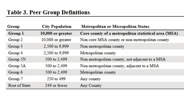
Performance Summary of Top 5 Counties Based On Population Group Codes
Click to view full county performance summary
Performance Summary of Top 5 Counties
Lyon County
- Strongest Area: Economic Strength
Lyon County performs well due to a high GDP per capita and a large percentage of small businesses. A low poverty rate (EP_POV) also contributes to its economic health.
- Weakest Area: Stability Strength
Weak Variable: Race Diversity
The county has low owner-occupancy and racial diversity, which may limit long-term social cohesion.
Sioux County
- Strongest Area: Civic Strength
High census response rate and a strong concentration of colleges and universities per 10k residents reflect strong civic infrastructure.
- Weakest Area: Infrastructure Strength
Weak Variables: Child Care Centers per 10k, Cellular Towers per 10k
These gaps suggest limited access to essential services and digital connectivity.
Madison County
- Strongest Area: Human Strength
Madison County performs well with high educational attainment and a strong food environment index.
Reason: Better education and food access support overall well-being and growth.
- Weakest Area: Infrastructure Strength
Weak Variable: Fire Emergency Stations per 10k
Limited emergency service access may affect public safety.
Adair County
- Strongest Area: Infrastructure Strength
Supported by a strong number of child care centers and cellular towers, indicating good service availability.
- Weakest Area: Stability Strength
Weak Variable: EP_CROWD
Overcrowding in households may impact quality of life.
Osceola County
- Strongest Area: Economic Strength
High employment rates, GDP per capita, and strong small business presence contribute to economic resilience.
- Weakest Area: Civic Strength
Weak Variable: Civic Organizations
Few civic groups limit opportunities for community engagement.
Performance Summary of Bottom 5 Counties
Wapello County
- Strongest Area: Stability Strength
Benefits from stable housing and fewer issues related to family structure or overcrowding.
- Weakest Area: Economic Strength
Low income, employment, and business activity point to economic struggle.
Des Moines County
- Strongest Area: Stability Strength
Performs relatively well in homeownership and racial diversity.
- Weakest Area: Economic Strength
Economic challenges include low income, job availability, and business growth.
Lee County
- Strongest Area: Environmental Strength
Strong forest coverage, good air quality, and flood resilience indicators.
- Weakest Area: Civic Strength
Low voter turnout and few civic groups reflect weak community participation.
Webster County
- Strongest Area: Stability Strength
High homeownership and group quarters support suggest stronger social foundations.
- Weakest Area: Infrastructure Strength
Lacks access to key services such as hospitals, child care, and telecom.
Clinton County
- Strongest Area: Stability Strength
Moderate success in homeownership and racial diversity.
- Weakest Area: Civic Strength
Civic disengagement reflected in low turnout and civic group presence.
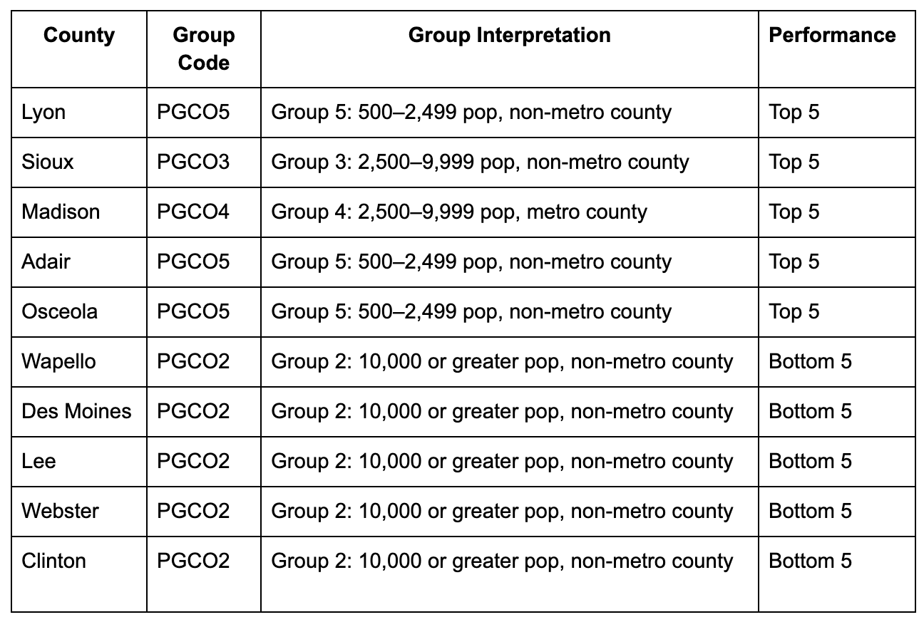
Among the top-performing counties, most belong to smaller population groups (Groups 3, 5, and 4), typically non-metropolitan or small metropolitan counties. These counties tend to perform well in economic and civic strength, often supported by strong local businesses and community institutions while facing challenges related to infrastructure quality and social stability, particularly in terms of diversity and access to services.
Conversely, several of the bottom-performing counties fall under larger or industrial counties (Group 2). While many lower-performing counties are stable in housing and demographics, they commonly struggle with economic development and civic engagement, highlighting gaps in community participation and opportunity.
Can we group similar counties together?
Methods
We approached this analysis using two different methods:
Hierarchical Clustering with Euclidean Distance: We calculated Euclidean distances between counties based on their strength scores across the variable subsets, then applied hierarchical clustering to identify groups of similar counties.
Latent Class Analysis: We calculated latent class models to identify underlying patterns in county characteristics, treating the strength scores as observed indicators of unobserved county types. This probabilistic approach allows counties to have partial membership in multiple classes and provides insights into the probability that a county belongs to each identified class.
Hierarchical Clustering Map
Interactive Hierarchical Clustering Map
Cluster Summary Table
Detailed County Data
LCA Map
Interactive LCA Classes Map
Interpretation of LCA
| Class | # Counties | Primary Strength | Main Challenge | Profile |
|---|---|---|---|---|
| Class 1: Affluent | 22 | Economic prosperity | Environmental concerns | Wealthy suburban-like |
| Class 2: Small Towns | 8 | Community organizations | Income inequality | Active small towns |
| Class 3: Urban-like | 24 | Diversity & education | Poverty & crowding | Diverse urban centers |
| Class 4: Rural Struggling | 19 | Emergency services | Economic hardship | Struggling rural |
| Class 5: Rural Thriving | 26 | Employment & services | Aging population | Thriving rural |
Key Insights
- Two Success Models: Iowa has both affluent suburban-like communities (Class 1) and thriving rural areas (Class 5)
- Rural Divide: Rural counties split between thriving (Class 5) and struggling (Class 4)
- Urban Challenges: More diverse counties (Class 3) face typical urban challenges like poverty and crowding
- Community Assets: Small towns (Class 2) punch above their weight in civic engagement despite economic challenges
Can we simplify the data by combining related strengths?
For this we tested the suitability for Factor Analysis
Factor Analysis Suitability Tests
| Test | Statistic | Value | Interpretation |
|---|---|---|---|
| Bartlett’s Test of Sphericity | Chi-square | 178.59 | Variables are significantly correlated |
| p-value | < 0.001 | Suitable for factor analysis | |
| Kaiser-Meyer-Olkin (KMO) | Overall KMO | 0.479 | Bad sampling adequacy |
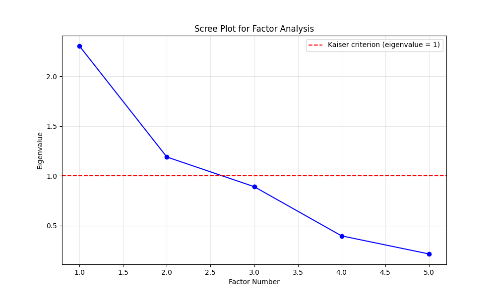
Results Summary:
- Bartlett’s Test: Significant (p < 0.001) - variables are sufficiently correlated for factor analysis
- KMO Score: 0.61 - falls in “miserable” range (<0.5), suggesting no suitability for factor analysis
- Overall Assessment: Data meets minimum requirements for factor analysis, though results should be interpreted carefully due to modest KMO score
Limitations
While using strength scores gives us a simplified version of how a cluster/county is doing, it oversimplifies the complexity of county characteristics by reducing multiple variables into single composite scores. This aggregation can mask important nuances within each domain - for example, a county might have high educational attainment but poor health outcomes. Additionally, the equal weighting of variables within each score assumes all factors are equally important, which may not reflect real-world relationships.
County Inequality Scores Overview
Question: What role does inequality play in communities?
Economic Inequality
What it shows: This score reflects income disparities and financial instability within a county. High inequality means wealth is not distributed evenly, and more residents may struggle economically.
Variables:
gini_income- Gini index of income inequalityEP_POV150- Poverty rateprop_employed- Unemployment rategdp_per_capita- GDP per capita
Education & Access Inequality
What it shows: This score reflects access to education and essential services like internet and language support. High inequality suggests that many face barriers to learning or information.
Variables:
high_school_completion- High school completion rateEP_LIMENG- English proficiency ratebroadband_access- Broadband internet access ratespublic_schools_per_sqmi- Public schools per square mile
Health Inequality
What it shows: This score reflects disparities in healthcare access and exposure to environmental health risks. A higher score may reflect poor health outcomes and limited health infrastructure.
Variables:
poor_health- Poor health ratehazardous_waste_proximity- Proximity to hazardous waste sitesParticulate_Matter- Particulate matter air pollution densityhospitals_per_sqMile- Hospitals per square mileinsurance_rate- Health insurance coverage rates
Disaster & Infrastructure Inequality
What it shows: This score reflects a community’s vulnerability to natural disasters and housing insecurity. High inequality may mean older infrastructure and higher risk from climate-related events.
Variables:
median_built_year- Median year housing was builtannual_hail_events- Annual frequency of hail eventsannual_wind_events- Annual frequency of wind eventsannual_drought_events- Annual frequency of drought eventshousing_occupancy- Housing units that are occupied
Well Being Indicators
What it shows: This score reflects overall quality of life, civic engagement, and public safety. A low score may indicate disconnection, distrust, or poor health and safety conditions.
Variables:
volunteering_rate- Volunteering ratevoter_turnout- Voter turnout ratescensus_response_rate- Census response ratescrime_per_10k- All crime incidents per 10,000 residentspoor_mental_health- Poor mental health ratepoor_physical_health- Poor physical health rate
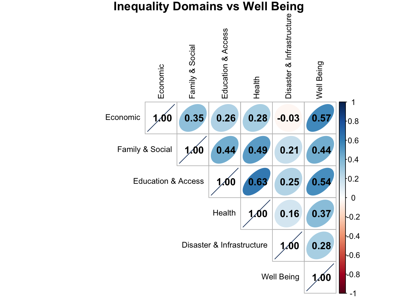
Correlation Matrix
The correlation matrix below illustrates that lower inequality is associated with higher community well-being. Each inequality domain shows a positive correlation with Well Being, meaning that as inequality decreases, overall well being increases.
Interactive Bar Chart
Variable Bar Charts
This interactive chart breaks down the specific variables used to calculate each inequality score. Users can explore how individual counties rank on each indicator and see which factors influence their performance in different inequality areas. We can use the filters to view data by county and inequality type.
Map of Inequality Domains & Well Being
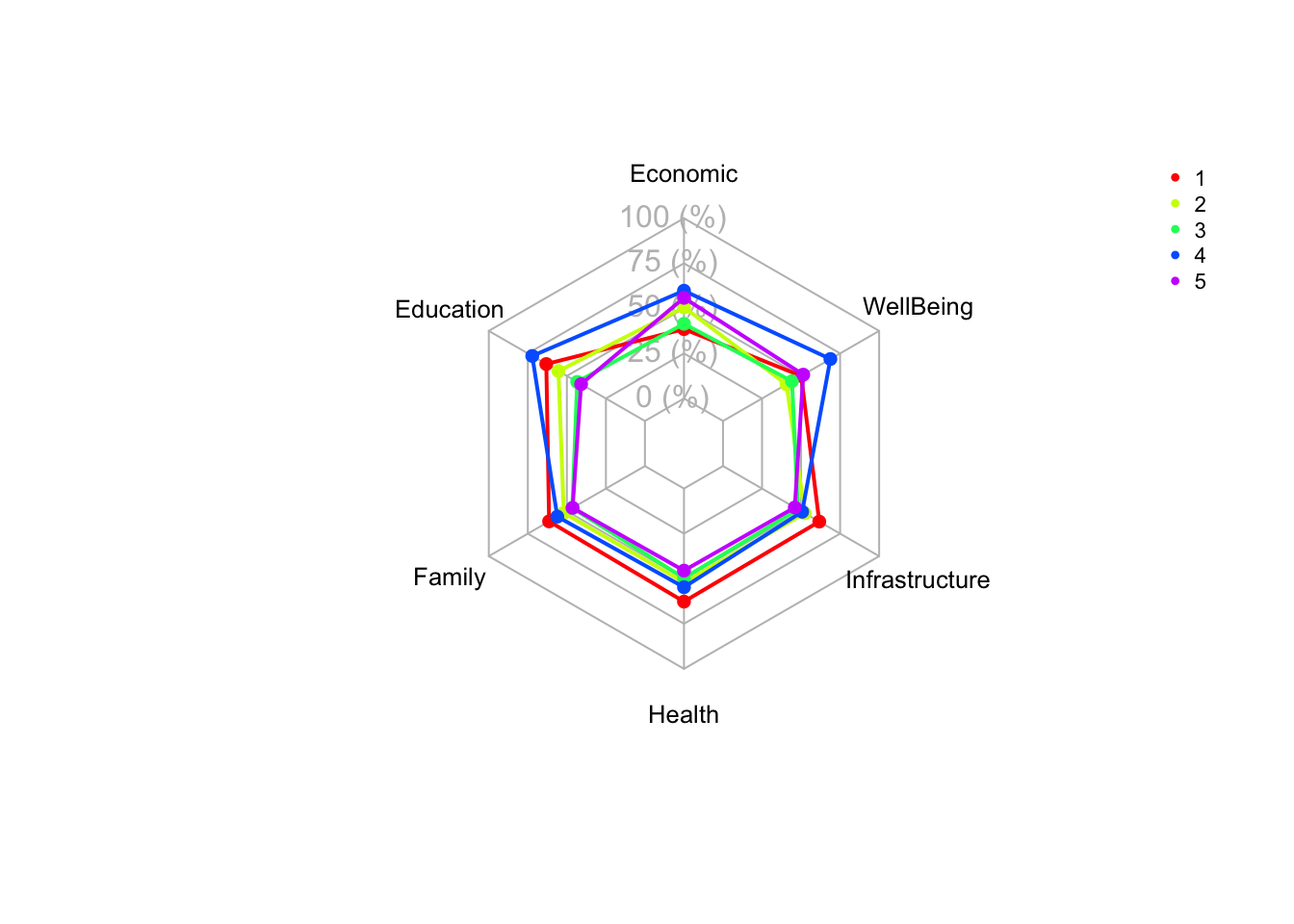
Do inequalities differ across counties of varying population size?
The radar chart below shows inequality scores for counties grouped by population size, which splits counties into one of 5 groups. PGCO1 being the largest in population, PGCO5 being the smallest in population.
Climate Change Belief Overview
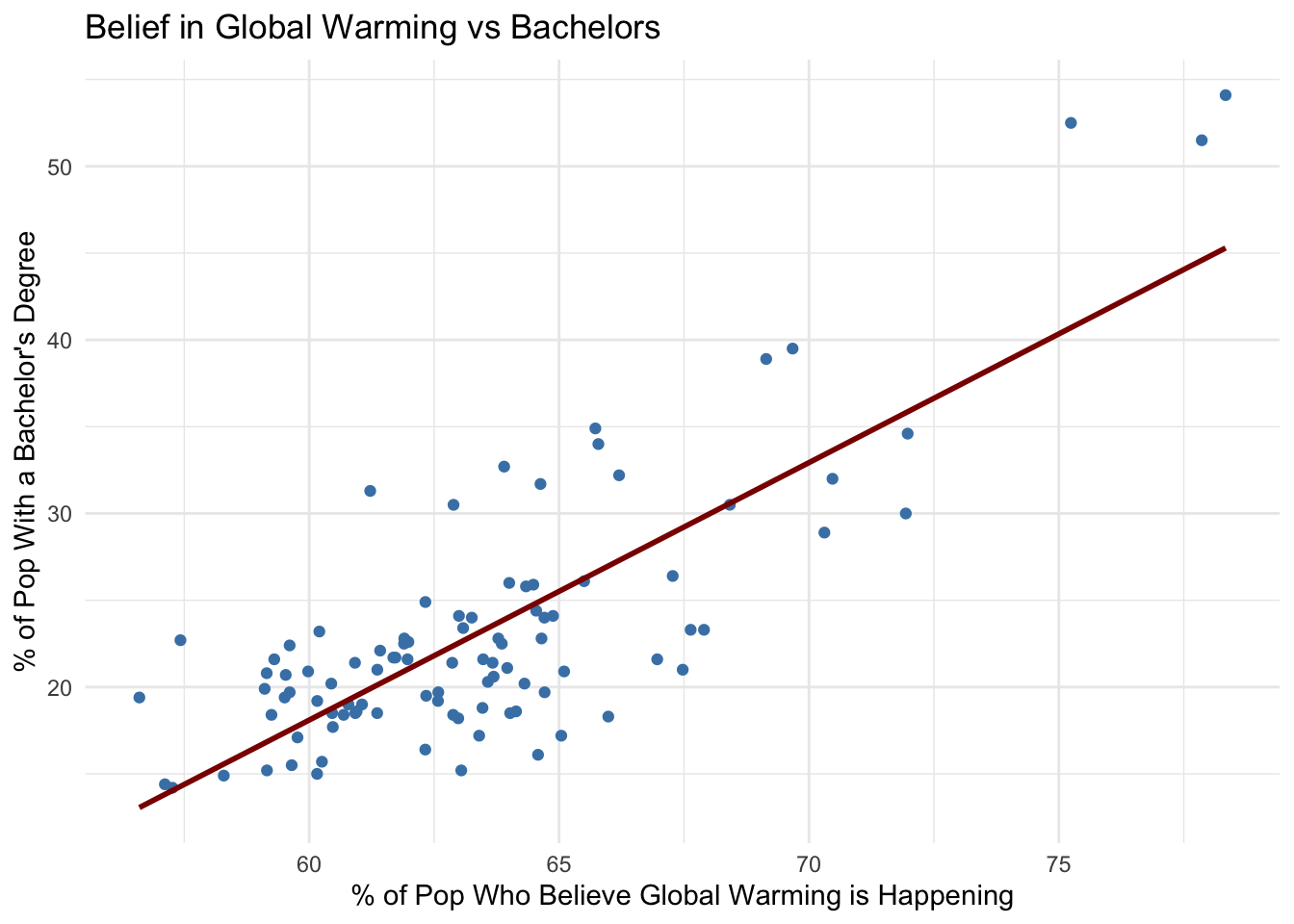
Do counties with higher levels of college educated population have higher beleifs in global warming?
- Counties with the highest percent of population with a bachelors degree also appeared in the top counties of climate change belief.
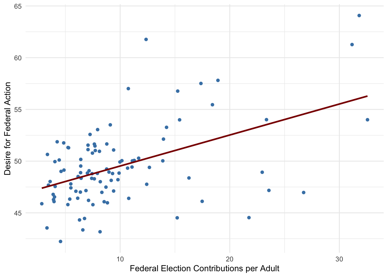
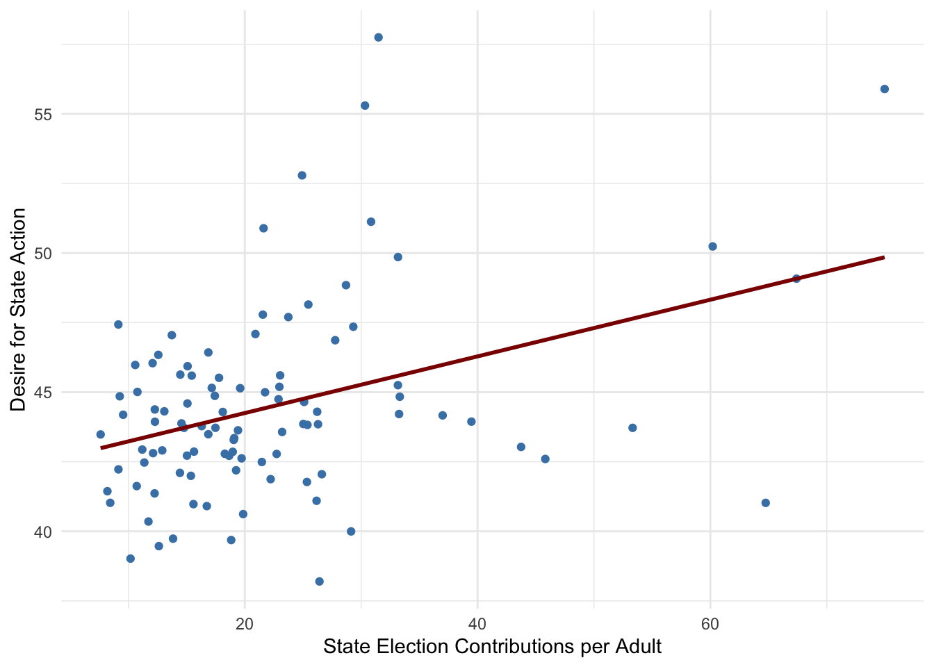
Does higher political engagement (election contributions) correlate with greater demand for government action on climate change?
- Positive Relationship: Counties with higher per-capita election contributions (state or federal) also tend to have a larger share of the population demanding action on global warming. This suggests that areas where people are more politically engaged financially may also be more climate-conscious or politically motivated to push for environmental policies.
Do counties with higher expected annual loss ($) from natural hazards believe global warming is affecting the weather?
- The correlation between the percentage of the population who believes global warming is affecting the weather and the expected annual loss ($) from tornadoes, winter weather, hail, strong winds, flooding, and drought is moderately positive. This suggests that in counties where climate-related disasters cause greater financial damage, more people tend to believe that global warming is influencing weather patterns.
Are there differences in climate change beliefs and wish for government action between counties based on their classification?
Urban vs Rural
The belief that global warming is happening is 5.4% higher in urban counties than in rural ones.
Wish for congressional action addressing global warming is 6.3% higher in urban counties than in rural ones.
Group Codes (5 Population Groups)
The belief that global warning is happening is 9.5% higher in the most populous counties compared to the least populous ones.
Wish for congressional action addressing global warming is 10.5% higher in the most populous counties compared to the least populous ones.
Conclusion