Where do mismatches appear and what might explain them?
Housing Deficiency vs. Civic Organizations
This graph reveals a slight positive relationship between housing deficiency and civic organizations per capita. As the proportion of deficient housing increases, the number of civic organizations tends to increase slightly. While the trend is not particularly strong, it may suggest that in areas with more housing challenges, there is a slightly higher presence of civic engagement possibly as a response to community needs.
How does geography affect opportunities?
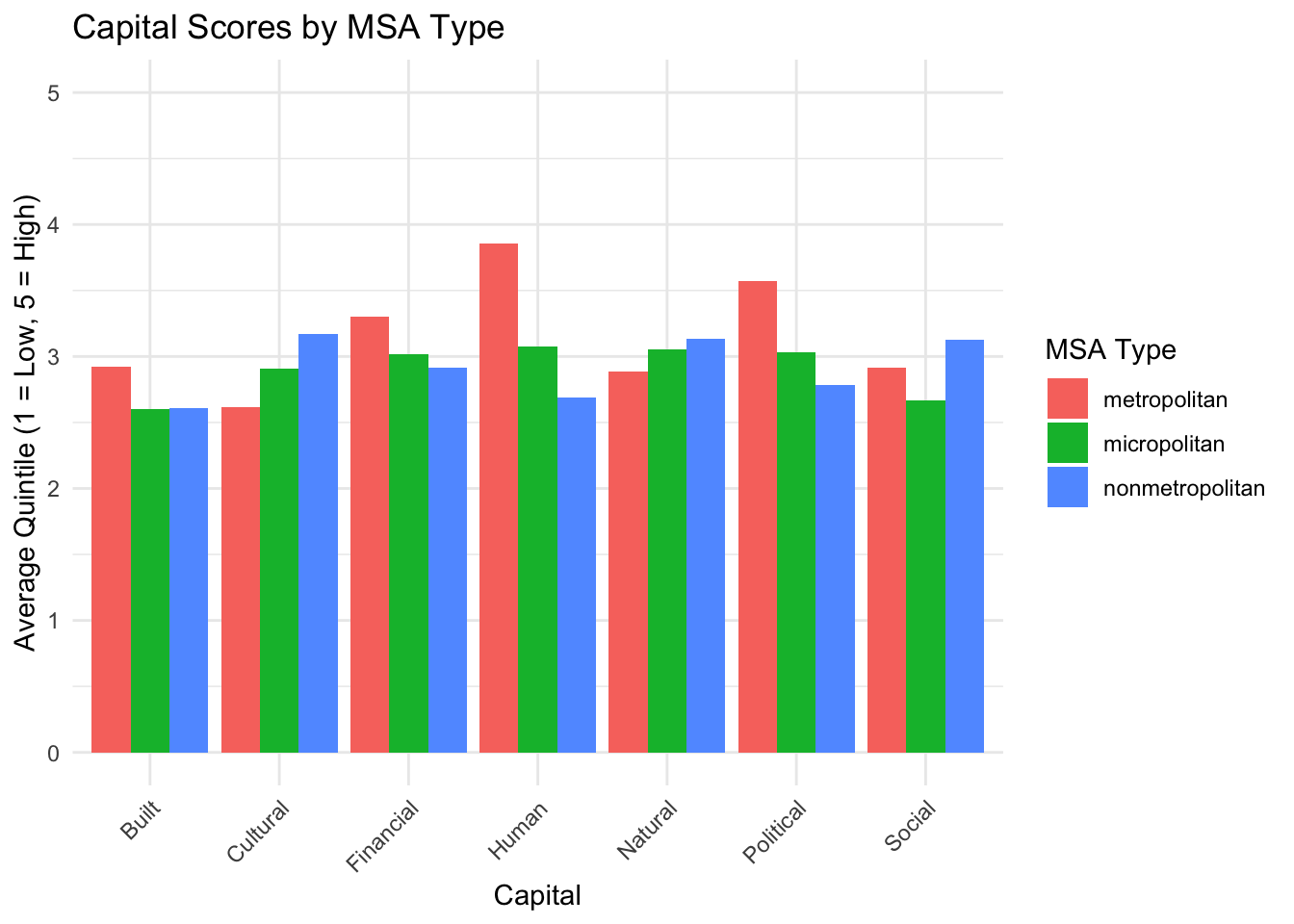
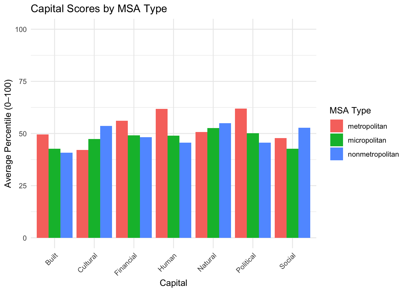
How does MSA type affect capital scores?
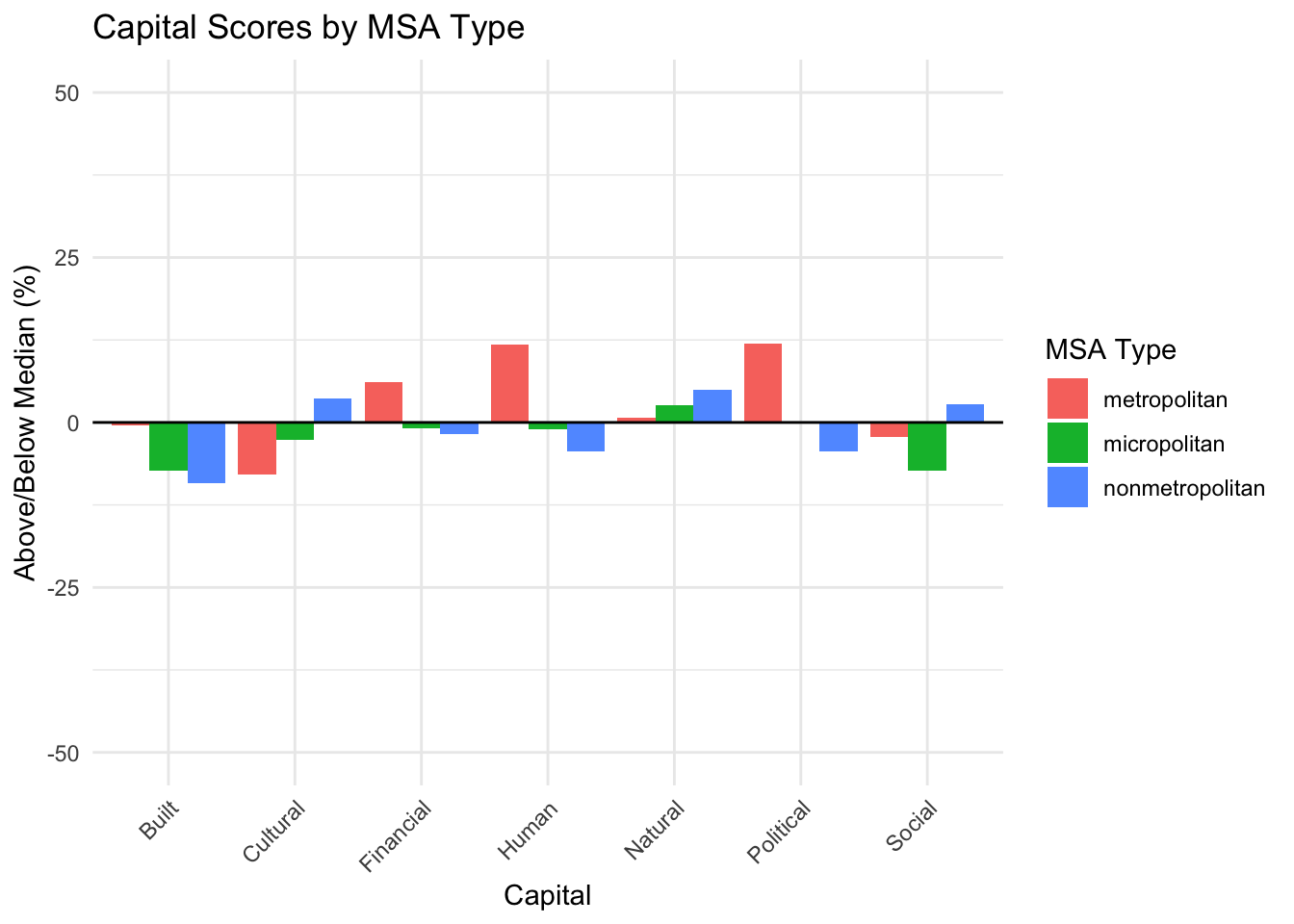
The graphs below show all capitals defined by all variables in the data with quintile values on the left and percentiles on the right for each capital by MSA type (Metropolitan, Micropolitan, and Non-Metropolitan). The graph below these uses calculated averages based on percentiles, to see how far a value is from the median of all counties, which is shown for MSA type below.
Analysis
Metropolitan counties do the best in Built, Financial, Human, and Political capitals. Non-metropolitan counties do the best in Cultural, Natural, and Social. Micropolitan does not do the best in any capital, but places in the middle for all capitals except Built and Social where they place last. Percentiles and quintiles show the same results.
Limitations
Results do not give us significant differences between metropolitan, micropolitan, and non-metropolitan grouped counties when using all variables. When averaging variables for counties under each MSA type, there is only small deviations from the median across capitals.
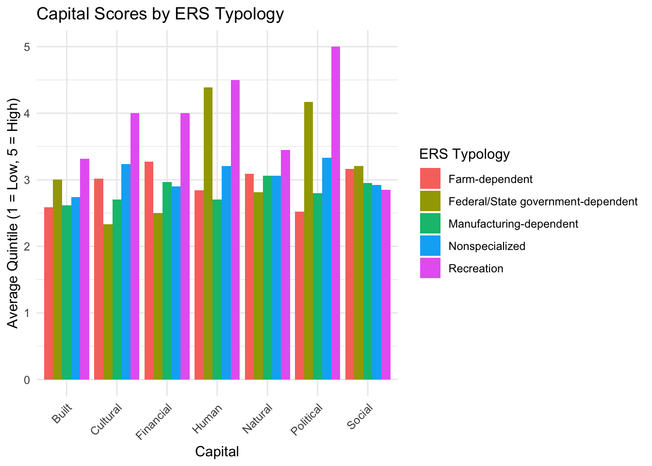
How does economic dependence affect capital scores?
The graphs below show all capitals defined by all variables in the data for each capital by ERS Typology, which gives each county a category of economic dependence. Quintiles are used in the graph on the left and percentiles are used in the right. Iowa counties fit into the following categories: Farm-Dependent, Federal/ State Government-Dependent, Manufacturing-Dependent, Non-Specialized, Recreation-Dependent. The graph below these uses calculated averages based on percentiles, to see how far a value is from the median of all counties, which is shown for ERS typology below.
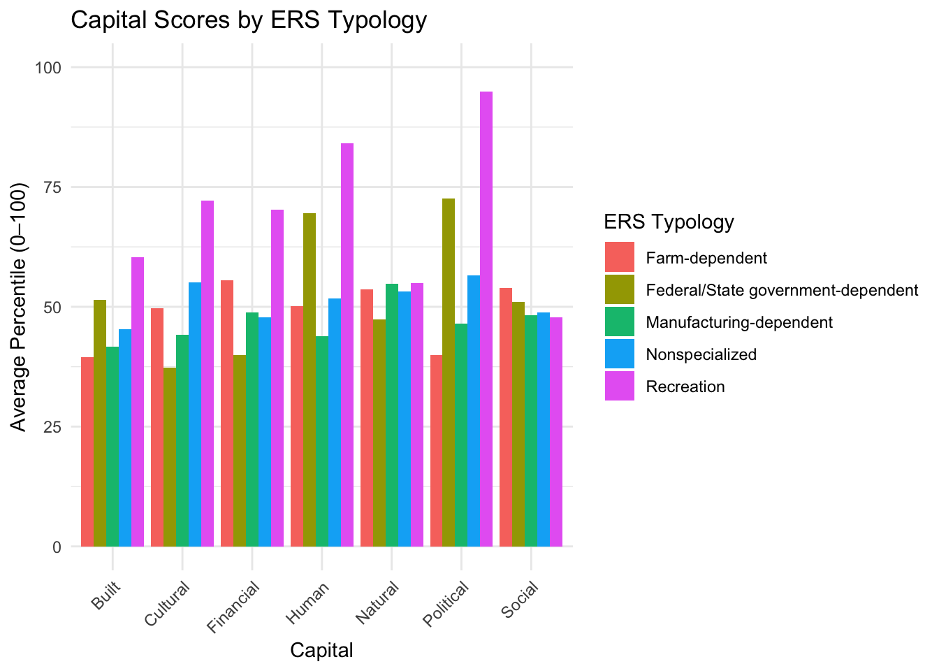
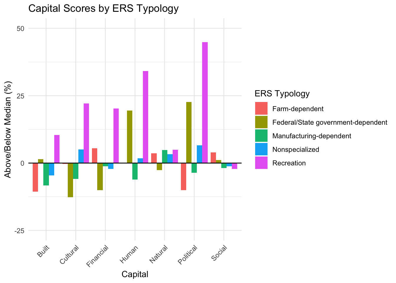
Analysis
Recreation performs the highest in all capitals except Social where it performs last. Federal/state government sticks out with high political and human capital. All other economic dependency categories stay relatively flat across capitals. Percentiles and quintiles show the same results. Besides recreation and federal/state government-dependent, averages do not deviate significantly from the median.
Limitations
While non-specialized, farm-dependent, and manufacturing-dependent all hold 25-40 counties each, recreation-dependent holds only one county and federal/state government-dependent holds only three counties. This is not a fair comparison as recreation-dependent and federal/state government-dependent are highly sensitive to local conditions/ outliers in their average values. Again, results do not give us significant differences between economic dependence types, as averages across those with enough counties to compare are very simaler when using all variables under each capital.
How do capital scores differ across CSA’s
The graphs below shows all capitals defined by all variables in the data using quintiles on the left and percentiles on the right for each capital by CSA, which is a combination of adjacent micropolitan or metropolitan counties as a statistical area. There are seven CSA’s that Iowa counties are apart of: Burlington-Fort Madison, IA-IL CSA, which contains Lee and Des Moines counties, Cedar Rapids-Iowa City, IA CSA, which contains Benton, Johnson, Jones, Linn, and Washington counties, Davenport-Moline, IA-IL CSA, which contains Clinton, Scott, and Muscatine counties, Des Moines-West Des Moines-Ames, IA CSA, which contains Boone, Dallas, Guthrie, Jasper, Madison, Marion, Polk, Story, Warren, and Mahaska counties, Omaha-Fremont, NE-IA CSA, which contains Harrison, Mills, and Pottawattamie counties, Sioux City-Le Mars, IA-NE-SD CSA, which contains Plymouth and Woodbury counties, and finally the Spencer-Spirit Lake, IA CSA, which contains Clay and Dickinson counties. The graph below these uses calculated averages based on percentiles, to see how far a value is from the median of all counties, which is shown for CSA’s below.
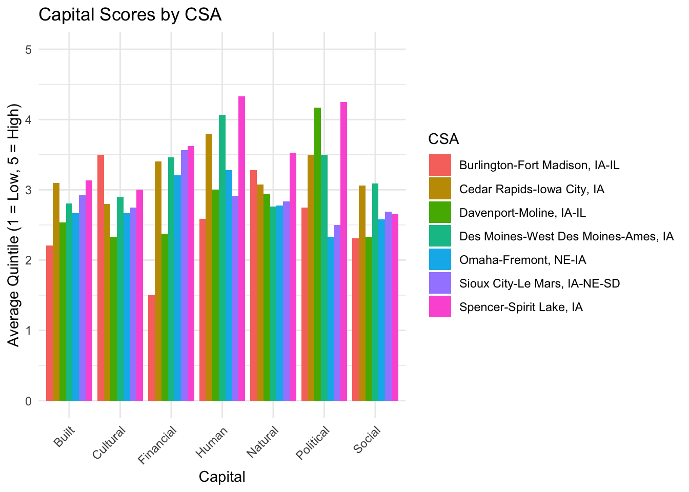
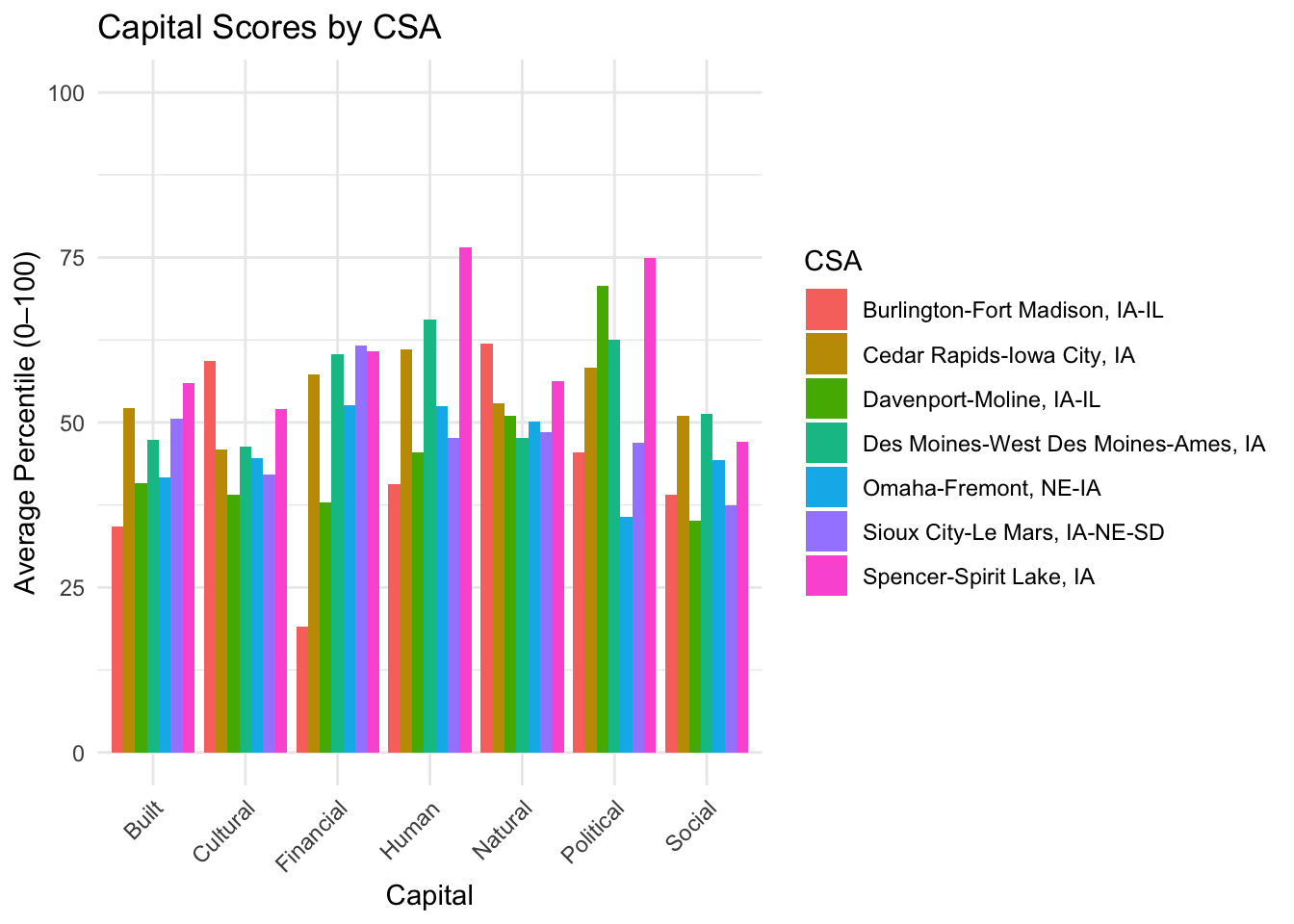
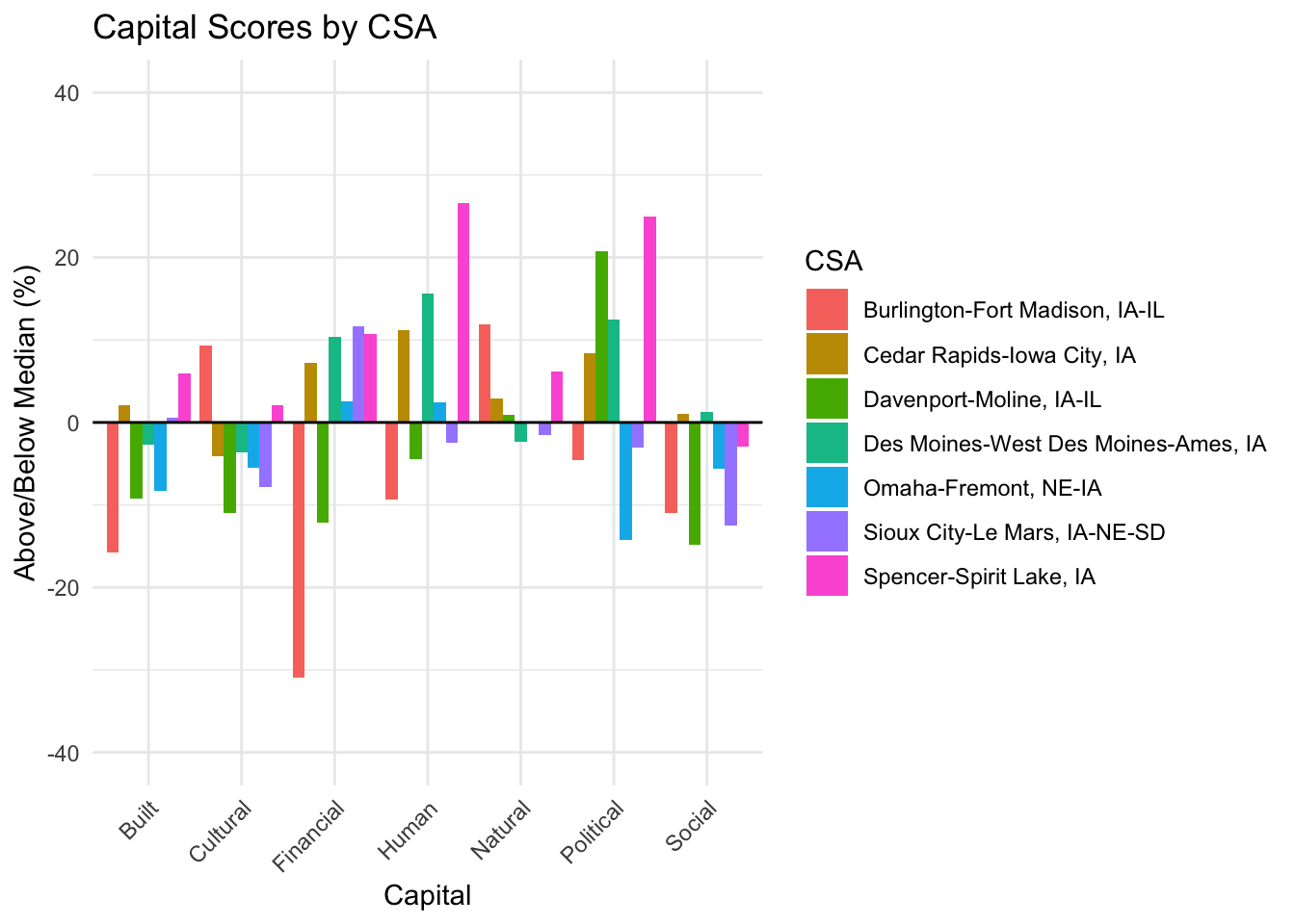
Analysis
Spencer-Spirit Lake, IA CSA performs best in Built, Financial, Human, Natural, and Political capitals. Burlington-Fort Madison, IA-IL CSA, performs worst in Built, Financial, Human, and Social capitals, but performs best in Cultural, and well (second place) in Natural capitals. Percentiles and quintiles show the same results.
Single variables across MSA type or ERS typology
The graphs below show various different variables across MSA type or ERS typology in search for significant differences.
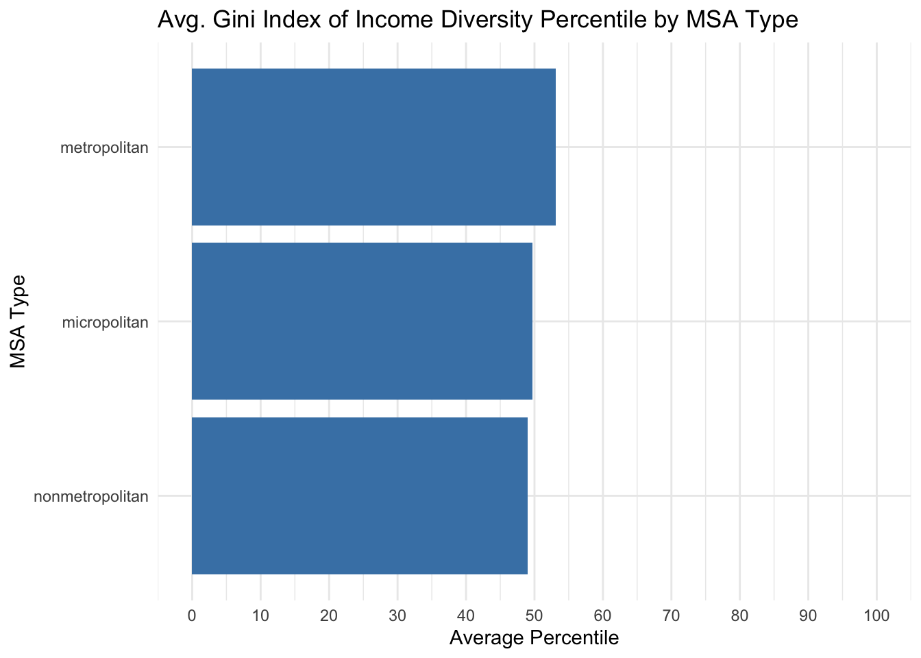
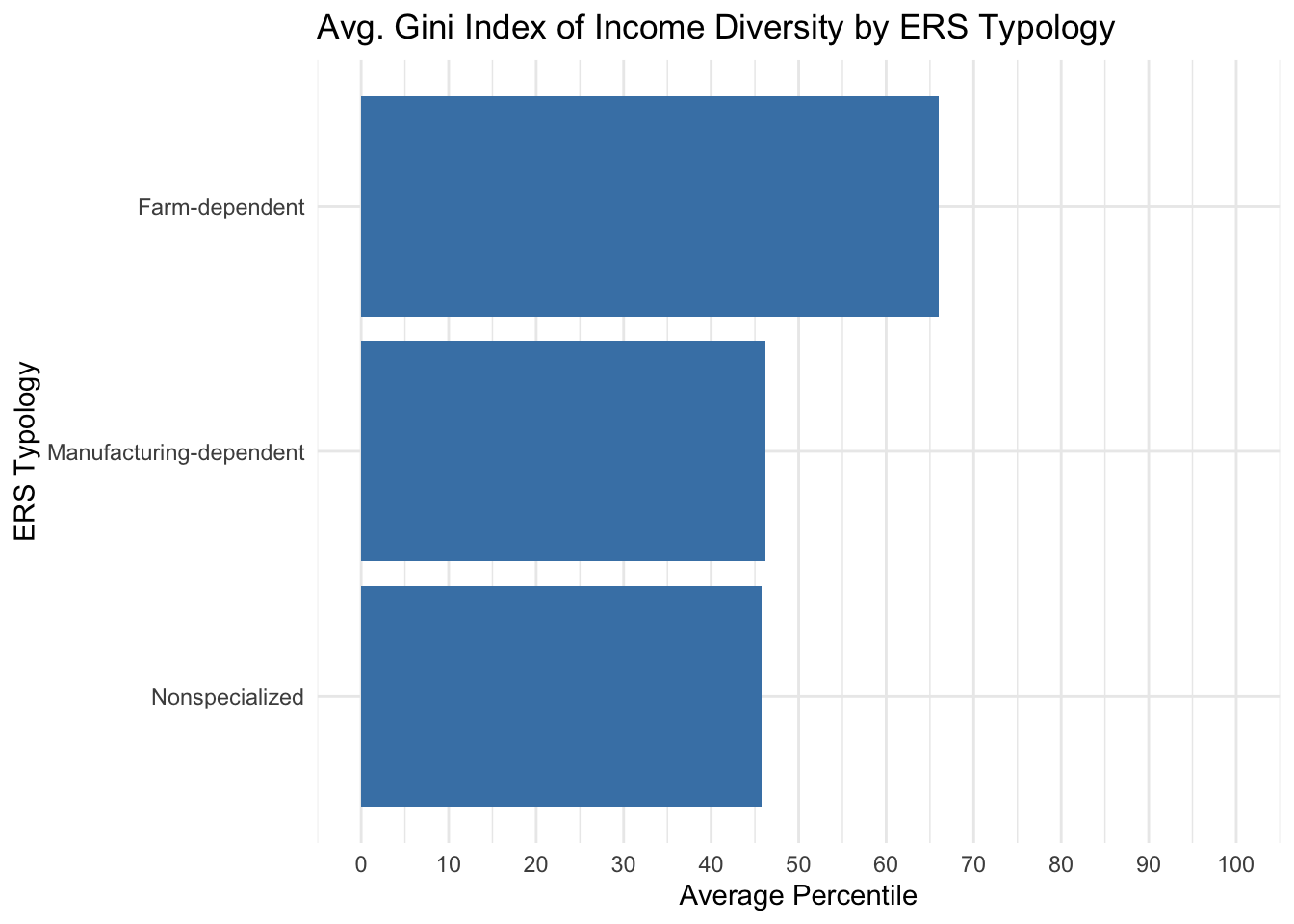
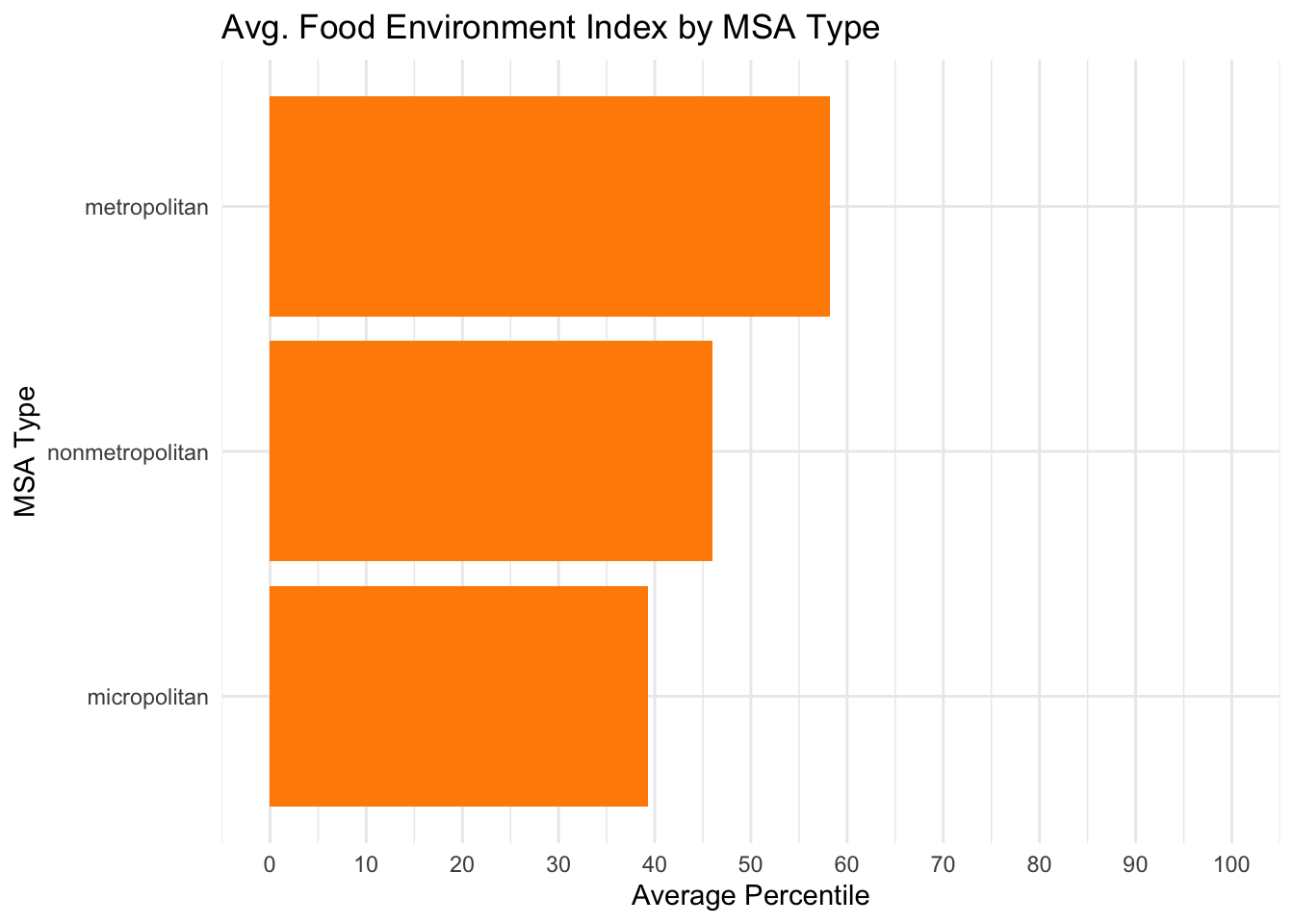
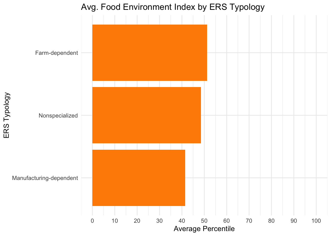
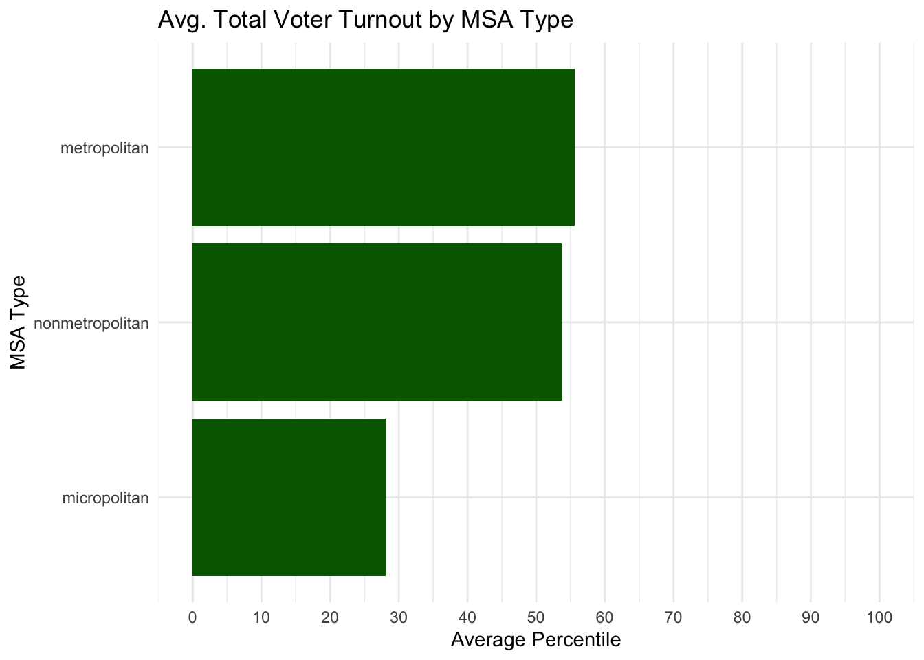
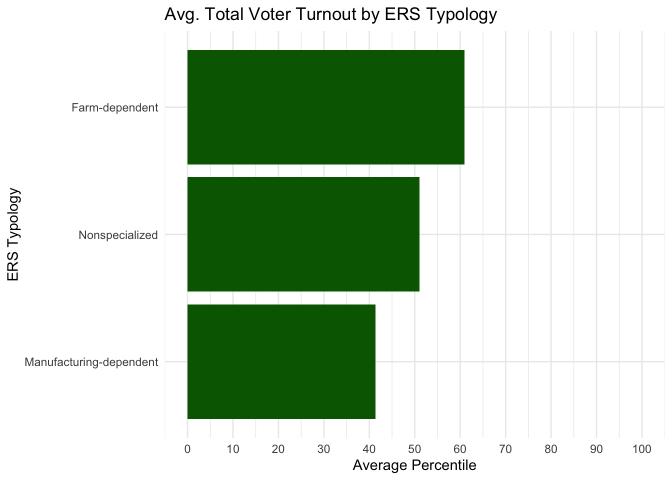
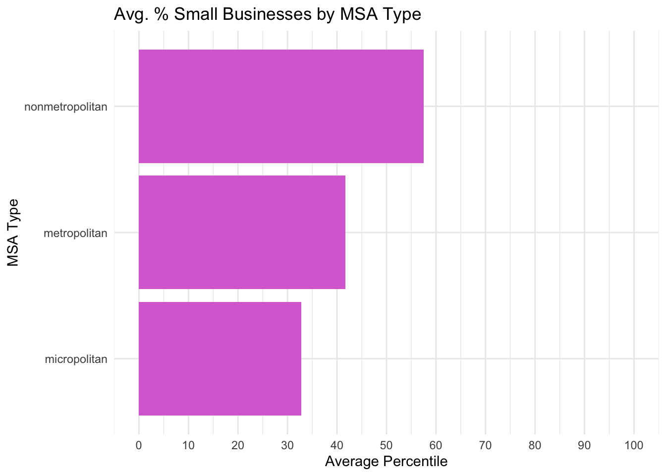
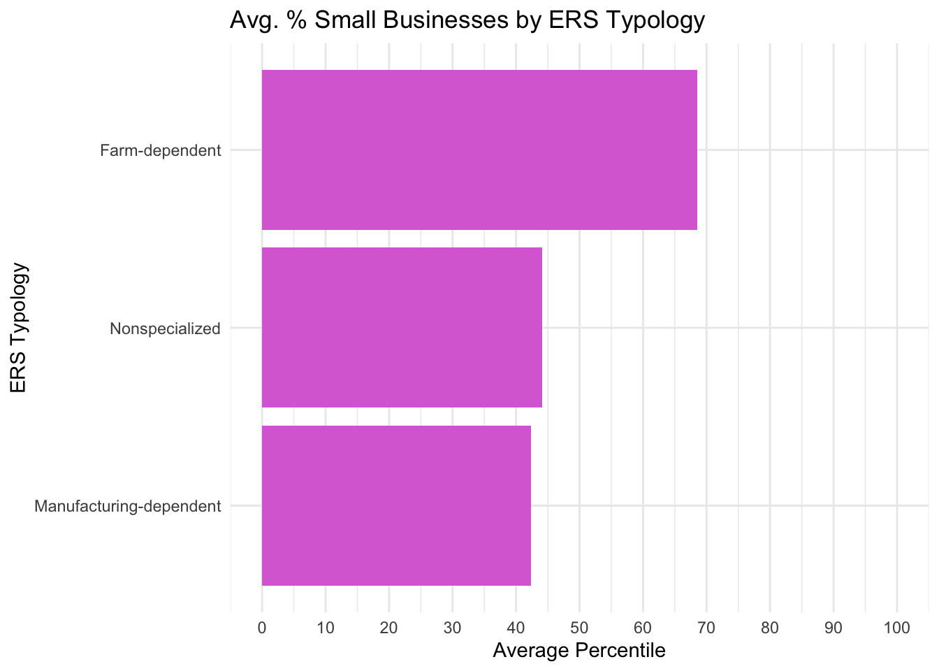
Analysis
For some variables, like the Gini Income Index and Food Environment Index, averages across MSA types or ERS typologies remain close to the 50th percentile (median of all counties), indicating only minor variation between groups. For others, like percentage of small businesses, averages across MSA types or ERS typologies stray farther from the 50th percentile (median of all counties), indicating more significant variations between groups. Though, after looking through all average variable percentiles across either MSA type or ERS typology, there are very few variables with significant variations for each.
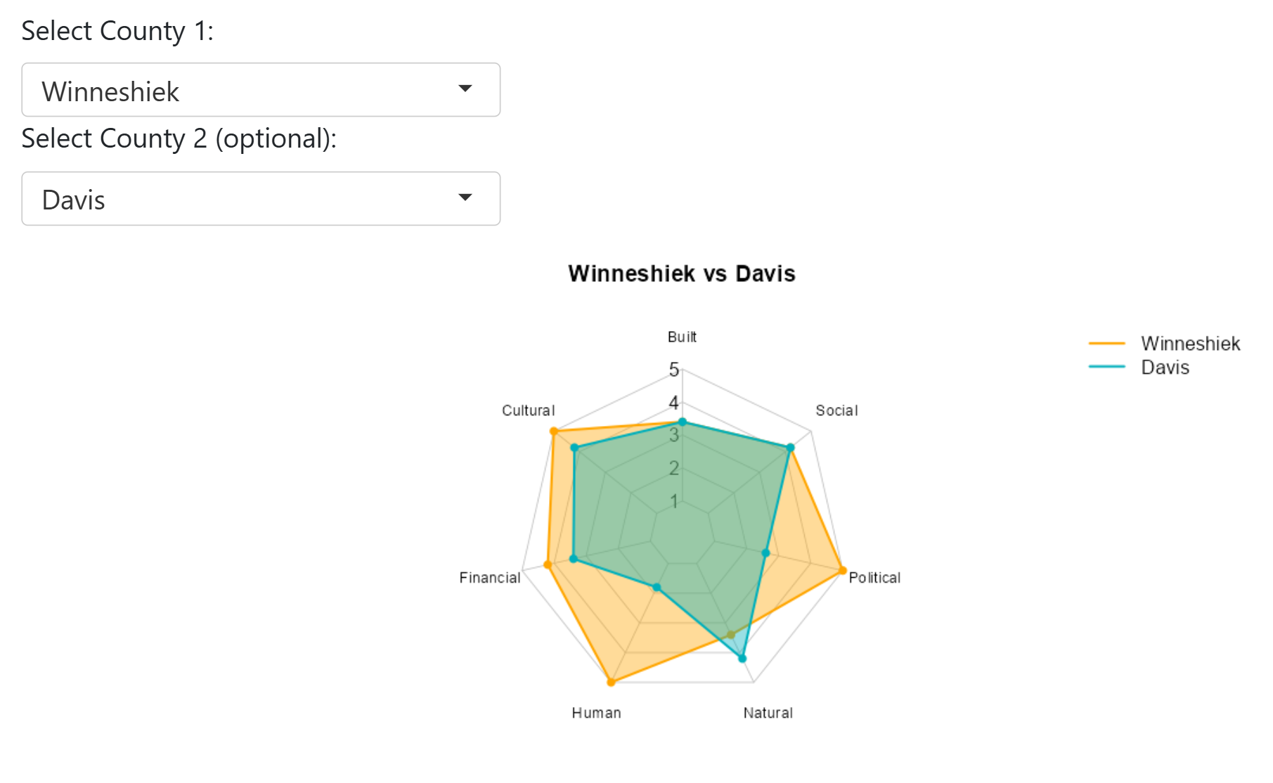
Interactive Radar Charts
I used shiny to create interactive radar charts with an option to view any county as well as compare any two counties capital scores using quintile values for all available variables. We could not include the interactive aspect in this blog post but below is an example of the application being used displaying Winneshiek and Davis counties.
Rural vs Urban Analysis
Overview
This analysis examines the socioeconomic differences between rural and urban counties in Iowa, revealing several counterintuitive patterns in poverty, income, and social indicators.
Key Findings
Poverty Patterns
- Student Effect: Story County, Johnson County, and Black Hawk County show higher poverty rates despite higher median incomes, likely due to college students experiencing temporary low income
- Income vs Poverty Paradox: Higher median income doesn’t guarantee lower poverty rates
- Rural Advantage: Lyon County demonstrates that rural areas can achieve low poverty rates with modest incomes
Contributing Factors to Poverty
Based on our correlation analysis:
- Poor health status correlates positively with poverty rates
- Single-parent households show strong correlation with higher poverty
- These relationships suggest interconnected social challenges
Racial Diversity Effects
Rural Counties: Weak correlation between diversity and income inequality
Urban Counties: Higher diversity associates with greater income inequality (Gini Index)
Health Insurance: Both rural and urban areas show diversity negatively correlating with insurance coverage
The Wealth-Inequality Paradox
Areas with higher population density and wealth generation show:
- Positive aspects: Higher median incomes, more economic opportunities
- Challenges: Greater income inequality, higher poverty rates in some cases
- Explanation: Urban areas attract both high earners and low-wage workers, creating income polarization
Notable Cases
Jefferson County
- Highest Gini Index with low median income
- High percentage of small businesses and bachelor’s graduates
- Elevated environmental risk factors
- Highest federal contribution per adult
Des Moines Area
- High poverty rate alongside high median income
- Strong financial capital but weaker social indicators
- Suburban areas perform better across multiple measures
Dickinson County
- Highest new housing prices and construction
- Lake-based tourism economy attracts wealthy retirees
- Natural amenities drive unique economic dynamics
Farm-Dependent Counties
Our analysis shows farm-dependent counties typically have:
- Lower median household income
- Lower poverty rates relative to income levels
- This pattern suggests rural cost-of-living advantages and community support systems
Health Connections
Iowa Mental Health Statistics
- 19.4% of adults in Iowa experience a mental health condition
- 56.4% of adults with mental illness don’t receive treatment
- 13.8% of youth experience major depressive episodes
- 780 individuals per 1 mental health provider (indicating shortage)
Correlation with Socioeconomic Patterns
The mental health data reinforces our findings:
- Health-Poverty Cycle: Untreated health conditions worsen economic outcomes
- Rural Access: Lower poverty but potentially hidden mental health burdens due to provider shortages
- Student Mental Health: College counties face dual burden of temporary poverty and youth mental health crisis
- Inequality Impact: Mental health disparities likely contribute to urban income inequality patterns
Data Visualizations
Poverty and Income Relationships
`geom_smooth()` using formula = 'y ~ x'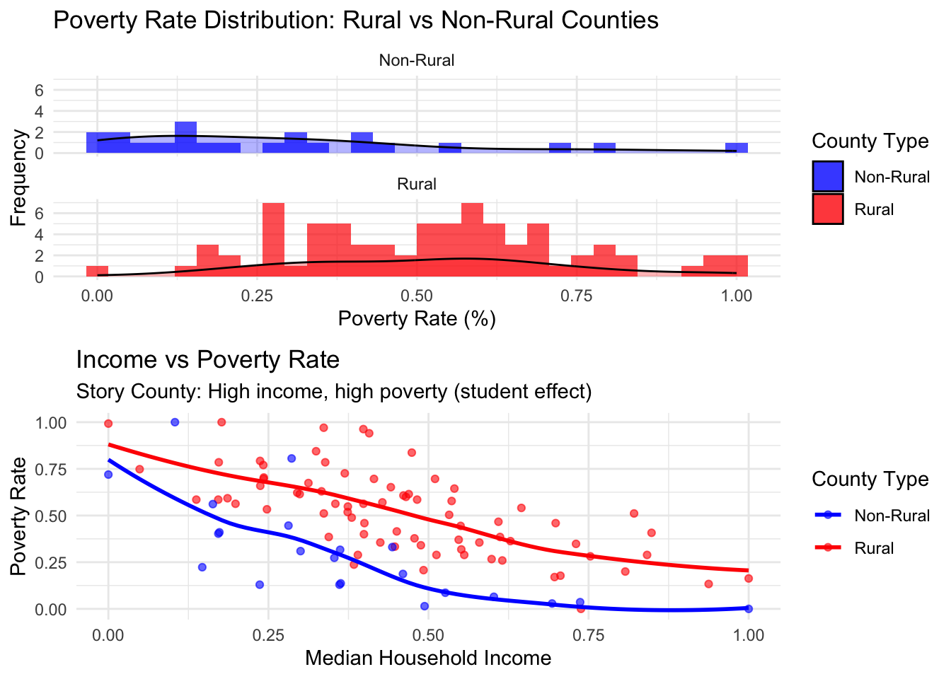
`geom_smooth()` using formula = 'y ~ x'
`geom_smooth()` using formula = 'y ~ x'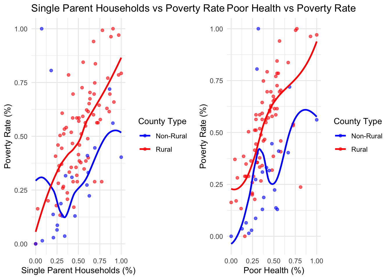
Understanding why rural areas have higher median income and higher poverty rates but lower income in equality
Potential Contributing Factors
Suburban-Rural Misclassification: Due to population thresholds, some commuter suburbs might be classified as rural (especially in ACS or Census data). These residents may work urban jobs with higher wages, pushing up median income. Meanwhile, others in the same areas may work locally for much lower wages or be unemployed, inflating poverty rates.
Effect:
-Raises median income via urban-connected earners
-Raises poverty rate via local non-earners or underemployed
-Keeps inequality low because incomes are not as extreme as in cities
Limited Economic Diversity: Rural areas often lack extreme wealth concentrations found in urban centers. Even if some earn more, income ceilings are lower compared to cities.
Effect:
-Inequality appears lower due to narrower income range, despite differences in livelihood quality.
Household Composition & Cost of Living:
-Larger rural households may have dual-income setups (e.g., both spouses working), pushing up median income.
-Yet, single-person or elderly households with limited resources remain vulnerable, increasing poverty rates.
-Lower cost of living can mask hardship in income statistics.
Effect:
-Median income looks better -Poverty remains high among vulnerable groups -Overall income spread remains tight → lower Gini coefficient
Commuting Patterns: Some rural residents commute to higher-paying city jobs (especially near metro fringes).
This creates a bimodal population:
-One group with urban income -Another group with limited local income or unemployment
Effect:
-Median income rises due to city-connected earners -Poverty rate high from those without access to such opportunities -Income inequality stays moderate due to few ultra-wealthy
What To Explore Further
-Commute Time Analysis: Match income and poverty data with average commute times to identify suburban influence in rural stats.
-Gini Coefficient Maps: Compare inequality within census tracts labeled as rural to detect variations.
-Occupation Types: Identify how remote work or medical/educational professions cluster in rural areas.
Why Rural Areas Have More Single Parents
This section explores the factors contributing to higher single parenthood rates in rural areas:
`geom_smooth()` using formula = 'y ~ x'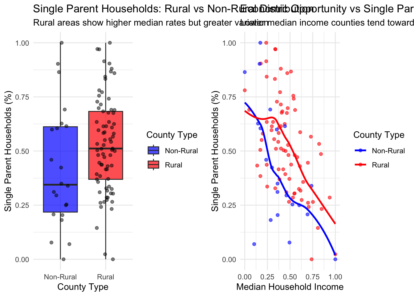
| county_type | Counties | Mean_Single_Parent | Median_Single_Parent | SD_Single_Parent |
|---|---|---|---|---|
| Non-Rural | 22 | 0.42 | 0.34 | 0.28 |
| Rural | 77 | 0.53 | 0.51 | 0.22 |
Understanding Rural Single Parenthood Patterns
Why do rural areas show higher rates of single parenthood?
Potential Contributing Factors:
-Economic Constraints: Many rural Iowans face limited employment opportunities, wage stagnation, and underemployment. Financial strain can contribute to relationship breakdowns or discourage formal partnerships like marriage.
-Out-Migration: Young adults often leave rural Iowa for better educational or career opportunities in urban centers. This reduces the pool of potential partners, weakens community ties, and interrupts long-term relationships.
-Cultural Factors: Family formation norms vary across rural regions. In some areas, early childbearing, cohabitation without marriage, or single parenting may be more socially accepted or less stigmatized than in urban areas.
-Service Access: Access to family planning, prenatal care, mental health services, and relationship counseling is limited in many parts of rural Iowa. This contributes to unplanned pregnancies and a lack of support for struggling relationships.
-Religious and Policy Influences: While rural Iowa communities often hold traditional values, they also tend to support policies that restrict abortion access and comprehensive sex education. Combined with limited reproductive healthcare, this can lead to higher rates of single parenthood following unintended pregnancies.
Support Systems and Policy Context in Iowa:
-Strong Informal Networks: Rural Iowans often benefit from strong extended family and community support after separation. However, these supports cannot fully address the root causes.
-State Programs: Iowa offers programs like the Family Investment Program (FIP), Parent Partners, Early Head Start, and Medicaid, which help single parents with basic needs, health, and employment training. However, gaps remain:
-Guaranteed income pilots (e.g., UpLift) have been banned for future expansion.
-Childcare shortages in rural counties force many parents out of the workforce.
-SNAP asset tests and restrictions risk excluding vulnerable rural families.
Racial Diversity Analysis
`geom_smooth()` using formula = 'y ~ x'
`geom_smooth()` using formula = 'y ~ x'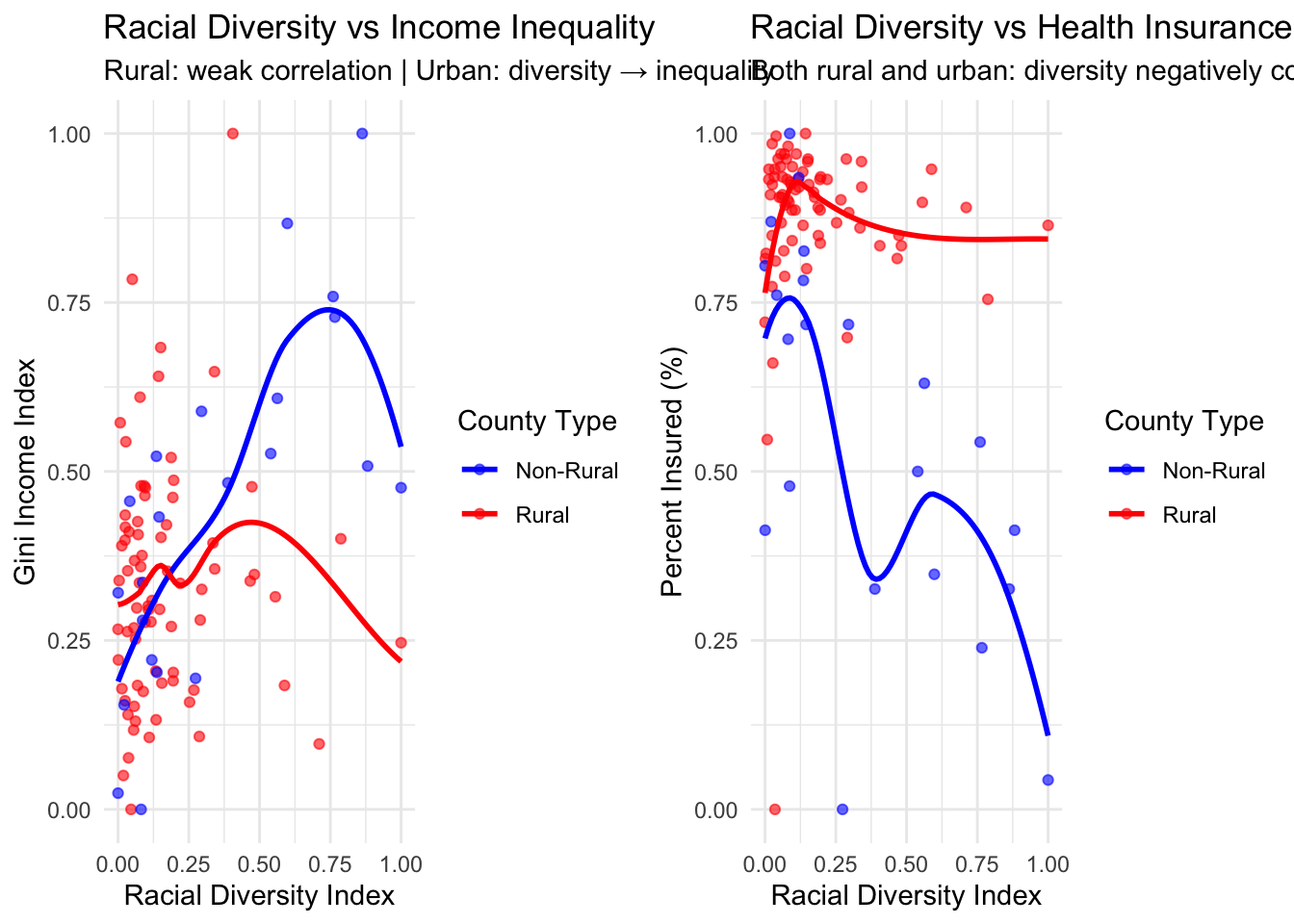
Understanding Race Diversity correlation with socioeconomic indicators
Income Inequality (Gini Index)
Rural Counties:
There is a weak correlation between racial diversity and income inequality. This suggests that in rural areas, increasing racial diversity does not significantly drive disparities in income distribution. Other factors (e.g., employment type, educational access, migration) may play a larger role.
Urban Counties:
Higher racial diversity is associated with greater income inequality. In urban settings, economic stratification often coincides with racial or ethnic divides, possibly due to systemic inequalities in education, housing, and labor markets.
Health Insurance Coverage
In urban areas, racial diversity is negatively correlated with health insurance coverage. As diversity increases, the percentage of insured individuals tends to decline, potentially reflecting disparities in employment-based insurance access, citizenship status, and enrollment in public programs.
The Diversity-Income-Inequality Triangle
Understanding the Diversity-Income-Inequality Triangle
Urban Counties:
Tend to show higher racial diversity. Exhibit greater income inequality (larger blue points).
Show a wider range of median incomes, including both very low and very high. Diversity and inequality appear positively correlated.
Rural Counties:
Cluster toward low racial diversity and lower-to-mid median income.
Display a wide range of inequality, but point sizes are generally smaller than urban counterparts.
Diversity has a weaker or no clear association with inequality.
This plot illustrates the triangular tension among:
Diversity (often associated with opportunity and inclusion)
Income (general prosperity)
Inequality (distribution of prosperity)
In urban areas:
More diversity attracts both high earners and low-wage workers, increasing polarization. Hence, diversity → income opportunity → inequality.
In rural areas:
Low diversity and modest incomes dominate. Inequality may arise from access disparities, not demographic heterogeneity.
Summary Statistics
| County Type | Counties | Avg Poverty Rate | Avg Median Income | Avg Diversity Index | Avg Gini Index | Avg Insurance Rate |
|---|---|---|---|---|---|---|
| Non-Rural | 22 | 0.30 | 0.375 | 0.354 | 0.440 | 0.56 |
| Rural | 77 | 0.52 | 0.457 | 0.171 | 0.332 | 0.88 |
Conclusions
Key Takeaways
- Student Effect is Real: College counties challenge traditional poverty metrics
- Diversity Creates Complex Dynamics: Urban diversity correlates with both opportunity and inequality
- Rural Resilience: Farm-dependent counties show economic stability despite lower absolute incomes
- Health-Poverty Connection: Mental health gaps compound socioeconomic challenges
- Geographic Context Matters: One-size-fits-all policies are inappropriate for Iowa’s diverse counties
Policy Implications
Targeted Interventions Needed
- College Counties: Student-specific poverty measures and support systems
- Diverse Urban Areas: Focused equity initiatives to address inequality
- Rural Health: Mental health workforce development critical given access gaps
- Farm Communities: Preserve social capital while encouraging economic diversification
Economic Development Insights
- Farm dependency provides stability but may limit growth potential
- Urban diversity creates opportunity but requires active inequality management
Limitations
- Data quality can be a limitation, as some measures may be wonky and different from certain data sources online
- Lack of policy-induced changes analysis only provides current conditions without policy context
- Student population effects may artificially inflate poverty rates in college counties
- Geographic aggregation at county level may mask city variations
- Causation vs correlation - the analysis shows relationships but doesn’t establish causal mechanisms
Future Research
- Time series Analysis: Track changes over time to identify trends
- Spatial Analysis: Account for geographic effects
- Health Integration: Develop comprehensive models linking health, economics, and geography
- Economic types: Analyze different economic dependencies (e.g., farming, manufacturing, services) to understand their impact on community capitals.
This analysis demonstrates that Iowa’s socioeconomic landscape is far more complex than simple rural-urban dichotomies suggest, requiring nuanced approaches to policy and development that recognize each region’s unique characteristics and challenges.
Are small Iowa cities (8,000–12,000 people) seeing changes in housing data based on what they’ve been doing to improve homes and infrastructure?
Selected Housing Variables
Median Property Value, Median Year Built, Percent of Households with Broadband Access,Percent of Households with Complete Plumbing
We selected Iowa cities with populations between 8,000 and 12,000. These include:
Tier 1: Bondurant, Pleasant Hill, Sioux Center, Pella, Le Mars, Waverly
Tier 2: Carroll, Storm Lake, Denison
Tier 3: Spencer, Grinnell, Oskaloosa, Mount Pleasant
Tier 4: Fort Madison, Keokuk
Data Insights and heatmap analysis
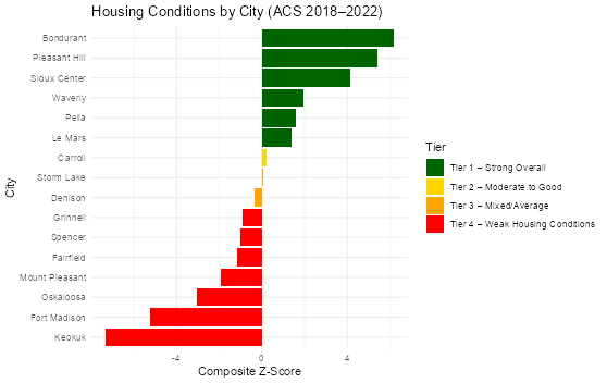
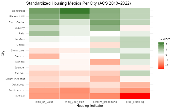
Ground Truthing , How cities are actually doing
Summary
Tier 1 – Leading Cities Bondurant, Pleasant Hill, Sioux Center, Le Mars, Waverly, Pella
Why It Worked:
Long-term Planning: Cities like Bondurant and Le Mars prepared sewer and road systems years before housing demand peaked.
Proactive Zoning: Pleasant Hill used zoning reforms and tax incentives ( Forge65) to attract developers early.
Design + Growth Balance: Pella and Waverly maintained housing quality through design guidelines and rehab support while allowing infill housing.
Early Broadband Coordination: Sioux Center’s upfront investment in utilities and Harvest Heights(new residential development) helped support strong infrastructure.
## Limitations:
Some cities (like Waverly and Pella) scored well because of maintaining older homes, not because of large-scale new construction.
Le Mars’s “Vision 2045” started late—most of its impact will show up in the next ACS cycle.
Tier 2 – Mid-performing Cities with Active Efforts Carroll, Denison, Storm Lake
What They Did:
Broadband Pushes: Storm Lake’s early city-school fiber ducts and Spencer’s local ISP expansions created foundational change.
Housing Rehabilitation: Denison and Carroll used local banks and federal CDBG grants to fund rehab programs and modest new builds.
Flexible Growth Tools: Carroll encouraged infill housing using bonds and local partnerships after 2018.
Why They’re Mid-tier:
Timing: Many projects began in or after 2018—results are just starting to show.
Small Scale: Denison’s 7-unit construction and rehab efforts were limited in scale, preventing full-tier improvement.
Limitations:
Improvements were uneven or didn’t scale across the whole city.
Broadband still lags in low-income neighborhoods.
Tier 3 – Patchy Progress & Infrastructure Gaps Grinnell, Spencer, Fairfield, Mount Pleasant, Oskaloosa
What They Tried:
Downtown Revitalization:
Broadband Attempts: Spencer and Mount Pleasant installed fiber before 2018, but take-up was slow.
Sewer Fixes: Oskaloosa and Fairfield invested in sewer systems, improving plumbing indicators.
Why It Didn’t Fully Work:
Localized Improvements: Most projects didn’t reach the full city.
Delayed Rollouts: Fiber reached neighborhoods late or remained unconnected.
Little New Housing: Most cities didn’t add many homes so median year built stayed low.
Limitations:
Plumbing and broadband improvements didn’t scale.
Most benefits were visible only in central or well-resourced areas. ### Tier 4 – Struggling or Underinvested Cities Fort Madison, Keokuk
What They Did:
Relied on Grants: Both cities used CDBG or state historic preservation grants for small-scale housing rehab.
Maintained Low-Income Units: Fort Madison’s housing authority supported over 100 households with federal assistance.
Why They Remain Low Tier:
Minimal New Development: No new large housing projects.
Aging Infrastructure: Water systems and housing stock remained older than average.
Weak Broadband Efforts: Little evidence of citywide or neighborhood fiber investment before 2022.
Limitations:
Even with downtown rehabs, systemic issues (like vacant lots, outmigration) outweighed progress.
ACS data shows accurate reflections—Z-scores low across all metrics.