Question-1: Do strong counties show strength across many areas, or just one?
(i) Do counties with strong education and income also show strong housing, internet and civic life, or are those strengths separate?
Variables:
- Monthly housing cost with mortgage: monthly_housing_cost_with_mortgage
- Monthly housing cost without mortgage: monthly_housing_costs_without_mortgage
- Monthly median gross rent: monthly_median_gross_rent
- Internet access: median_house_value
- No internet access: no_internet_access
- Access to plumbing facilities: access_plumbing_facilities
- No access to plumbing facilities: lacking_plumbing_facilities
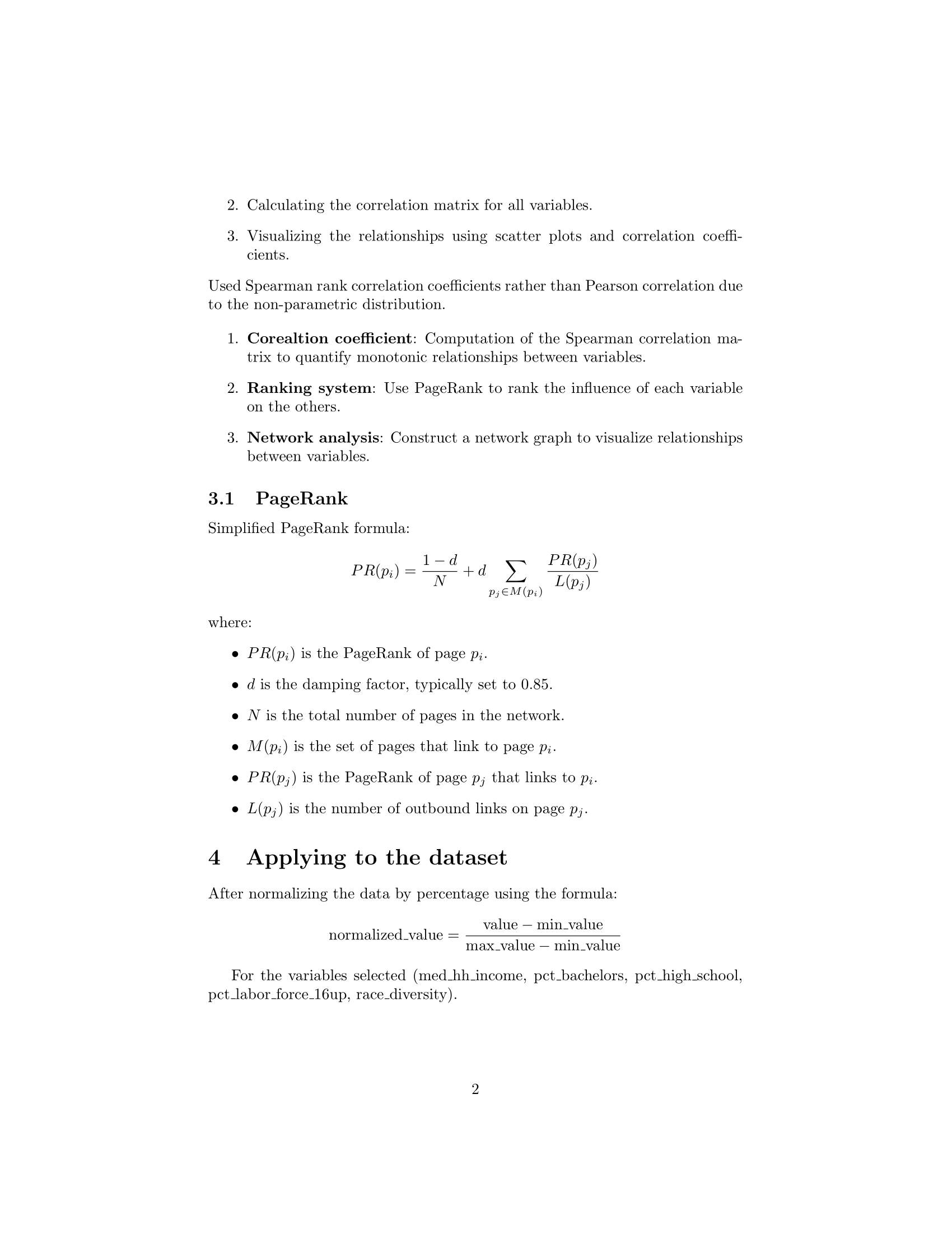
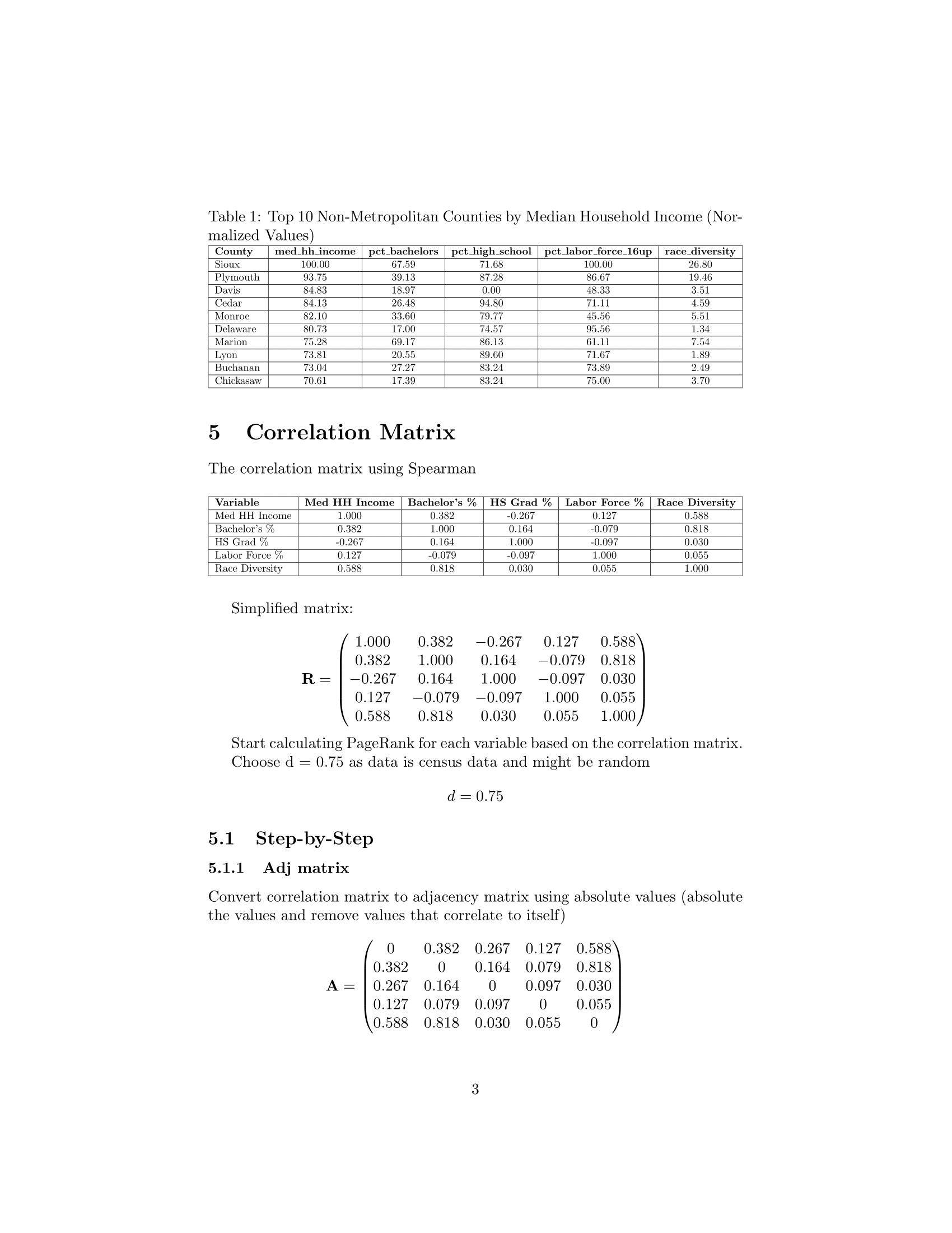
Standardized the data then construc a correlation matrix using Spearman coefficient
In this data transformation pipeline, several key socioeconomic indicators were calculated and standardized. The education rate was computed as the proportion of individuals with a bachelor’s degree or higher relative to the total adult population, and a standardized education score was derived from it. Housing affordability was measured in three ways: the share of monthly income spent on mortgage payments, rent, and the ratio of median house value to income; each was then standardized into respective scores. Access to infrastructure was assessed by calculating the rate of internet and plumbing access in each area, with corresponding standardized scores. Commuting patterns were captured by first summing all time intervals to get total commuters, then calculating the share of commuters for each time bracket (e.g., less than 5 minutes, 10–14 minutes, etc.), and finally standardizing those proportions. Altogether, these metrics were transformed into z-scores to enable direct comparisons across different domains of well-being and infrastructure.
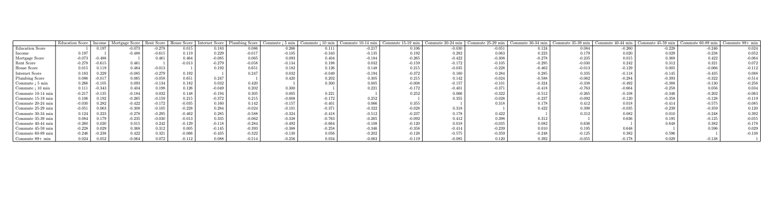
Higher education and income are generally linked to shorter commutes, higher internet scores, and better housing/plumbing. Longer commutes tend to correlate with lower socioeconomic and infrastructure indicators. Housing ownership (Mortgage Score) and renting (Rent Score) show inverse patterns across the board.
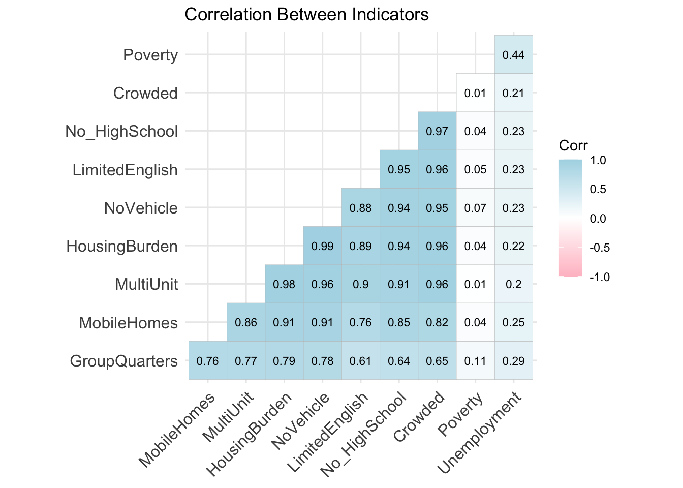
(ii) Which strengths appear together most often like broadband and labor force participation, or housing and civic groups?
Variables:
Built (5 variables): Housing Burden, Mobile Homes, MultiUnit, Crowded, No Vehicle
Human (2 variables): No High School, Limited English
Financial (2 variables): Poverty, Unemployment
Social (1 variable): Group Quarters
Correlation Between Indicators
Each square compares two indicators and calculates how closely they move together.
The value inside each square is the Pearson correlation coefficient (from –1 to 1):
1.00 = positive correlation (both go up/down together)
0.00 = no correlation
–1.00 = negative correlation (one goes up, the other goes down)
Darker blue = stronger positive relationship
Analysis:
No_HighSchool, LimitedEnglish, NoVehicle, and HousingBurden are very highly correlated (values around 0.94–0.97).
Counties with low education levels often also have high housing costs, more residents with limited English, and less access to transportation.
Poverty and Unemployment: Only weakly correlated with other indicators here (e.g., Poverty and HousingBurden: just 0.04).
This suggests that housing strain, language barriers, and education may be major issues even when income isn’t the worst.
Conclusion: Community strain is multi-dimensional. This chart shows that counties struggling in one area (like education) often struggle in others (like housing and transportation), but poverty itself doesn’t always align with those issues.
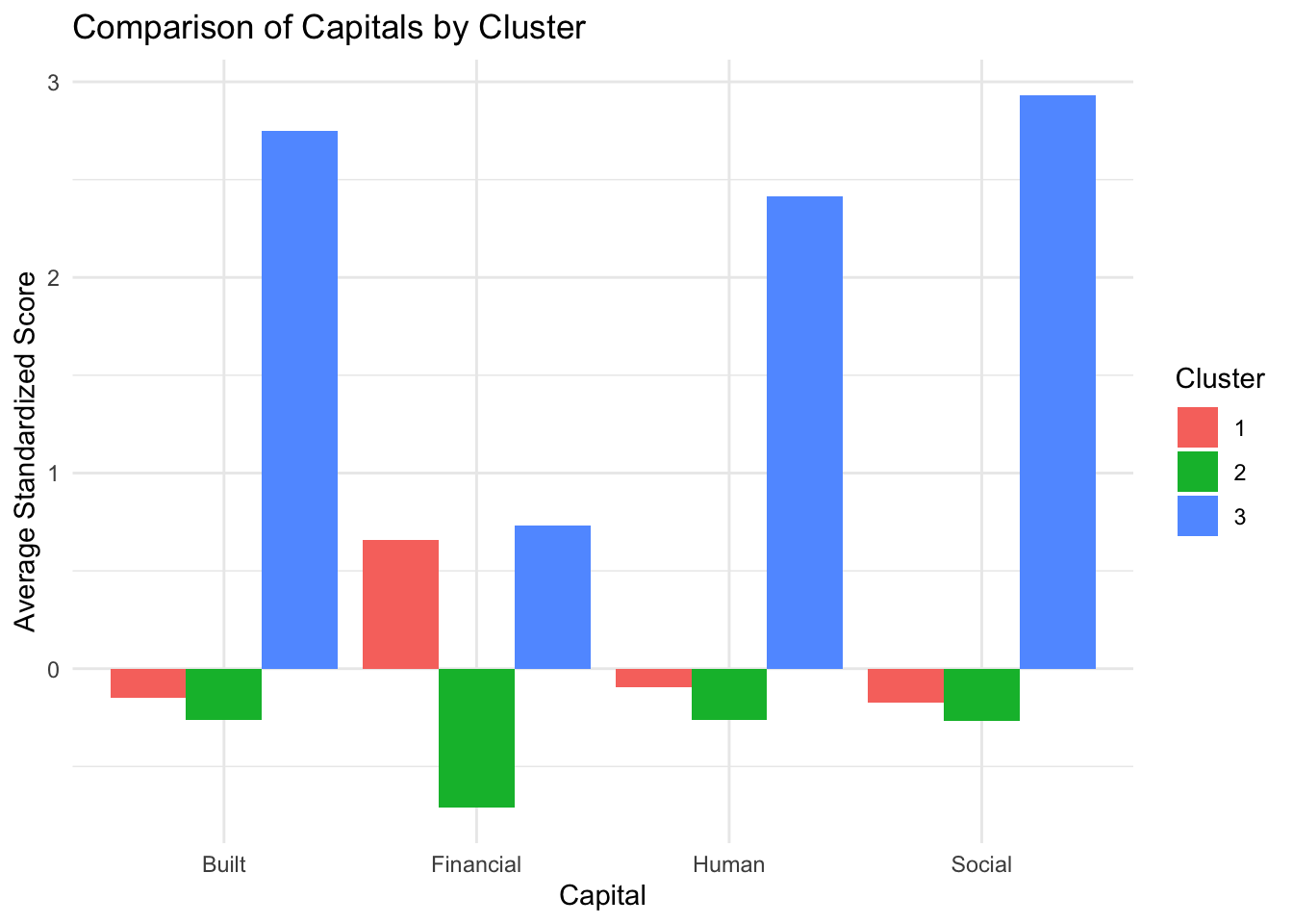
Comparison of Capitals by Cluster
This bar chart compares the average standardized score for four types of community strengths (called capitals) across the three county clusters.
The four capitals are:
Built: Housing conditions, vehicles, and infrastructure
Financial: Income, poverty, and employment
Human: Education and language access
Social: Community living situations like group quarters
Each bar shows how counties in a cluster score (on average) in each capital:
What the Chart Shows
Cluster 3 (Blue) has the highest scores in all four capitals. This means counties in this group are experiencing greater levels of challenge.
Cluster 2 (Green) has the lowest scores. That means counties in this group are doing better than average on all four fronts.
Cluster 1 (Red) sits in between. These counties show some level of vulnerability, but not as severe as Cluster 3.
(iii) Are there counties with low education, but high civic involvement/ engagement?
Variables:
Education: (Built, Human): Public and Private Schools per 10k, Community and University Colleges per 10k, Percent of Population with High School and Bachelor’s Degree
Civic Engagement: (Social, Political): Volunteering Rate, Civic Organizations, 2020 Decennial Response Rate, % of Total Voter Turnout, Federal and State Election Contributions
Correlation Between Indicators
After grouping variables into Education and Civic Engagement, I then calculated z-scores for each variable value, calculated an average z-score for all variable values in either education or civic engagement, and calculated a correlation coefficient between education and civic engagement = 0.3527734 (not significant).
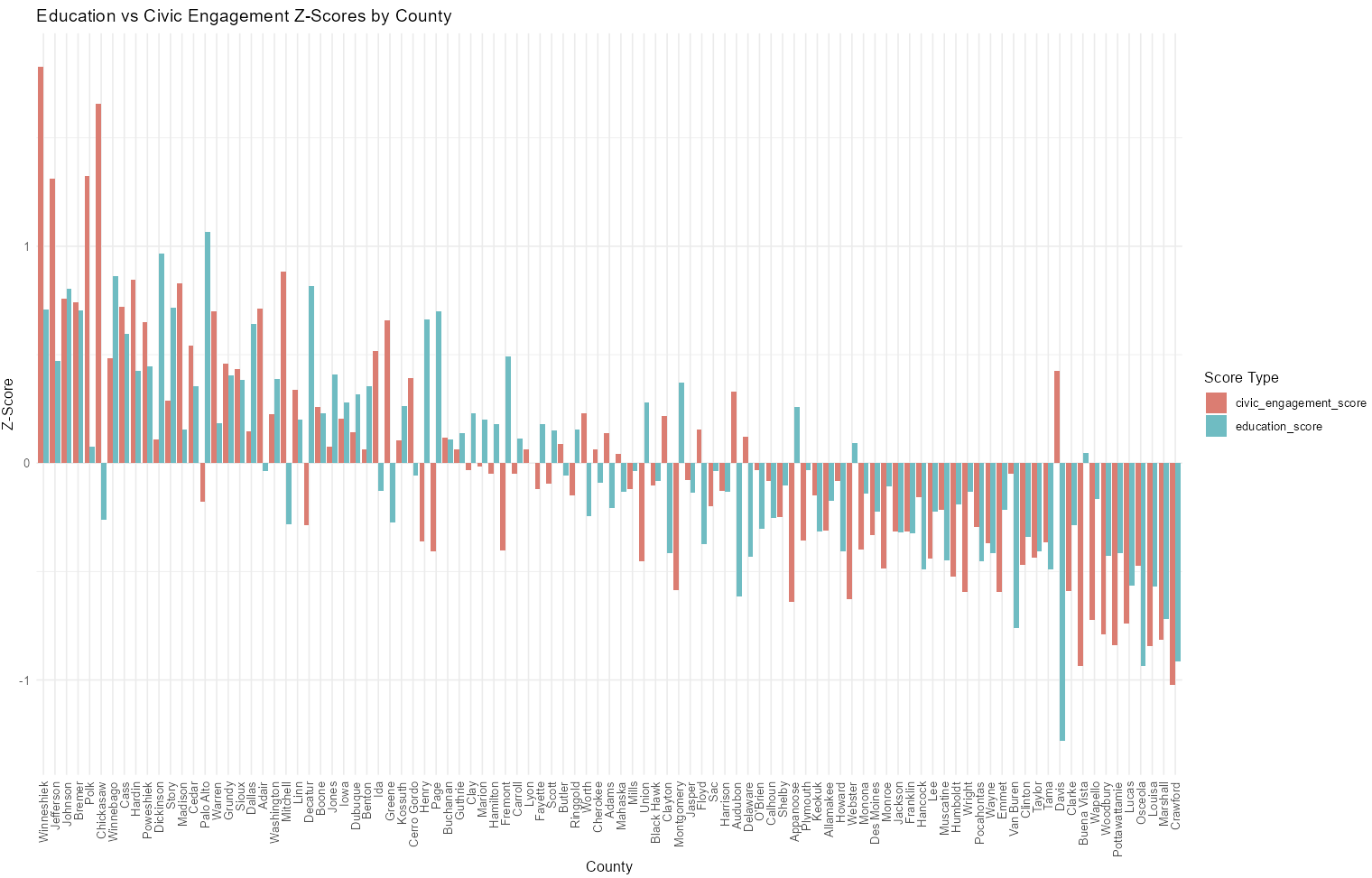
Analysis:
Many counties high in education and civic engagement
Many counties low in education and civic engagement
Many counties with high education but low civic engagement and vice versa
Question-2: Where do mismatches appear and what might explain them?
(i) Are there counties where education is high, but poverty or unemployment is also high?
Variables:
Human Capital: Education levels
Financial Capital: Poverty and Unemployment
Education vs. Poverty
What it shows: Each dot is an Iowa county. The x-axis shows % with a Bachelor’s degree or higher; the y-axis shows % in poverty.
Trend line: The purple line shows the general trend. The shaded area shows uncertainty.
Interpretation: Counties with more college-educated people tend to have slightly lower poverty rates. The link is weak, as the data is widely spread.
Education vs. Unemployment
There’s a very weak positive link, more education is slightly tied to higher unemployment, but the data is scattered, so the trend may not be meaningful and other factors may be influencing unemployment rates more than education levels alone.
Analysis of Human vs Financial Capital Across Counties
This chart compares Human Capital and Financial Capital for a selected county using standardized scores. These scores show how the county compares to the average across all counties in the dataset.
Human Capital is measured by standardized education levels.
Financial Capital is based on poverty and unemployment, but reversed because lower poverty and unemployment are better.
The scores are standardized (using scale()), meaning:
A score of 0 = average among all counties.
A negative score = below average.
A positive score = above average.
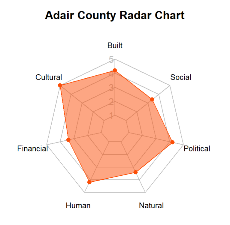
Example: Adair County
The Human Capital score is moderately negative, suggesting that education levels in Adair are below the state average.
The Financial Capital score is more strongly negative, meaning that poverty and unemployment in Adair are worse compared to other counties.
Top 10 Counties Excelling in Human and Financial Capital
These counties rank above average in overall human and financial capital, based on standardized indicators of education, poverty, and unemployment.
| County | Human Capital | Financial Capital | Overall Score |
|---|---|---|---|
| Dallas | 3.8078523 | 0.93 | 2.37 |
| Johnson | 4.1571418 | -1.16 | 1.50 |
| Dickinson | 1.2822207 | 1.23 | 1.25 |
| Sioux | 1.0941418 | 1.16 | 1.13 |
| Bremer | 1.4568655 | 0.70 | 1.08 |
| Marion | 1.1478786 | 0.91 | 1.03 |
| Warren | 1.2150497 | 0.77 | 0.99 |
| Boone | 0.4358655 | 1.35 | 0.90 |
| Winneshiek | 0.9866681 | 0.80 | 0.89 |
| Polk | 2.1151418 | -0.42 | 0.85 |
(ii) Do some counties have high incomes but low civic participation or education?
Variables:
Human Capital: Education levels
Financial Capital: Poverty and Unemployment
Social Capital: Volunteering Rate
Income vs. Volunteering Rate
The graph suggests a very slight positive relationship between income and volunteering as income increases, volunteering tends to increase a little. However, the dots are widely scattered, and the trend is quite weak. This indicates that income alone may not be a strong predictor of volunteering rates, and other factors, such as community engagement or local culture, may play a larger role.
Income vs. Education
This graph shows a strong positive relationship between income and education. As income increases, the percentage of residents with a college degree also tends to rise. The trend is much clearer and more consistent compared to other relationships, suggesting that higher income levels are closely associated with higher educational attainment across counties. This may reflect the role of wealth in expanding access to higher education or the economic advantages held by more educated populations.
Question-3: What can we learn from counties that stand out?
Are there rural or smaller counties that do surprisingly well across most areas?


Question-4: How does geography affect opportunities?
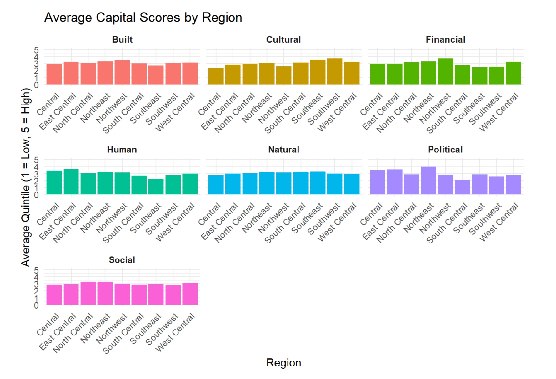
(i) How do the 9 regions of counties (Central, East Central, Northwest, South Central, Southeast, Southwest, West Central, North Central, Northeast) compare to each other?
The graphs below show all capitals defined by variables for each capital by region. We can conclude that when using average quintiles there are no large/ significant differences in capitals between regions of the State of Iowa.
(ii) How do Metro vs Non-Metro counties compare to each other?
The graph below shows differences in capitals between metro vs non-metro counties based on the rural urban continuum. There are 22 counties in Iowa classified as metro based on a (1-3) code and 77 counties in Iowa classified as non-metro based on a (4-9) code.
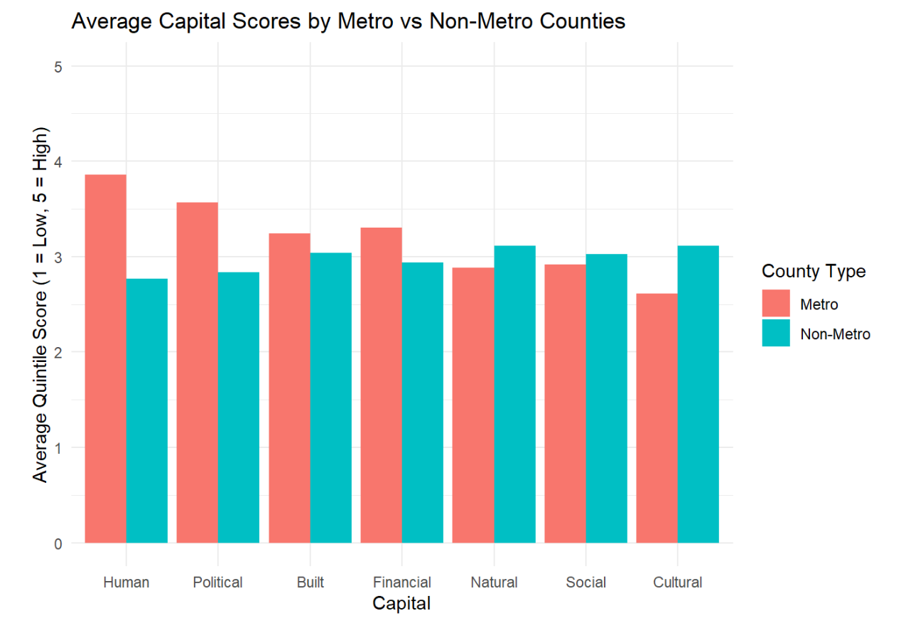
Analysis:
- Metro counties do better in Human, Political, Built, and Financial capitals
- Non-metro counties do better in Natural, Social, and Cultural capitals
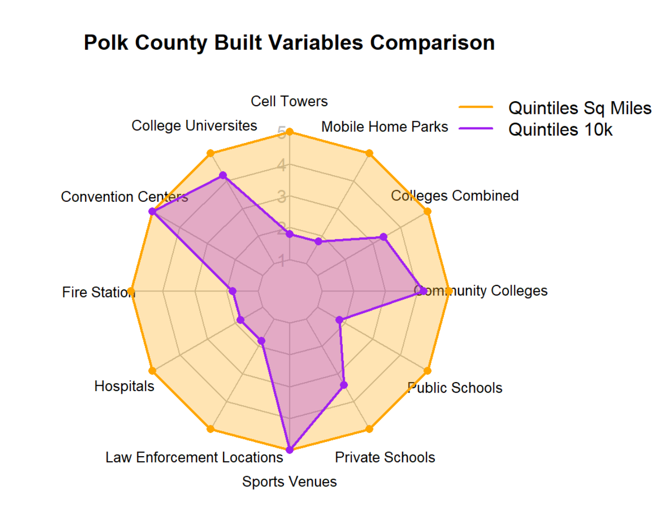
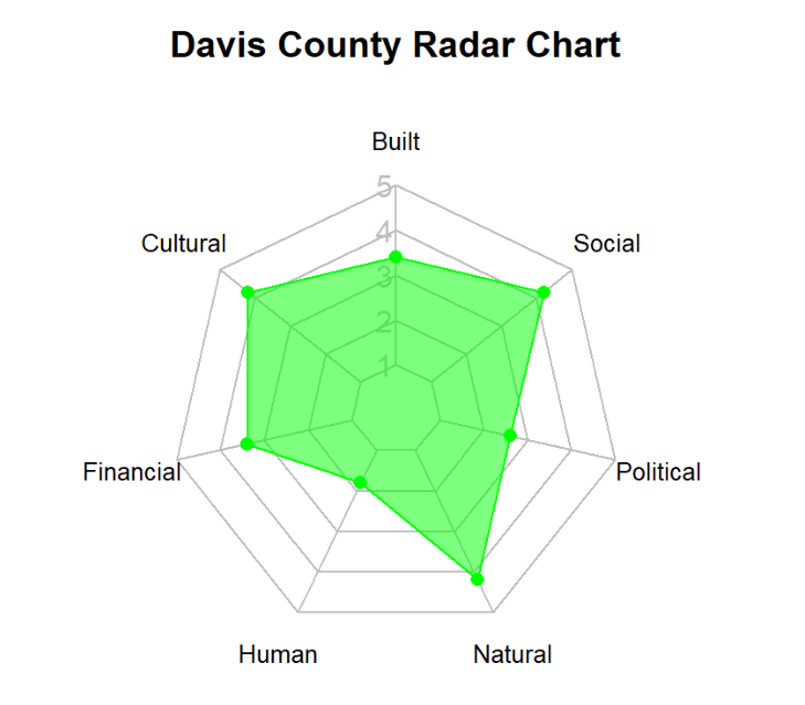
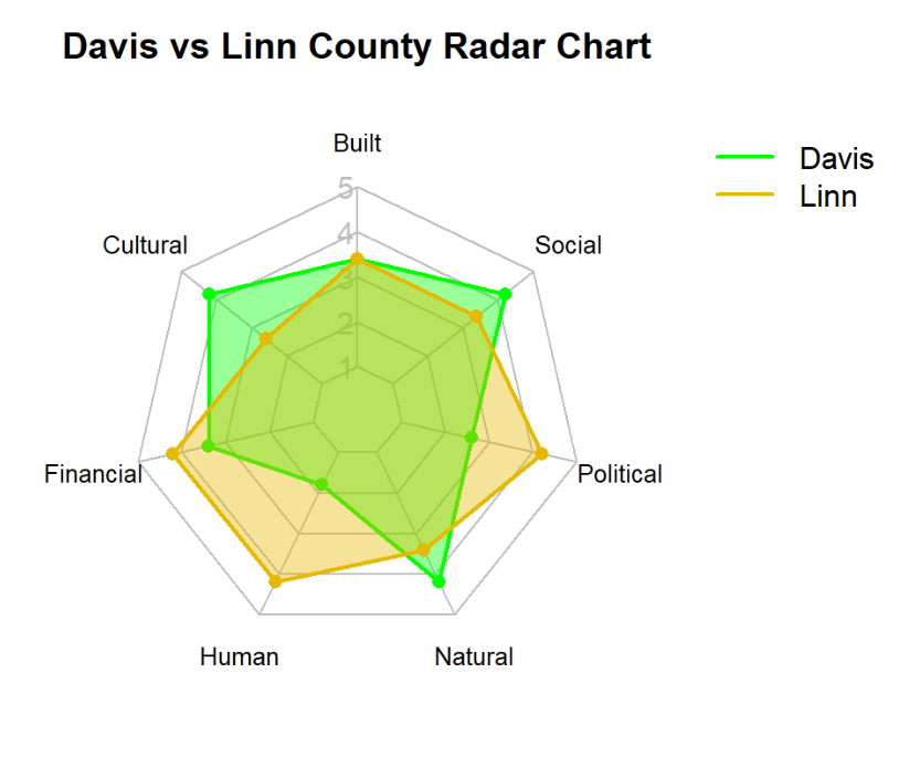
County Radar Charts by Capitals
I calculated average quintile values per capital in each county and am able to plot a radar chart for any county or multiple counties.
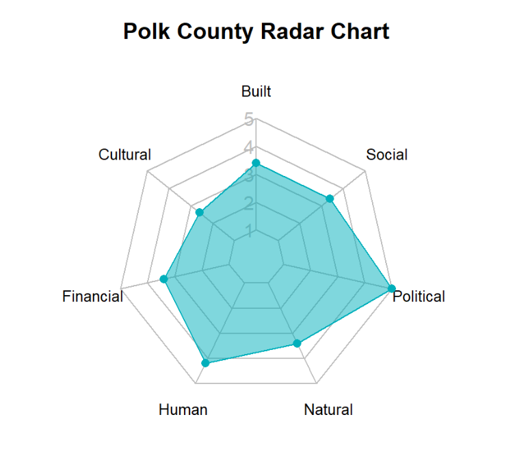
Radar Chart by Quintile Methods
The graph below shows Polk County built capital variables using two different methods of quintiles