Introduction:
This week, we explored how counties perform across five key dimensions of strength: Human, Economic, Civic, Infrastructure, and Stability. By breaking these areas into percentile based scores, we can better understand what makes a county strong and how improving even one area might shift overall progress. We also explored how counties perform across five key dimensions of inequality: Economic, Family & Social, Education & Access, Health, and Disaster & Infrastructure, as well as how these inequality domains compare to well being indicators. We also looked at the methodology and performed some cluster analysis.
If we fixed one measure, how would it affect the progress of a county?
What Makes a County Strong?
Counties succeed in different ways. Some offer great schools and health care. Others succeed through strong economies or close-knit communities.
We created five strength scores: Human, Economic, Civic, Infrastructure, and Stability to help explore how counties compare and where they might improve.
Individual Strength Charts To Compare County Levels
Human Strength Score
What it shows: This score reflects how well counties are doing in education, health, and basic personal well-being. It combines things like high school and college graduation rates, English skills, health insurance coverage, and physical health.
Why it matters: Strong human factors mean residents are more prepared to succeed in school, work, and community life.
Economic Strength Score
What it shows: This score measures the overall financial health of a county. It includes income levels, poverty and unemployment rates, GDP per person, and how many people are employed.
Why it matters: Higher scores mean stronger local economies and more job opportunities.
Civic Strength Score
What it shows: This score tracks how active and engaged people are in their communities. It looks at things like volunteering, participation in civic groups, and census response rates.
Why it matters: Civic strength reflects a sense of belonging, trust, and willingness to work together for the common good.
Infrastructure Strength Score
What it shows: This score covers the quality of basic physical and digital infrastructure, including broadband access, plumbing, housing age, commute times, and home values.
Why it matters: Better infrastructure supports healthy living, access to jobs, and future development.
Stability Strength Score
What it shows: This score measures family and social stability. It looks at housing occupancy, family structure (like single-parent rates), age balance, support networks, and racial diversity.
Why it matters: More stable communities tend to be safer, more resilient, and better able to support children and older adults.
County Specific Strength Score Chart
Why Population Might Influence Performance
Large Counties (e.g., Dallas, Johnson):
More infrastructure and economic diversity
Stronger in GDP, broadband, and education
Weaker in civic and stability due to population turnover
Smaller Counties (e.g., Sioux, Madison, Bremer):
Stronger community ties and civic engagement
Lower unemployment and better insurance coverage
Success often driven by close-knit, stable populations
Conclusion: Population size doesn’t define success but it shapes how counties are strong. Big counties lead in infrastructure; smaller ones shine in civic life and stability. These counties highlight what strong or struggling performance looks like.
Variable Comparison Chart
Each strength score (like Human or Economic) is made up of several variables. This chart helps you see which specific variables are helping or hurting a county’s overall strength.
After looking at the strength scores across counties, we wanted to dig deeper. Do things like broadband access or long commutes help explain why some counties score higher or lower?
If broadband access improves, will there be measurable gains in school violence, economic connectedness, or volunteering rates?
Broadband vs School Violence
Interpretation: The graph indicates a slight upward trend, suggesting a weak positive relationship between broadband access and school violence rate. The wide confidence interval especially at the lower and higher ends of broadband percentages shows significant variability and uncertainty in the estimate, likely due to outliers and fewer observations in those ranges.
Broadband vs Economic Connectedness
Interpretation: This graph suggests a positive relationship between broadband access and economic connectedness. Counties with more broadband access tend to be more economically connected. While there’s still some variation in the data, we can say that broadband access may help improve economic opportunities and networks in a community.
Broadband vs Volunteering
Interpretation: This graph shows a slight negative relationship between broadband access and volunteering. In simple terms, counties with higher broadband access tend to have slightly lower volunteering rates. However, the relationship is weak, and there is a lot of scatter in the data. This suggests that while there might be a small downward trend, other factors likely play a bigger role in whether people volunteer.
Could shorter commutes help people get more involved locally?
Long Commutes vs Volunteering
Interpretation: This graph shows a very slight positive relationship between long commutes and volunteering. However, the trend is weak, and there’s a lot of variation in the data. This suggests that commute time may not have a strong effect on whether people volunteer, and other factors likely matter more.
What role does inequality play in society?
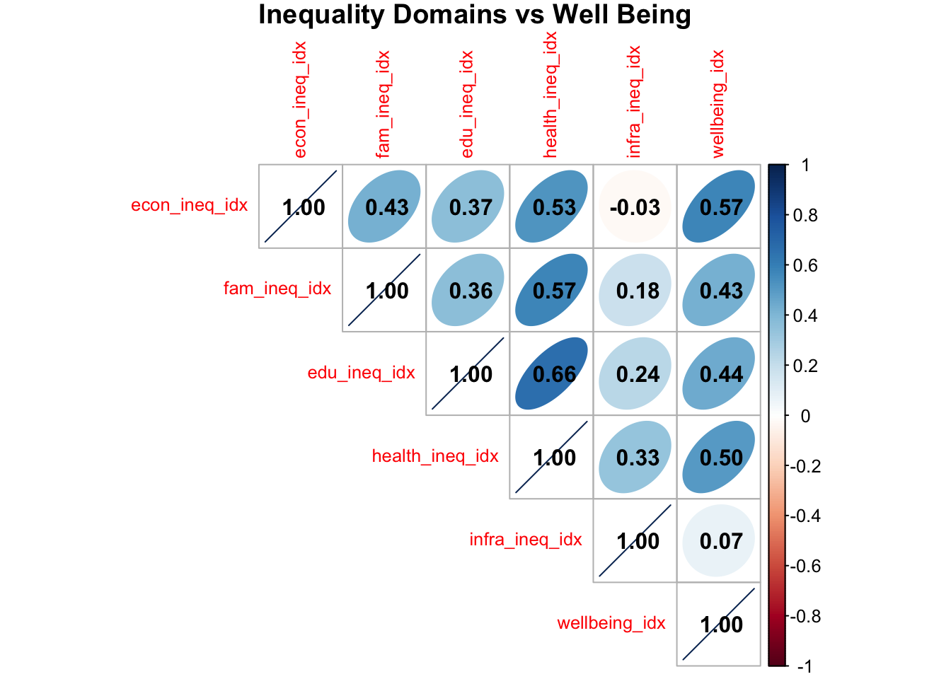
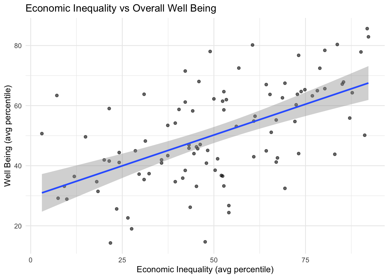
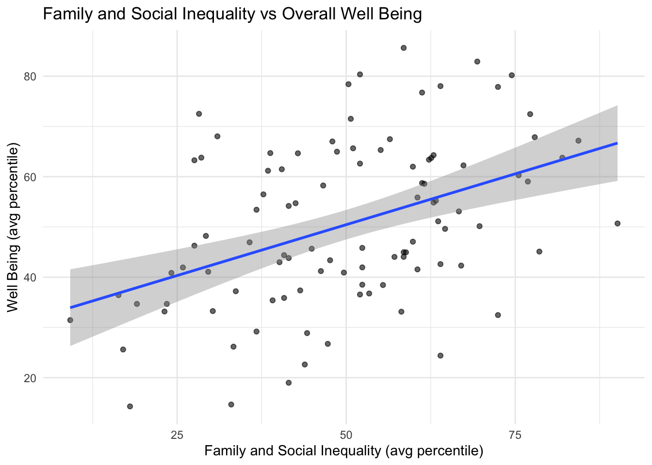
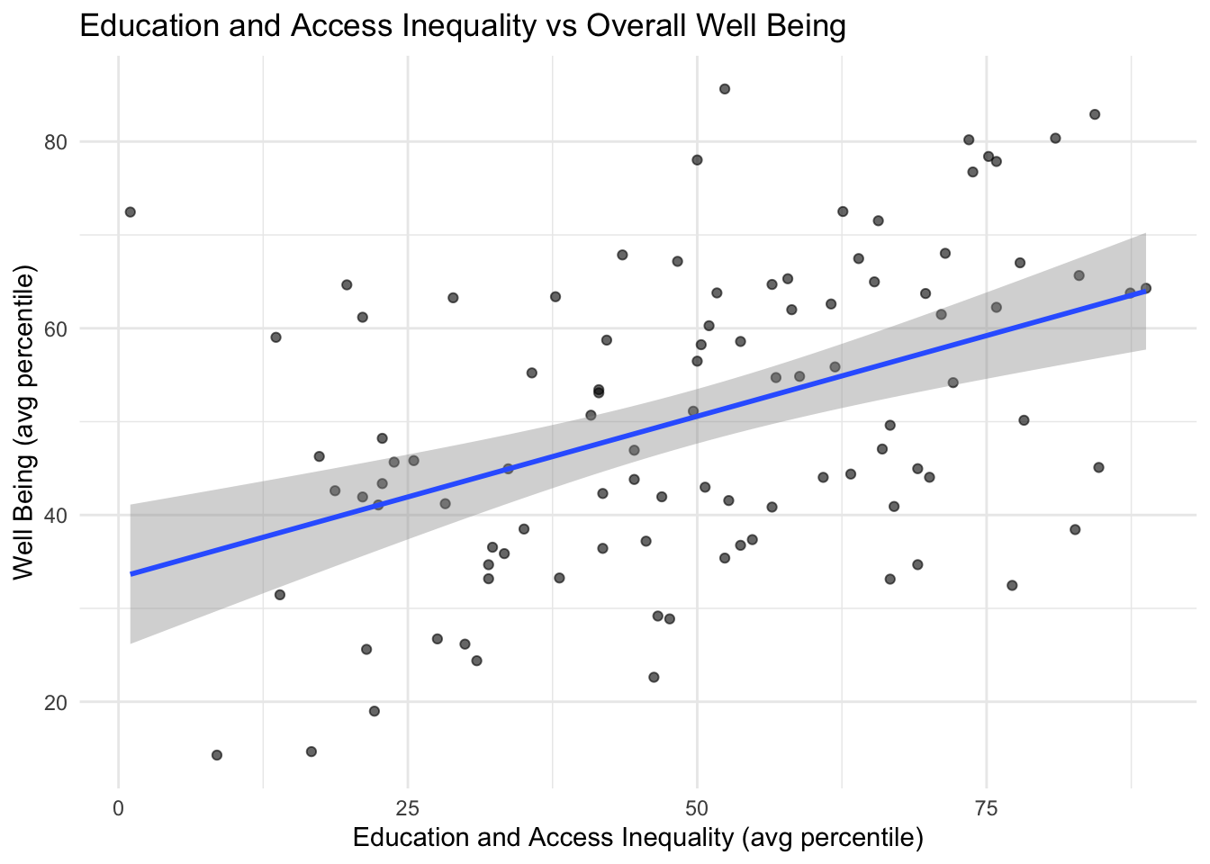
Inequality Domains vs Well Being Indicators
Inequality Domains
Economic Inequality: gini index of income inequality, poverty, unemployment
Family and Social Inequality: single parents, long commutes, civic organizations
Education and Access Inequality: high school, english proficiency, broadband rates
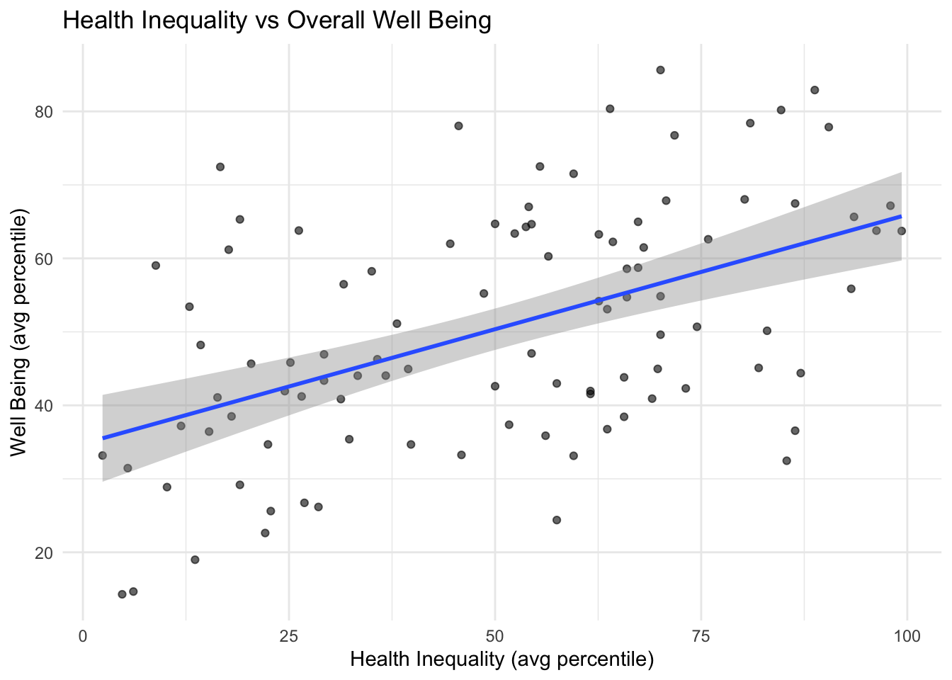
Health Inequality: poor health, poor mental health, poor physical health
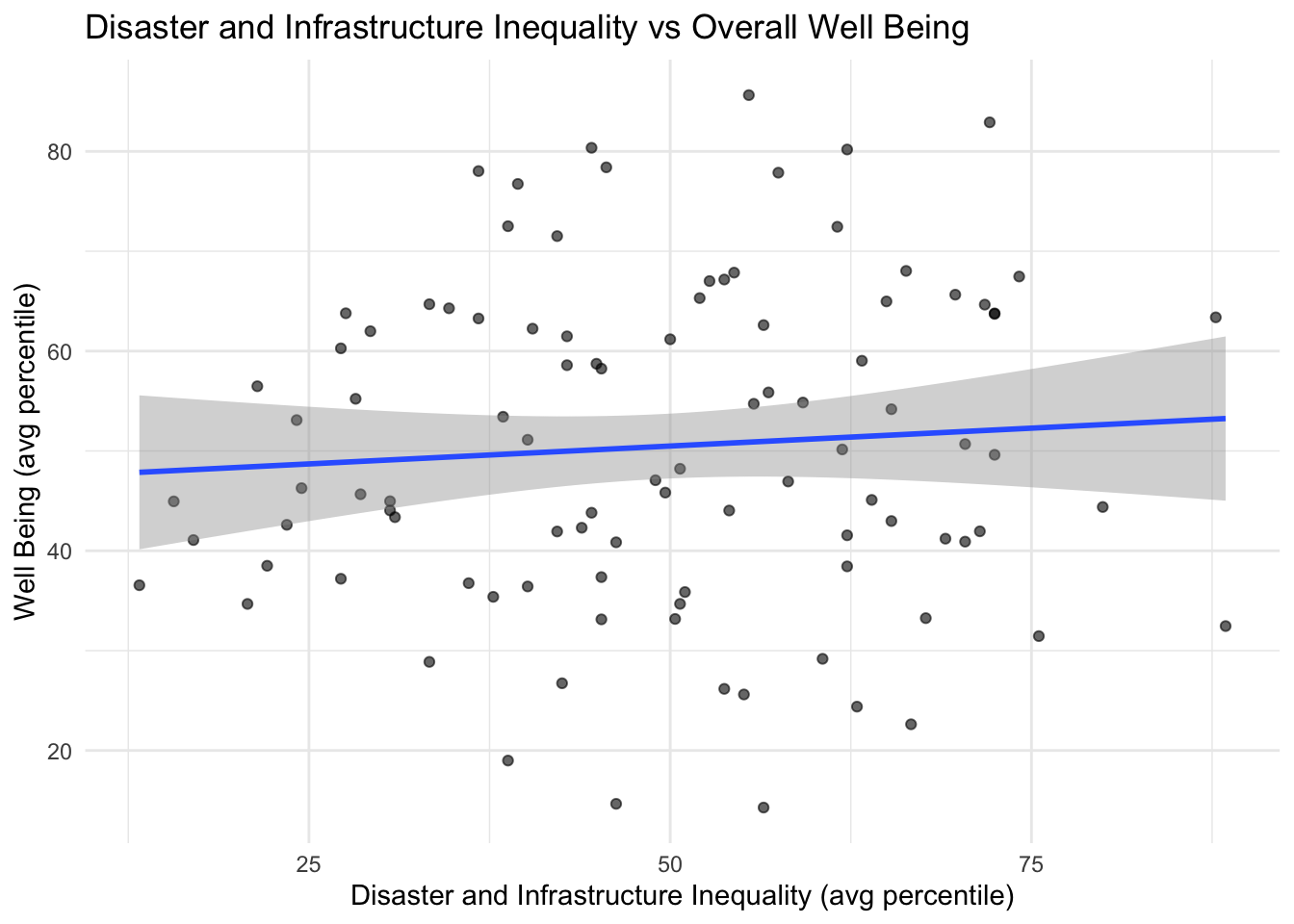
Disaster and Infrastructure Inequality: median built year, plumbing, annual tornado events
Well Being Indicators
- volunteering rate, voter turnouts, census response rates, rates of school violence, violent crime per 10k, all crime per 10k
Correlation Matrix
The matrix below shows each inequality domain’s correlation coefficient when compared to another inequality domain or against well being indicators. The more blue the color, the higher the positive correlation. The more red the color the higher the negative correlation. If the color is ligter or white, there is less to no relationship between the two.
Scatterplots
The scatterplots below show each inequality domain vs well being indicators with each dot representing a county. These scatterplots visualize the trends of counties represented in the correlation matrix above.
Top and Bottom 10 Counties of Overall Inequality
The table below presents the top and bottom 10 counties based on overall inequality scores. In this context, a higher score indicates lower levels of inequality, while a lower score reflects higher levels of inequality. These rankings help highlight counties that may require targeted improvement across one or more inequality domains, as well as counties demonstrating minimal inequality that can serve as models for others.
| Top 10 County | Inequality ↑ | Bottom 10 County | Inequality ↓ |
|---|---|---|---|
| Bremer | 82.2 | Tama | 21.9 |
| Madison | 81.4 | Wapello | 21.9 |
| Dickinson | 78.6 | Appanoose | 23.4 |
| Grundy | 77.3 | Clarke | 24.5 |
| Lyon | 76.8 | Montgomery | 25.1 |
| Warren | 75.5 | Crawford | 26.7 |
| Dallas | 73.9 | Lucas | 28.0 |
| Sioux | 73.9 | Woodbury | 28.7 |
| Plymouth | 71.9 | Page | 29.0 |
| Mills | 71.5 | Clinton | 29.6 |
Top and Bottom 10 Counties of Well Being
The table below displays the top and bottom 10 counties based on overall well-being scores. A higher score reflects greater well-being, while a lower score indicates lower levels of well-being. These rankings help identify counties with exceptionally high or low levels of civic engagement and crime, highlighting both areas of concern and examples of community strength.
| Top 10 County | Well-Being Index | Bottom 10 County | Well-Being Index |
|---|---|---|---|
| Chickasaw | 85.6 | Wapello | 14.3 |
| Madison | 82.9 | Marshall | 14.7 |
| Benton | 80.4 | Woodbury | 19.0 |
| Winneshiek | 80.2 | Des Moines | 22.6 |
| Cedar | 78.4 | Buena Vista | 24.4 |
| Butler | 78.0 | Lucas | 25.6 |
| Grundy | 77.9 | Pottawattamie | 26.2 |
| Worth | 76.7 | Emmet | 26.7 |
| Ida | 72.5 | Page | 28.9 |
| Davis | 72.4 | Black Hawk | 29.2 |
Analysis
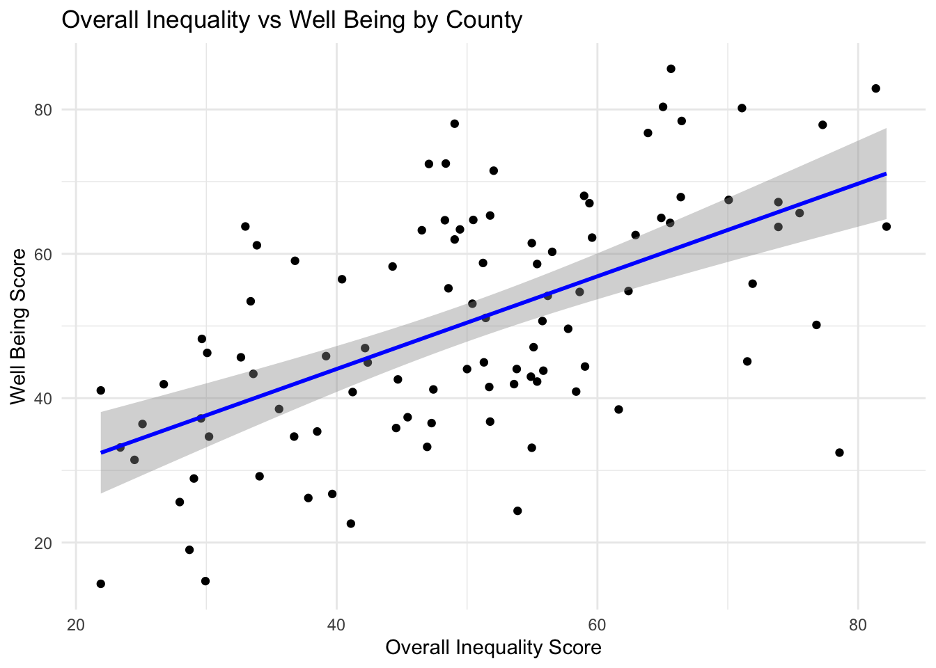
As economic, family & social, education & access, health, and overall inequality grows better in score, well being also rises.
There seems to be no correlation between disaster and infrastructure inequality and well being.
The most correlated inequality domain with well being is health, the most correlated inequality domains with each other is education and health.
Bremer has the least overall inequality, Tama has the most overall inequality
Grundy exists in the top 10 of inequality as well as well being. Wapello, Lucas, Woodbury, and Page exist in the bottom 10 of inequality as well as bottom 10 of well being.
Interactive Bar Charts
Can We Group Counties by Their Overall Patterns?
If counties have similar patterns, we can group them and give them better-targeted support. For example, a county with strong infrastructure but weak civic life might need leadership or youth programs, not more housing.
Methodology
Data Collection & Cleaning:
We combined a variety of county-level datasets covering socioeconomic, environmental, and infrastructure information. Variables with excessive missing values were dropped to maintain data quality.Variable Selection & Scaling:
We picked indicators from four areas:
Financial Capital (income, jobs)
Natural Capital (farmland, environment)
Built Capital (housing, internet)
Human Capital (education, health)
\[ z = \frac{x - \mu}{\sigma} \]
where (x) is the original value, () is the mean, and () is the standard deviation.
- Measuring Similarity Using Euclidean Distance:
We used Euclidean distance to calculate how similar counties are based on all variables,This helps us group counties with similar patterns of strength or weakness.
\[ d(\mathbf{x}, \mathbf{y}) = \sqrt{\sum_{i=1}^n (x_i - y_i)^2} \]
where () and () are county vectors across all variables.
Clustering:
We applied hierarchical clustering using Ward’s method to counties that had complete data. This method puts counties into groups (or “clusters”) based on their overall similarity. 11 distinct clusters of similar counties.Assigning Counties with Missing Data:
Counties missing data were assigned to clusters by matching available variables to the closest cluster centroid.Missing Data Imputation:
Some counties were missing a few values. We handled this in two steps:
First, we matched them to the closest cluster using the data they did have.
Then, we filled in missing values using the average value from that cluster:
\[ x_{ij}^{\text{imputed}} = \bar{x}_{.j}^{(c)} \]
where (x_{ij}^{}) is the imputed value for county (i), variable (j), and ({x}_{.j}^{(c)}) is the cluster (c) mean for variable (j).
Final Clustering:
After imputation and re-standardization, clustering was rerun to finalize groups.Model Building:
For clusters with enough counties, we built linear Regression model to see what factors explain the differences in financial, natural, built, and human capital.
We used:
R² to check how much the model explains.
Adjusted R² to see if the model is actually reliable.
If Adjusted R² was high, the model worked well. If it was low or negative, the model didn’t explain much.
Terminology
R-squared (R²):
This tells us how well the model works. It shows how much of the change in a result (like income or housing) is explained by the model. A score closer to 1 means the model is strong. Example: R² = 0.70 means the model explains 70% of the differences.Limitation of R²:
R² always goes up when you add more variables, even if they don’t help. That can make the model look better than it really is.Adjusted R-squared:
It gives a lower score if the model has too many useless variables. It tells you more honestly how well the model really works. If it’s low or negative, the model doesn’t explain much.
\[ \text{Adjusted } R^2 = 1 - \left( \frac{(1 - R^2)(n - 1)}{n - p - 1} \right) \]
where:
- (n) = number of observations
- (p) = number of predictors
Adjusted R² can decrease if added variables don’t improve the model enough.
Adjusted R-squared Summary by Cluster (Using Imputed Data)
| Cluster | Financial Adj. R² | Natural Adj. R² | Built Adj. R² | Human Adj. R² |
|---|---|---|---|---|
| 1 | 0.428 | 0.449 | 0.673 | 0.490 |
| 2 | -0.024 | 0.585 | -0.178 | -0.013 |
| 3 | 0.932 | 0.884 | 0.398 | 0.592 |
| 4 | 0.640 | 0.352 | 0.537 | 0.490 |
| 5 | NA | NA | NA | NA |
| 6 | NaN | NaN | NaN | NaN |
| 7 | 0.247 | 0.459 | 0.674 | 0.344 |
| 8 | NA | NA | NA | NA |
| 9 | NA | NA | NA | NA |
| 10 | NA | NA | NA | NA |
| 11 | NA | NA | NA | NA |
Model Performance Summary
| Cluster | Number of Counties | Financial R² | Natural R² | Built R² | Human R² | Notes |
|---|---|---|---|---|---|---|
| 1 | 18 | 0.630 | 0.643 | 0.789 | 0.610 | Full models |
| 2 | 15 | 0.415 | 0.733 | 0.327 | 0.276 | Full models |
| 3 | 9 | 0.983 | 0.971 | 0.850 | 0.796 | Full models |
| 4 | 15 | 0.794 | 0.629 | 0.736 | 0.636 | Full models |
| 5 | 4 | NA | NA | NA | NA | Descriptive stats only |
| 6 | 5 | 1.000 | 1.000 | 1.000 | 1.000 | Sample model; likely overfitting |
| 7 | 21 | 0.473 | 0.621 | 0.772 | 0.475 | Full models |
| 8 | 2 | NA | NA | NA | NA | Descriptive stats only |
| 9 | 4 | NA | NA | NA | NA | Descriptive stats only |
| 10 | 3 | NA | NA | NA | NA | Descriptive stats only |
| 11 | 3 | NA | NA | NA | NA | Descriptive stats only |
Detailed Cluster Analyses
Cluster 1 (18 counties)
Counties: Adair, Audubon, Butler, Carroll, Fayette, Fremont, Greene, Guthrie, Hardin, Harrison, Jasper, Keokuk, Mahaska, Mills, Monona, Poweshiek, Shelby, Tama
Financial Capital Model (Gini Income)
- R² = 0.63 (Adjusted R² = 0.43)
- Significant predictors:
pct_labor_force_20_64: negative effect
pct_gdp_finance_insure: positive effect
Natural Capital Model (Employment Rate)
- R² = 0.643 (Adjusted R² = 0.45)
- Significant predictors:
prop_crop: positive effect
value_per_acre: negative effect
pct_gdp_ag_for_fish_hunt: borderline positive effect
Built Capital Model (Housing Value)
- R² = 0.789 (Adjusted R² = 0.67)
- Significant predictor:
prop_old: negative effect
Human Capital Model (Bachelor’s Degree %)
- R² = 0.61 (Adjusted R² = 0.49)
- Significant predictor:
poor_health: negative effect
Cluster 2 (15 counties)
Counties: Adams, Appanoose, Cass, Clarke, Davis, Decatur, Lucas, Monroe, Montgomery, Page, Ringgold, Taylor, Union, Van Buren, Wayne
Financial Capital Model
- R² = 0.415 (Adjusted R² = -0.02)
- No significant predictors found
Natural Capital Model
- R² = 0.733 (Adjusted R² = 0.59)
- Significant predictor:
pct_gdp_ag_for_fish_hunt: positive effect
Built Capital Model
- R² = 0.327 (Adjusted R² = -0.18)
- No significant predictors found
Human Capital Model
- R² = 0.276 (Adjusted R² = -0.01)
- No significant predictors found
Cluster 3 (9 counties)
Counties: Allamakee, Clayton, Dubuque, Henry, Jackson, Jefferson, Louisa, Marion, Muscatine
Financial Capital Model
- R² = 0.983 (Adjusted R² = 0.93)
- Significant positive effect:
pct_gdp_finance_insure
Natural Capital Model
- R² = 0.971 (Adjusted R² = 0.88)
- No significant predictors found
Built Capital Model
- R² = 0.85 (Adjusted R² = 0.40)
- No significant predictors found
Human Capital Model
- R² = 0.796 (Adjusted R² = 0.59)
- Borderline negative effect:
dep_ratio_child
Cluster 4 (15 counties)
Counties: Benton, Boone, Bremer, Buchanan, Cedar, Cerro Gordo, Delaware, Grundy, Hamilton, Iowa, Jones, Madison, Warren, Washington, Winneshiek
Financial Capital Model
- R² = 0.794 (Adjusted R² = 0.64)
- Significant positive effect:
pct_gdp_manufacturing
- Borderline negative effect:
med_hh_income
Natural Capital Model
- R² = 0.629 (Adjusted R² = 0.35)
- Significant positive effect:
pct_gdp_ag_for_fish_hunt
Built Capital Model
- R² = 0.736 (Adjusted R² = 0.54)
- No significant predictors found
Human Capital Model
- R² = 0.636 (Adjusted R² = 0.49)
- Significant negative effect:
poor_health
Cluster 5 (4 counties) — Descriptive Statistics Only
Counties: Black Hawk, Linn, Polk, Scott
- Gini Income: 0.451
- Proportion Employed: 0.011
- Median Household Value: $197,825
- % Bachelor’s Degree: 34.6
Cluster 6 (5 counties)
Counties: Buena Vista, Crawford, Marshall, Pottawattamie, Woodbury
- Models show perfect fit (R² = 1.0) — small sample likely causes overfitting.
Cluster 7 (21 counties)
Counties: Calhoun, Cherokee, Chickasaw, Emmet, Floyd, Franklin, Hancock, Howard, Humboldt, Ida, Kossuth, Mitchell, O’Brien, Osceola, Palo Alto, Pocahontas, Sac, Webster, Winnebago, Worth, Wright
Financial Capital Model
- R² = 0.473 (Adjusted R² = 0.25)
- No significant predictors found
Natural Capital Model
- R² = 0.621 (Adjusted R² = 0.46)
- No significant predictors found
Built Capital Model
- R² = 0.772 (Adjusted R² = 0.67)
- Significant predictors:
prop_old: negative effect
percent_occupied: positive effect
Human Capital Model
- R² = 0.475 (Adjusted R² = 0.34)
- Significant positive effect:
pct_high_school
Clusters 8 to 11 — Descriptive Statistics Only (small clusters)
| Cluster | Counties | Gini Income | Prop. Employed | Median HH Value | % Bachelor’s Degree |
|---|---|---|---|---|---|
| 8 | Clay, Dickinson | 0.432 | 0.043 | 193,750 | 29.35 |
| 9 | Clinton, Des Moines, Lee, Wapello | 0.446 | 0.029 | 126,750 | 20.93 |
| 10 | Dallas, Johnson, Story | 0.469 | 0.019 | 273,933 | 52.7 |
| 11 | Lyon, Plymouth, Sioux | 0.401 | 0.089 | 203,767 | 24.93 |
Limitations
Sample Size Constraints:
Small clusters limit reliable model building and generalizability.Missing Data Imputation:
Using cluster averages for missing data assumes within-cluster similarity, which may oversimplify true variation.Variable Selection:
Only selected capital-related variables were used; other relevant factors might be missing.Potential Overfitting:
Very small clusters showed perfect fits, likely overfitting, requiring cautious interpretation.
Key Takeaways
High broadband access often helps with economic opportunities but may not boost community volunteering.
Shorter commutes don’t guarantee more civic involvement.
Small counties mostly succeed in civic life, while large ones lead in infrastructure.
Generally, as inequality decreases, well-being increases.
Small clusters (5 counties or fewer) have limited modeling due to sample size constraints.
Cluster 6 shows perfect fits due to very small size and possible overfitting.
Key predictors of financial capital include poverty, income, and finance sector presence.
Natural capital correlates with agricultural land use and environmental risk factors.
Built capital is influenced by housing age and occupancy rates.
Human capital reflects education attainment and health status.
Next Steps
Look at variables influencing the strength scores and find out if improving them will increase/ decrease the composite scores.
Use feedback to switch out some of the variables used in inequality domains for a better representation.
Consider log-linear models to handle heteroscedasticity typical in income and GDP variables.
Explore Gamma generalized linear models for modeling right-skewed positive financial data.
Use generalized least squares (GLS) to model non-constant variance explicitly.
Employ Huber-White robust standard errors for reliable inference under heteroscedasticity.