Introduction
This blog looks at how Iowa counties are doing across seven Community Capitals:
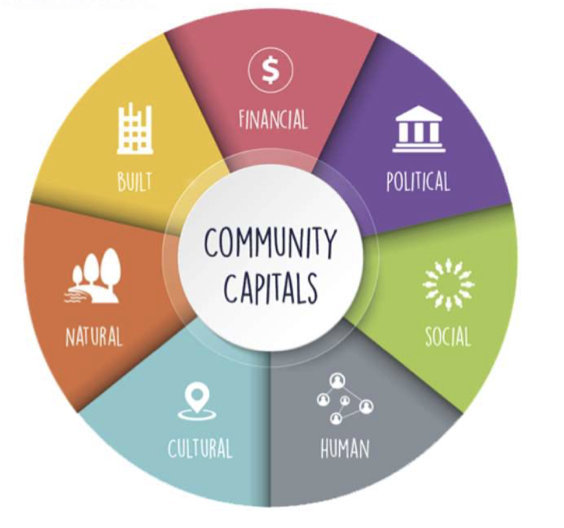
Image Source: Kansas State Extension, 2023
We use data from the American Community Survey (ACS), the State Library of Iowa, and the U.S. Religion Census to explore questions like:
- Do strong counties do well in one area or many?
- Where are the mismatches—like good infrastructure but weak culture?
- What can we learn from counties that stand out or fall behind?
We look for patterns, surprises, and lessons using both data and local knowledge.
As Scott Thompson said, “Social capital doesn’t just come from meetings. It shows up in potlucks, cleanup crews, and people who still wave from tractors.” (Daily Yonder, 2020)
Project Goals
- See which counties and cities are doing well in areas like education, income, housing, and civic life
- Find places where things don’t match up like high income but low civic engagement, or good housing but low education
- Spot patterns and outliers that help explain why some places succeed and others struggle
- Group similar cities and counties into types or tiers to compare them more easily
- Show how local efforts like broadband or housing programs can make a difference
- Explore how location, size, or local economy affect a community’s opportunities
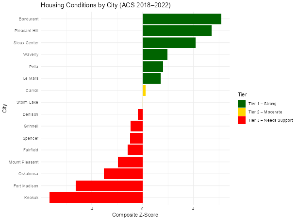
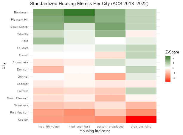
Housing Changes in Small Iowa Cities
We looked at cities with 8,000 to 12,000 people to see how local efforts may be shaping housing quality.
Tier 1 – Strong Cities
Cities: Bondurant, Pleasant Hill, Sioux Center, Waverly, Pella, Le Mars
What Worked and Why:
- These cities planned ahead expanding roads, sewers, and broadband before growth took off.
- They supported builders with zoning reforms and tax incentives. Strong design rules and housing rehab programs helped maintain housing quality.
Population: Most Tier 1 cities are growing, especially Bondurant, Sioux Center, and Pleasant Hill.
Tier 2 – Moderate Cities
Cities: Carroll, Storm Lake, Denison
What Worked and Why:
- Used grants and partnerships to repair older homes.
- Encouraged infill housing and broadband improvements.
- Many efforts started after 2018, so impacts are still developing.
Population: All three saw modest growth, but at a slower pace than Tier 1.
Tier 3 – Cities That Need Support
Cities: Grinnell, Spencer, Fairfield, Mount Pleasant, Oskaloosa, Fort Madison, Keokuk
What Worked and Why:
- Some sewer and broadband upgrades were made.
- Small-scale housing rehab was tried, often with federal or state help.
- Why It Wasn’t Enough:
- Most projects were small or limited to certain areas.
- New housing was minimal, and old homes still dominate.
Population: Most Tier 3 cities saw flat or declining populations.
Land Use and Civic Participation
Cropland vs. Volunteering
Interpretation: This plot shows a slight negative relationship between cropland proportion and volunteering rate. As cropland increases, volunteering tends to decrease modestly. However, the points are still fairly spread out.
Forest Reserve vs. Volunteering
Interpretation: This plot shows a slight positive relationship between the proportion of forest reserve and volunteering rate. Counties with more forest reserve land tend to have somewhat higher volunteering, though the association is still weak and uncertain.
Flora & Flora (2008) state that natural capital provides more than ecological services; it enhances place of attachment and stewardship, which are foundations for civic life.
Natural Disasters and Civic Engagement
Interpretation: This plot reveals a moderate negative relationship between tornado frequency and volunteering rates. As tornado events increase, volunteering appears to decline slightly. This could suggest that areas more frequently impacted by tornadoes may face barriers to sustained civic engagement, potentially due to recurring disruptions or resource strain.
Emery & Flora (2006) explicitly introduce the idea that crisis can lead to community growth through spiraling up in capitals. After events like floods, communities often develop stronger civic coordination and cultural expression
Income, Education and Unemployment
Income vs. Education
Interpretation: This graph shows a strong positive relationship between income and education. As income increases, the percentage of residents with a college degree also tends to rise, suggesting that higher income levels are closely associated with higher education across counties.
Education vs. Unemployment
Interpretation: Surprisingly, this graph shows a very small positive relationship as education goes up, unemployment also goes up a little. However, the dots are very scattered, and the trend is very weak. This means other factors may be influencing unemployment rates more than education levels alone.
Built Capital by County
Variables used: Convention Centers, Fire and Emergency Stations, Hospitals, Local Law Enforcement Locations, Sports Venues, Private Schools, Public Schools, Community Colleges, Colleges and Universities, Mobile Home Parks, Cellular Towers
Top and Bottom Counties by Built Capital
The following counties rank in the top 10 for Built Capital, scoring above the 50th percentile (median of all counties) based on infrastructure density (per square mile).
| County | Built Capital Percentile |
|---|---|
| Polk | 99.8 |
| Story | 88.7 |
| Black Hawk | 87.8 |
| Johnson | 86.6 |
| Linn | 85.4 |
| Dubuque | 85.1 |
| Scott | 81.7 |
| Wapello | 75.5 |
| Woodbury | 72.1 |
| Dickinson | 64.0 |
The following counties rank in the bottom 10 for Built Capital, scoring below the 50th percentile (median of all counties) based on infrastructure density (per square mile)
| County | Built Capital Percentile |
|---|---|
| Adams | 7.3 |
| Ringgold | 7.4 |
| Audubon | 9.8 |
| Davis | 10.5 |
| Keokuk | 10.5 |
| Taylor | 10.6 |
| Ida | 11.2 |
| Adair | 12.0 |
| Wayne | 12.2 |
| Lucas | 12.4 |
The following counties rank in the top 10 for Built Capital, scoring above the 50th percentile (median of all counties) based on on population density (per 10k people)
| County | Built Capital Percentile |
|---|---|
| Palo Alto | 63.6 |
| Decatur | 62.2 |
| Dickinson | 57.8 |
| Emmet | 54.6 |
| Page | 53.5 |
| Winnebago | 49.6 |
| Hamilton | 49.5 |
| Ringgold | 48.0 |
| Pocahontas | 47.9 |
| Cass | 47.6 |
The following counties rank in the bottom 10 for Built Capital, scoring below the 50th percentile (median of all counties) based on population density (per 10k people)
| County | Built Capital Percentile |
|---|---|
| Dallas | 16.0 |
| Marshall | 16.0 |
| Warren | 18.4 |
| Muscatine | 18.9 |
| Des Moines | 19.1 |
| Mahaska | 19.8 |
| Tama | 21.7 |
| Clinton | 22.3 |
| Pottawattamie | 23.5 |
| Cerro Gordo | 23.8 |
Geographical Impacts on Capitals
Rural Urban Continuum
The graph below on the left shows differences in capitals between Urban and Rural counties based on the rural urban continuum. There are 22 counties classified as Urban based on a (1-3) code and 77 counties classified as Rural based on a (4-9) code. The graph below on the right shows differences in capitals between Metropolitan, Micropolitan, and Non-Metropolitan counties based on a different slicing of the rural urban continuum. There are 22 Metropolitan counties (1-3) code, 16 Micropolitan (4-7) code, and 61 Non-Metropolitan (8-9) code.
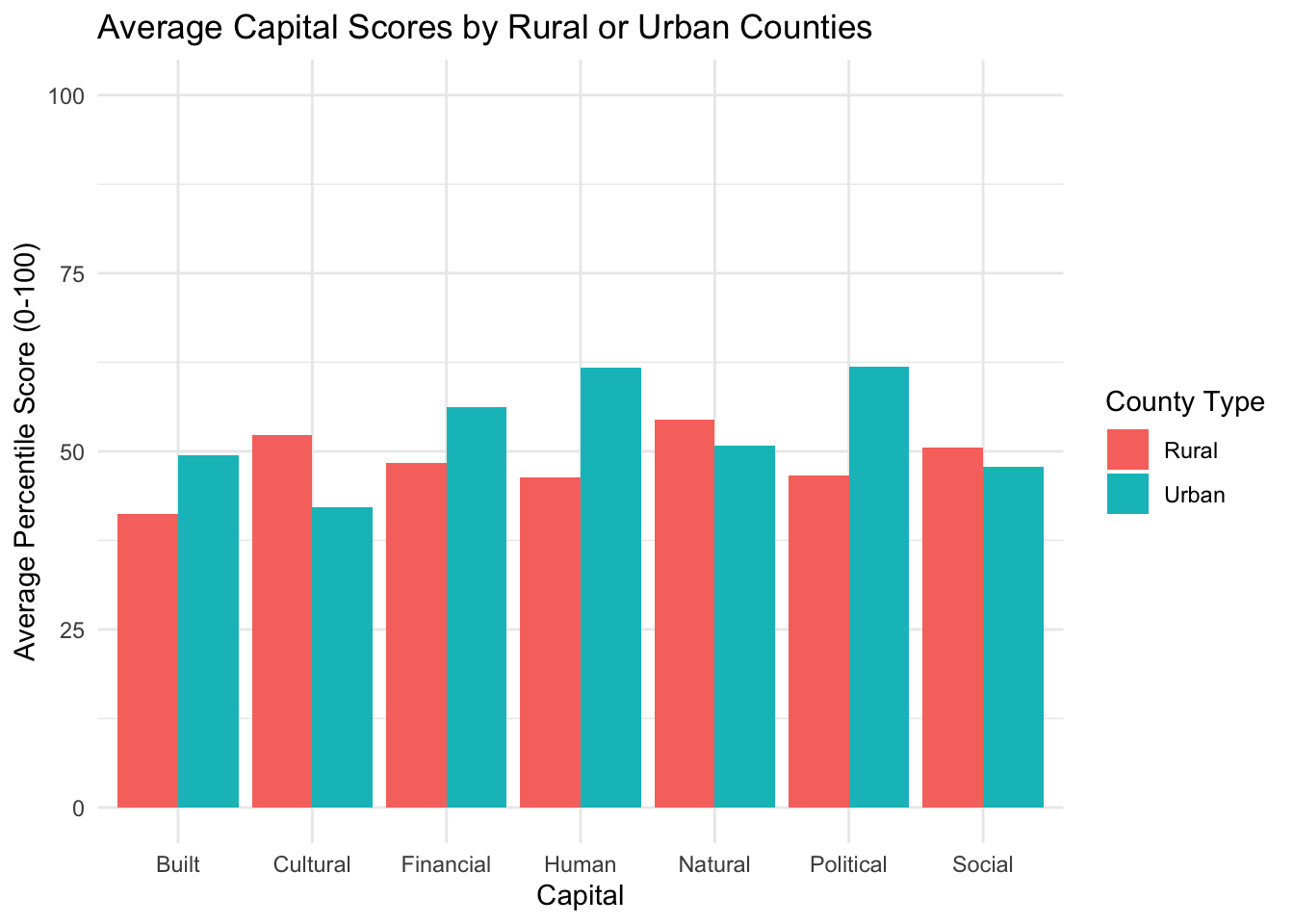
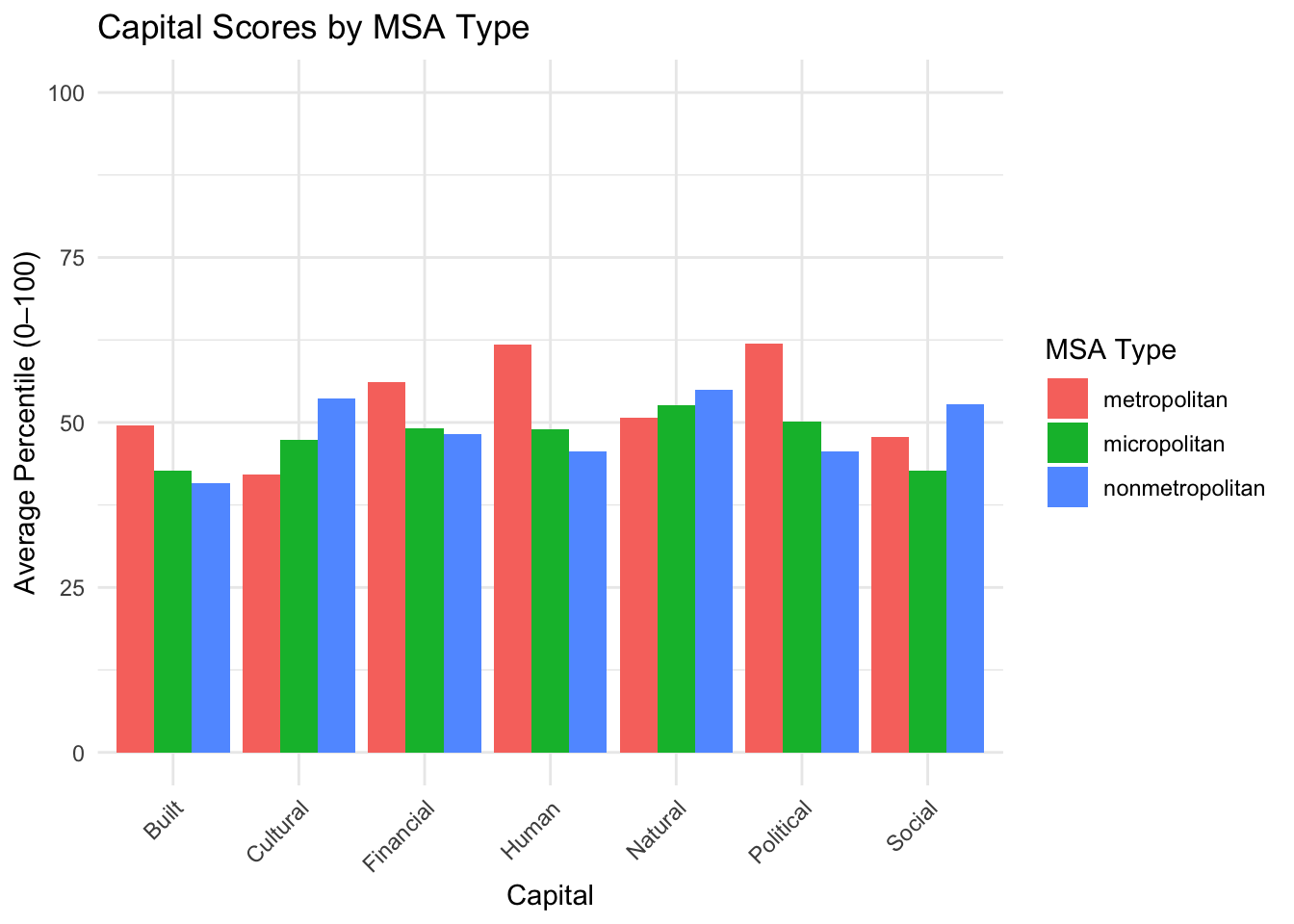
Interpretation: Urban counties do better in Built, Financial, Human, and Political capitals. Rural counties do better in Cultural, Natural, and Social capitals. Metropolitan counties do the best in the same capitals as Urban counties. Non-metropolitan counties do the best in the same capitals as Rural. Micropolitan does not do the best in any capital, but places in the middle for all capitals except Social where they place last. Although the differences between the overall capital scores between counties using the rural urban continuum are not huge, many specific variables within each capital face large differences between classifications.
Urban/ Metropolitan strengths:
Household Incomes, Property Values
Bachelor and Highschool Degrees/ Diplomas
Insurance and Broadband Rates
Rural/ Nonmetropolitan strengths:
Cancer Risk, Particulate Matter, Respitory Hazards
Rates of School Violence
Support Ratio
Economic Dependence
The graph below shows all capitals by ERS Typology, which gives each county a category of economic dependence. Iowa counties fit into the following categories: Farm-Dependent, Federal/ State Government-Dependent, Manufacturing-Dependent, Non-Specialized, Recreation-Dependent. The second graph shows how far a capital score is from the median of all counties.
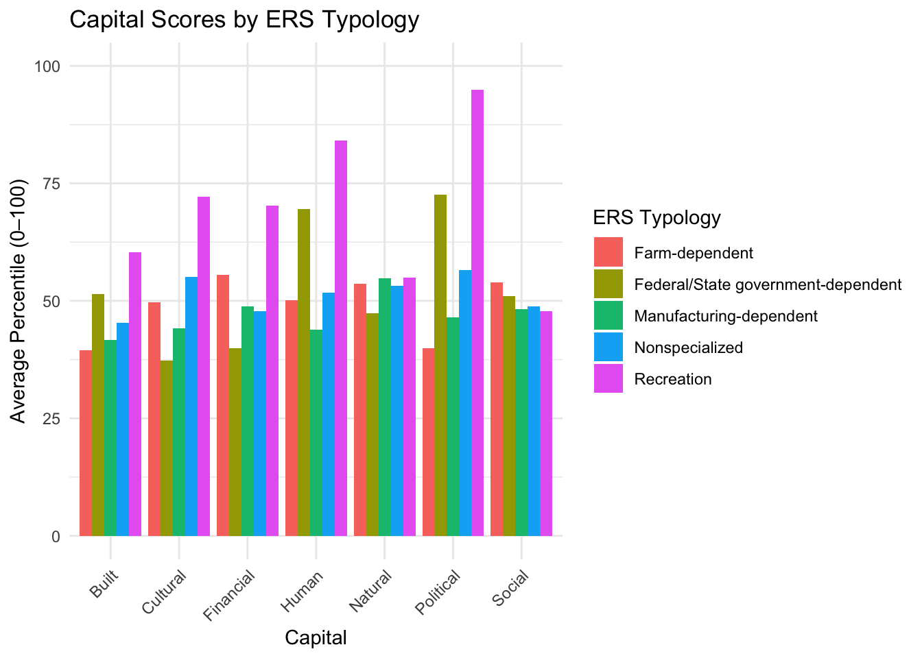
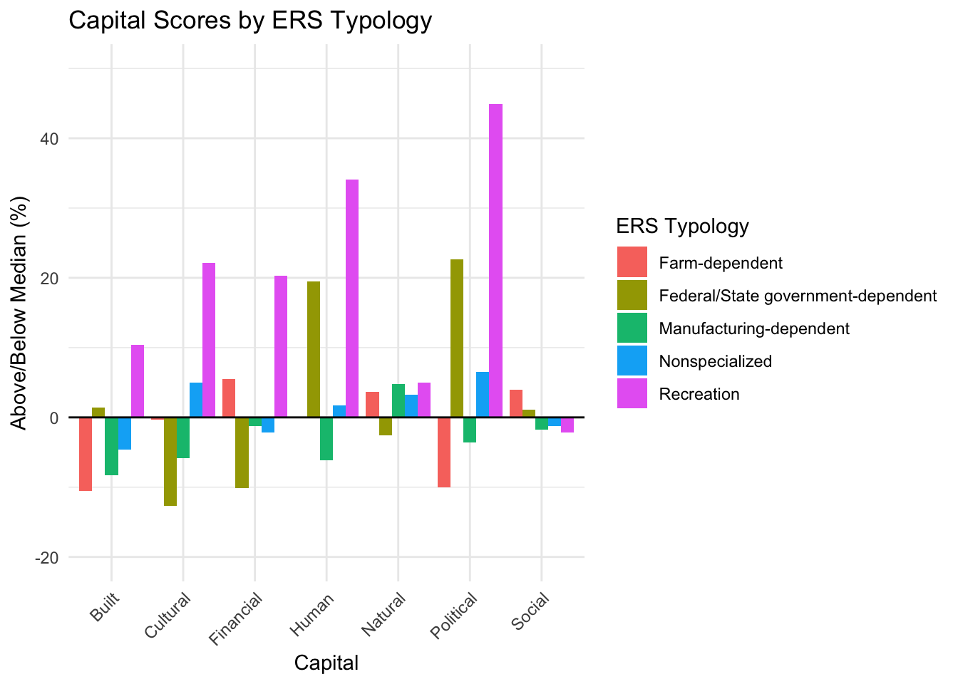
Interpretation: Recreation performs the highest in all capitals except Social where it performs last. Federal/state government sticks out with high political and human capital. All other economic dependency categories stay relatively flat across capitals. While non-specialized, farm-dependent, and manufacturing-dependent all hold 25-40 counties each, recreation-dependent holds only one county and federal/state government-dependent holds only three counties. This is not a fair comparison as recreation-dependent and federal/state government-dependent are highly sensitive to local conditions/ outliers in their average values, but this does give us an opportunity to expolore these counties as outliers.
Combined Statistical Areas (CSA)
There are seven CSA’s that select Iowa counties are apart of.
CSA means Combined Statistical Area. It’s a group of nearby cities and towns that are connected because many people live in one place and work in another nearby place. The government groups these places together to study how people live, work, and move around in a region.
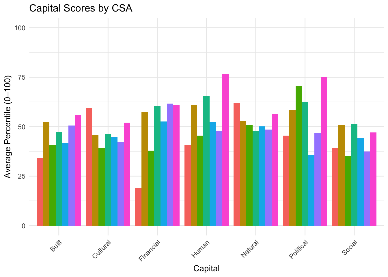
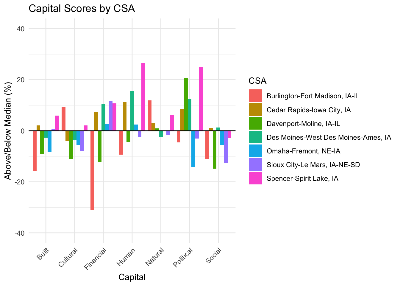
Interpretation: There are significant differences in capital scores across CSA’s. From this we can identify outliers of extreme high and low scores. The Spencer-Spirit Lake, IA CSA sticks out as high in Human and Political capitals. The Burlington-Fort Madison, IA-IL CSA, sticks out low in Built and Financial capitals, but performs high in Cultural and Natural capitals.
City Influence on CSA Scores
Spencer-Spirit Lake, IA CSA
The graph below shows Human and Political capital scores (capitals of extreme high scores) in the cities contained in the Spencer-Spirit Lake, IA CSA, seperated by county.
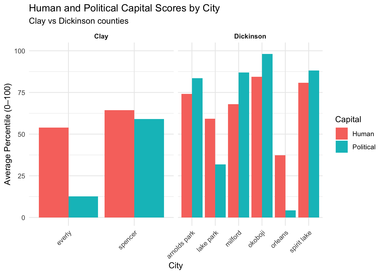
Interpretation: Cities in Clay County may not contribute to the high CSA totals as much as those in Dickinson County. Cities in Dickinson County boast high, above-median human and political capital scores, except the city of Orleans, which scores below the median in both capitals. The city of Lake Park also scores below the median in political capital.These underperforming cities can weaken the CSA’s overall results, masking the full potential of its collective strengths.
Burlington-Fort Madison, IA-IL CSA
The graph below shows Built and Financial capital scores (capitals of extreme low scores) in the cities contained in the Burlington-Fort Madison, IA-IL CSA, seperated by county.
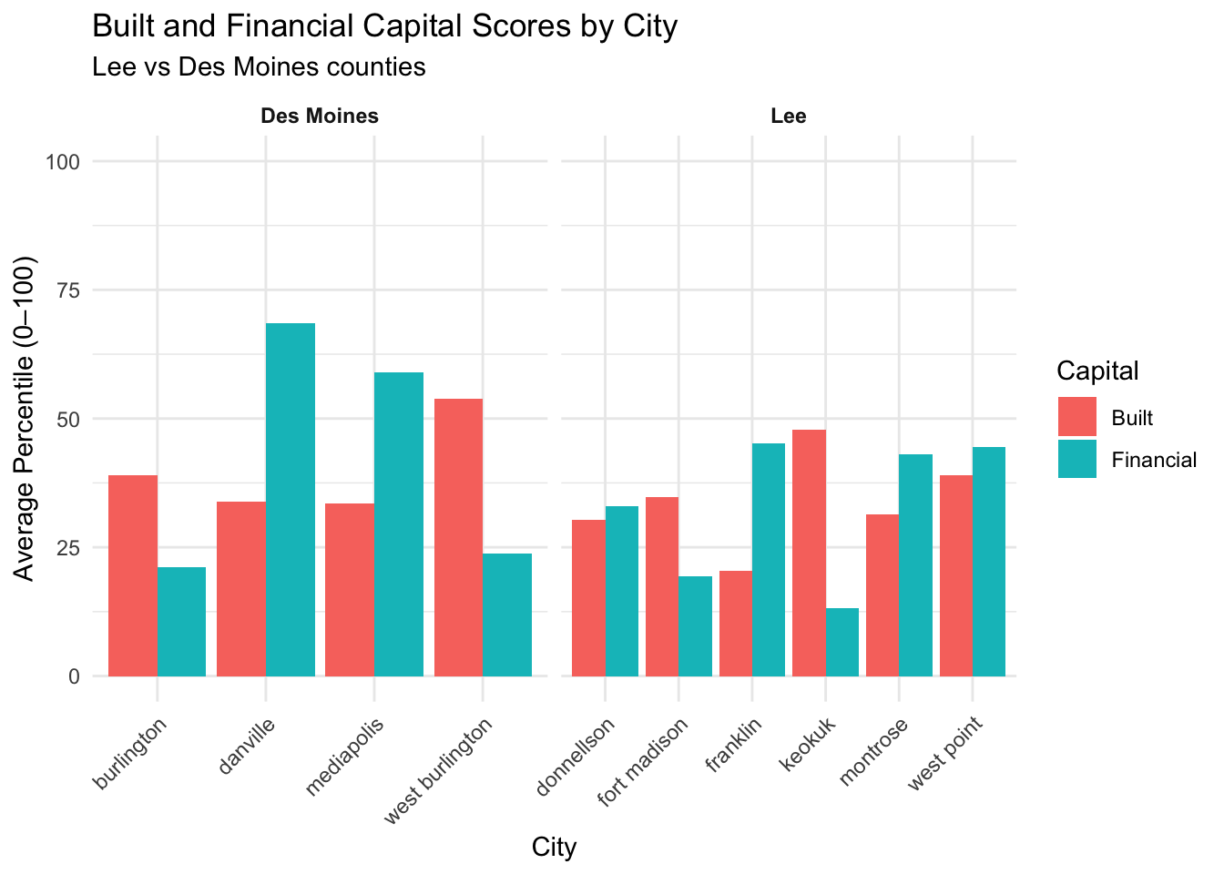
Interpretation: Most cities in both Lee and Des Moines counties contribute to the low built and financial capital scores seen in the overall CSA, with all city scores in both capitals being below the median in Lee County. Des Moines County holds two above-median cities in the financial capital, Danville and Mediapolis, and one city above the median in the built capital with West Burlington.
Capital Analysis: Rural vs Urban
The Student Effect
College counties (Story, Johnson, Black Hawk) demonstrate an income-poverty paradox where high median incomes coexist with high poverty rates. This occurs because college students experience temporary low income, inflating poverty statistics while actual economic conditions may be more stable. [@juday2016modifypoverty]
Diversity and Inequality Dynamics
The analysis reveals complex relationships between racial diversity and economic outcomes:
- Rural areas: Weak correlation between diversity and income inequality
- Urban areas: Higher diversity associates with greater income inequality (Gini Index)
- Health insurance: Both rural and urban areas show diversity negatively correlating with coverage [@beech2021poverty]
Some graphs
1. Income vs Poverty Rate Analysis
This scatter plot reveals how college counties break traditional economic assumptions, with Story County showing high income but high poverty due to student populations.
2. Single Parent Household Patterns
Demonstrates that rural areas have higher rates of single parenthood, potentially due to economic constraints, out-migration, and limited service access.
3. The Diversity-Income-Inequality Triangle
This comprehensive visualization shows how diversity, income, and inequality interact differently in rural vs urban contexts, with urban areas showing larger inequality bubbles.
Capital Analysis: Regression Modeling Results
Financial Capital Model Performance
Predicting median household income:
- R² = 61.2%
- Strong predictors: Poverty rates (-), labor force participation (+), finance/insurance sector (+)
- Interesting finding: Higher GDP per capita correlates with lower median income
- Non-significant factors: Unemployment, manufacturing, small businesses, income inequality
Predicting poverty rates:
- R² = 60.1%
- Strong predictors: Median income (-), small businesses (-), income inequality (+)
- Policy insight: Small business development and income distribution matter more than unemployment rates
Built Capital Model Performance
Predicting home values:
- R² = 79.5%
- Strong predictors: Housing age (-), plumbing quality (+), broadband access (+)
- Interesting findigns: Most public services don’t significantly predict home values
- Digital divide: Broadband access emerges as critical factor
Natural Capital Model Performance
Predicting property employment in nature:
- R² = 71.3%
- Strong predictors: Agricultural GDP (+), public areas (+), land values (-)
- Intersting findings: Most pollution/risk factors don’t affect property employment
- Economics: Agricultural economy and public land access drive employment
Regression Model Performance Summary
| Capital Type | R² | Key Finding |
|---|---|---|
| Financial | 61.2% | Small businesses reduce poverty more than unemployment programs |
| Built | 79.5% | Broadband matters more than traditional infrastructure |
| Social | 45.2% | Economic connectedness predict civic engagement |
| Natural | 71.3% | Agricultural GDP drives property employment, not environmental quality |
Noteable outliers
Jefferson County
- Highest Gini Index despite low median income
- High percentage of small businesses and bachelor’s graduates
- Elevated environmental risk factors
- Highest federal contribution per adult
Des Moines County
- High poverty alongside high median income
- Strong financial capital but weaker social indicators
- Suburban areas outperform urban core
Dickinson County
- Highest new housing prices
- Lake-based tourism economy
- Natural amenities drive unique economic dynamics
The cost of living in Iowa

Insights
- Income Gap Reality: Median household incomes across most Iowa counties fall below the self-sufficient income threshold
- Hidden Economic Stress: Even counties with relatively high median incomes may have many households struggling to achieve economic self-sufficiency
- Geographic Disparities: Rural counties often show larger gaps between median income and self-sufficient income requirements
The “Ghetto Tax” Phenomenon
Low-income residents pay more for basic goods and services due to:
- Limited transportation to competitive markets
- Predatory lending practices
- Higher insurance costs in disadvantaged areas
- Reduced market competition in isolated areas [@karger2007poverty]
Mental Health Crisis
Iowa faces significant mental health challenges:
- 19.4% of adults experience mental health conditions
- 56.4% don’t receive treatment
- 780 individuals per 1 mental health provider (indicating severe shortage) [@evans2016examining]
Data Limitations
- Data Quality: Some measures may vary from other sources
- Student Population Effects: May artificially inflate poverty rates in college counties
- Geographic Aggregation: County-level analysis may mask census-tracts variations
- Causation vs Correlation: Analysis shows relationships but doesn’t establish causal mechanisms
- Multicollinearity: Some models show high VIF values indicating overlapping predictors
Complex Zoning
Iowa’s counties cannot be simply categorized as “rural” or “urban”, each faces unique challenges shaped by demographic composition, economic structure, and historical development. The student effect in college counties like Story and Johnson demonstrates how traditional economic indicators can be misleading.
Multiple Capital Framework Insights
Our analysis across financial, built, social, and natural capital shows that:
- Financial Capital: Small business development and income distribution matter more for poverty reduction than unemployment rates alone
- Built Capital: Digital infrastructure (broadband) has become as critical as traditional infrastructure for property values
- Social Capital: Economic connectedness predicts civic engagement better than traditional measures like voter turnout
- Natural Capital: Agricultural economics drive property employment more than environmental quality measures
A Quick Look at outliers
Some places do well in a few areas, others are low in a few. Some are strong in one area but weak in another. This is a quick look at those patterns.
volunteering rate:
Cass County has came across as strong and active , even when usual pattern does not apply. people there volunteer a alot even without many formal events.
Why Cass County Scores High in Volunteering
Strong Extension and 4‑H Programs: Local Health & Public Safety Initiatives Informal Networks and Cultural Practices
Education unemployment and poverty in Iowa
General Trend Across Iowa
More education → slightly less poverty
More education → slightly more unemployment
Outliers Matter
Dallas County:
has high education and very low poverty and unemployment
Story and Johnson:
highest education levels, they have high poverty and unemployment
Audubon and Lyon Counties:
lower education levels, but still show very low unemployment or poverty
Why These Counties Stand Out
Story & Johnson – Student Inflation
College towns look poorer and less employed on paper because student incomes distort the data (U.S. Census Bureau, 2016).
Dallas – Suburban Alignment
High education matches with strong jobs, incomes, and housing—thanks to Des Moines metro growth (DataDesMoines, 2023; Axios, 2022).
Audubon & Lyon – Rural Resilience
Despite fewer degrees, these counties thrive through stable local jobs and strong social ties (Iowa State Extension, 2021).
Dickinson County – Iowa’s Recreational Outlier
Dickinson County is the only “Recreation” county in Iowa. ERS Typology groups counties by the main kind of work people do—like farming, manufacturing, government jobs, or tourism. Dickinson, with its focus on tourism, scores the highest in all areas of community strength. Natural, Cultural, Social – strong , Built, Political - Moderate Areas , Financial, Human- Lower Areas
These outliers show things don’t always go as expected. Now let’s see where counties are doing well and where they need more help.
Next Steps
Combine Similar Strengths
We will put related things together like income, education, and health insurance to make one clear score. This helps us see which counties are strong in areas like “people strength” or “housing.”
Find the One Weak Spot
Some counties are doing great in many ways, but have just one weak area like poor internet or old housing. We will ask questions like If we fix that one thing, could it help everything else too?
Study Inequality
We will look at whether counties with big income gaps or lots of single-parent households also have weaker community life or trust.
Final Goal
By the end, we will have a clear picture that helps people across the state:
See what is working
Notice what is missing
Find small, smart ways to grow stronger—based on what makes sense locally
4. Social Capital Distribution
Reveals differences in community capital between rural and urban areas using composite measures of civic engagement, family stability, and economic security.