
Introduction
What is a Community?
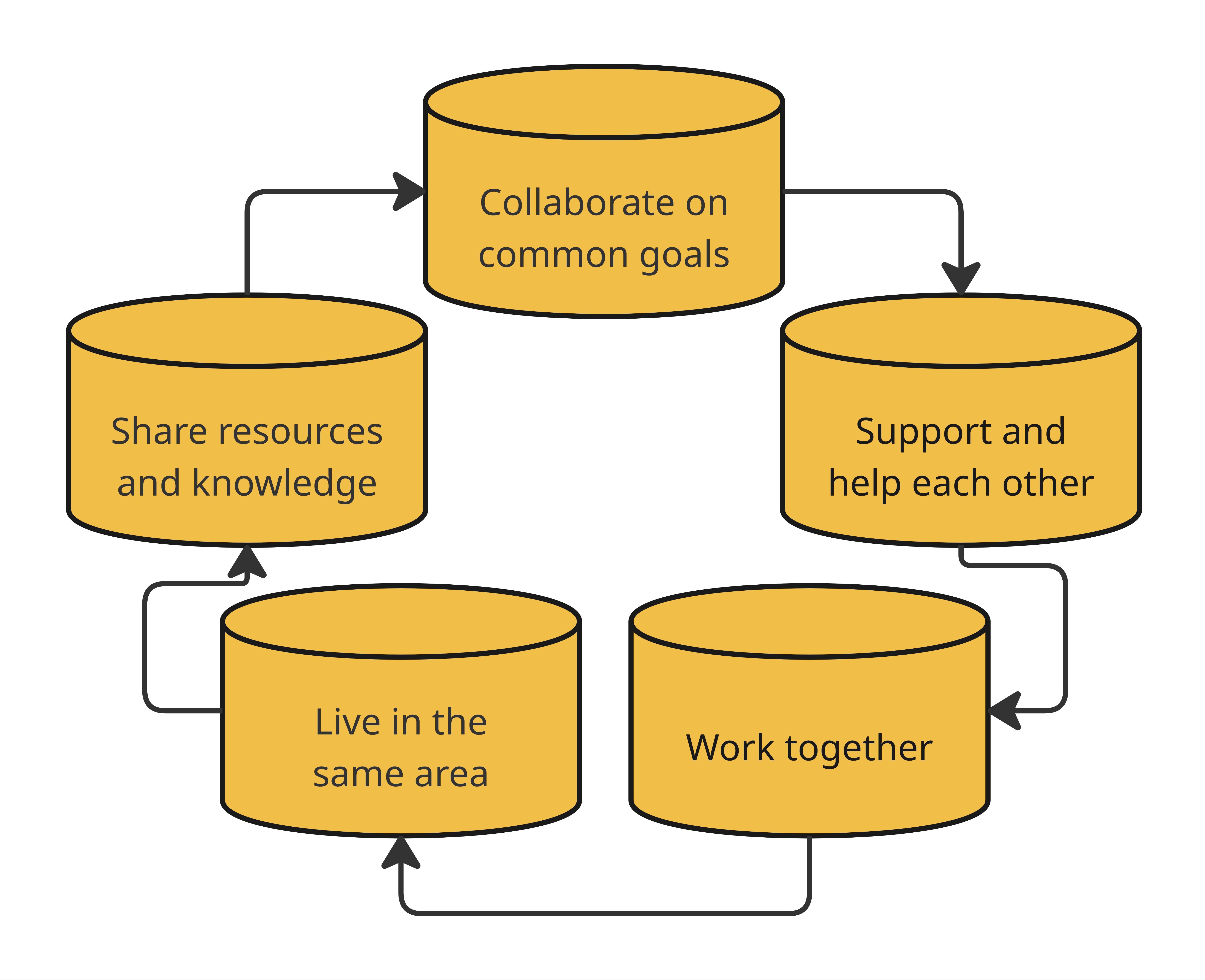
A community is more than just a place on a map. It’s a group of people who live in the same area and work together toward common goals. Communities grow stronger when people support and help one another, share resources and knowledge, and collaborate to improve life for everyone.
These shared community elements can include:
Public services such as schools, libraries, and healthcare
Natural spaces like parks, rivers, and trails
Opportunities for leadership, collaboration, and teamwork
Shared traditions, cultural knowledge, and mutual trust
What is a Capital?
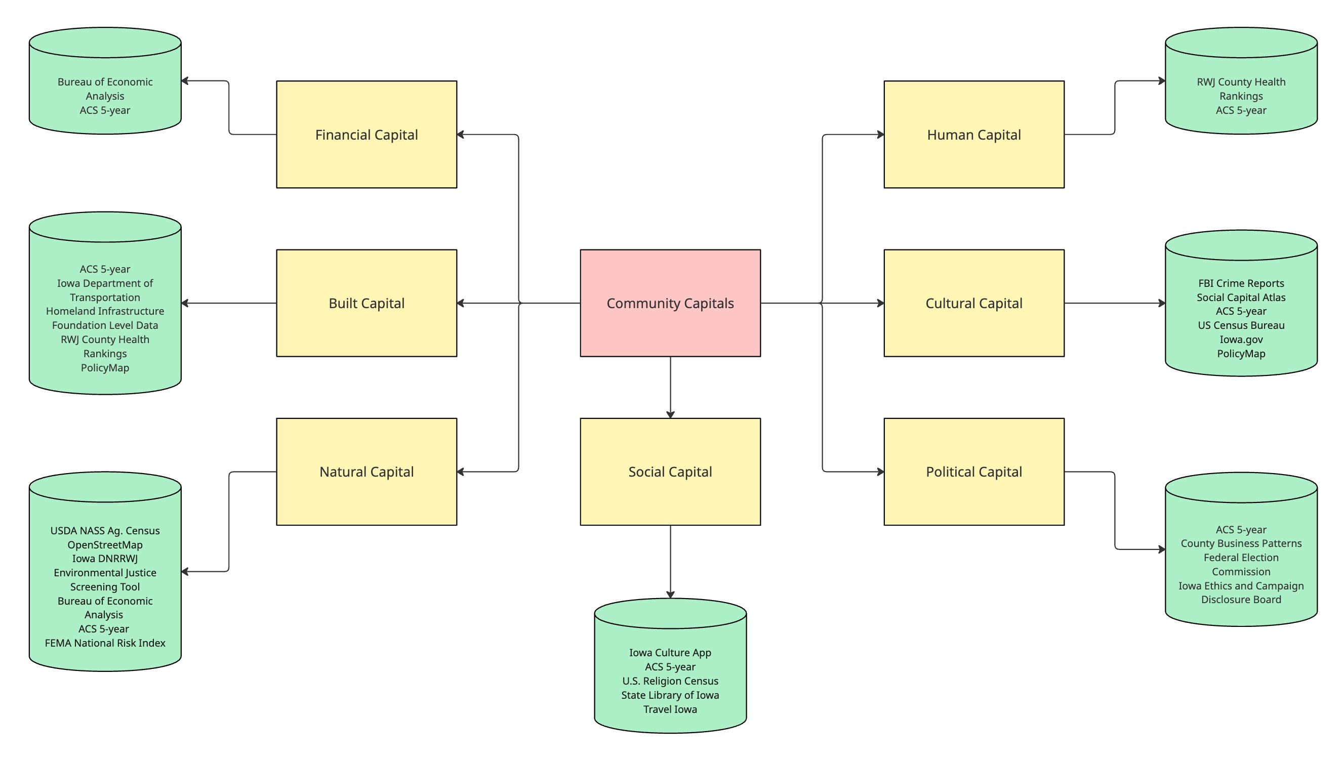
To guide our analysis, we used the Community Capitals Framework (CCF), a model developed by Cornelia Flora at Iowa State University, to examine and compare all 99 counties across seven key dimensions of community life.
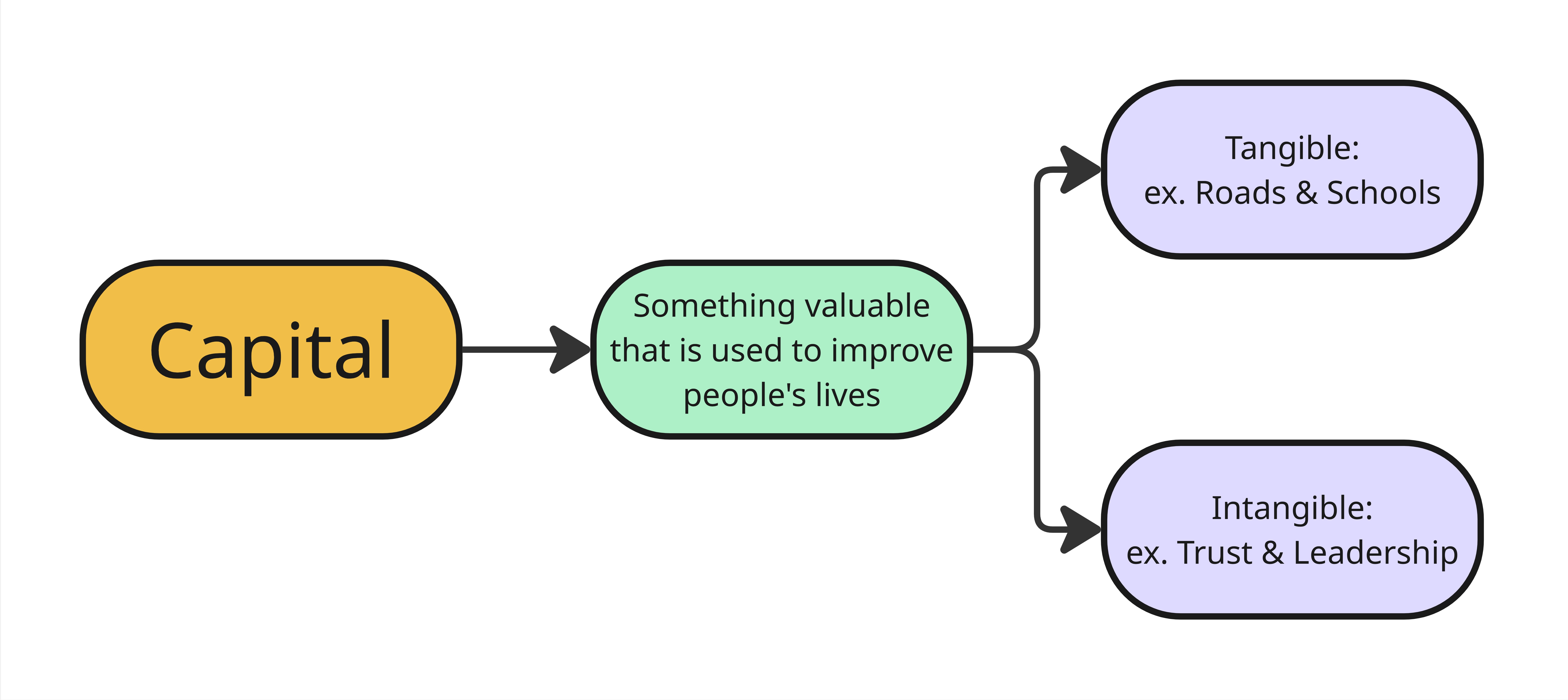
In the Community Capitals Framework, a capital is something valuable that a community can use to improve people’s lives. Some forms of capital are tangible, like roads, schools, or broadband. Others are intangible, such as local leadership, civic trust, or cultural heritage.
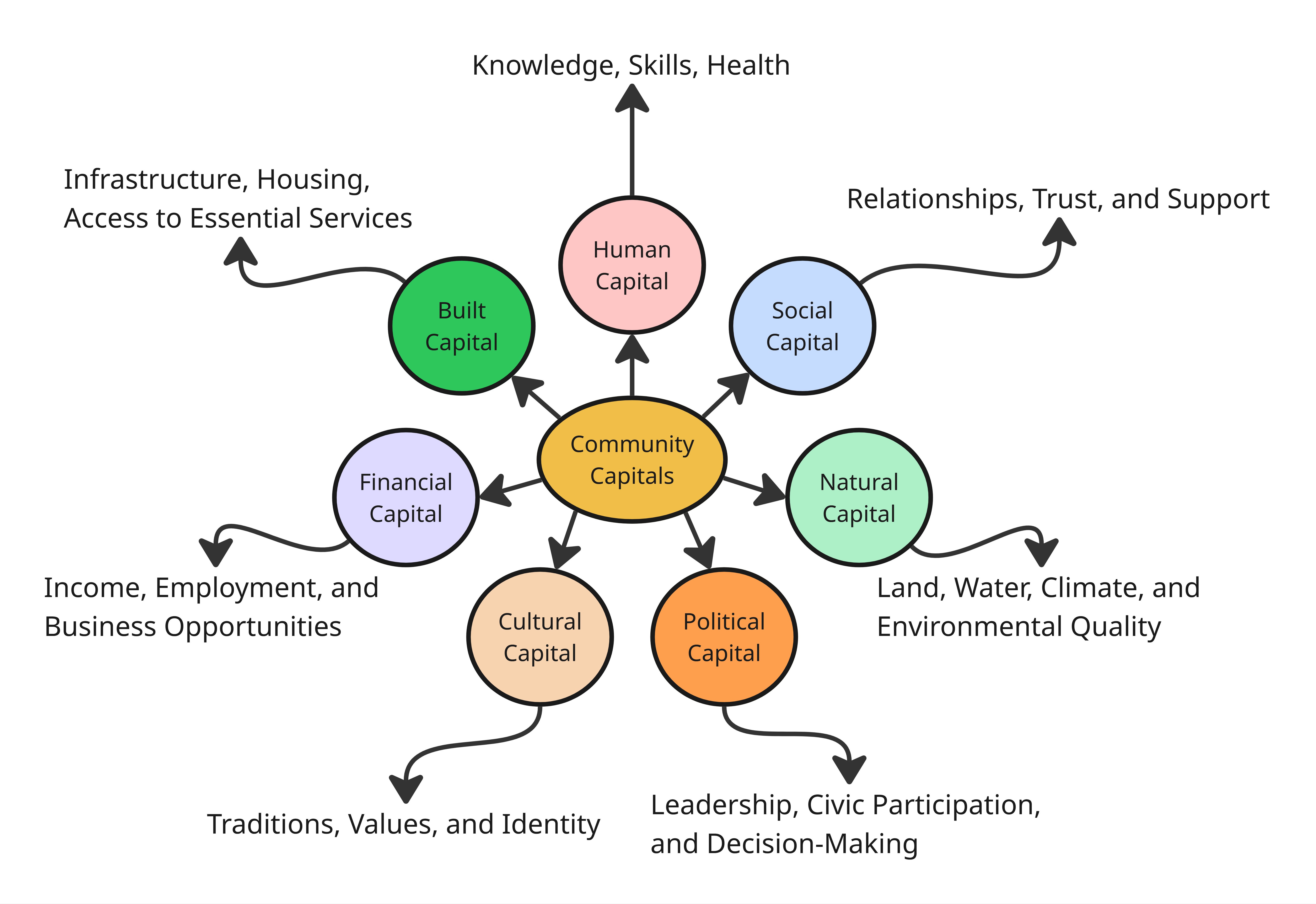
The seven types of capital are:
Human Capital – reflects the education levels, health, and skills of the people in a community.
Social Capital – reflects the strength of relationships, trust, and community support.
Political Capital – reflects local leadership, civic participation, and influence in decision-making.
Built Capital – reflects the quality of infrastructure, housing, and access to essential services.
Natural Capital – reflects the condition of land, water, climate, and environmental quality.
Financial Capital – reflects the availability of income, employment, and business opportunities.
Cultural Capital – reflects local traditions, shared values, and collective identity.
This project shows that real change doesn’t rely on just one kind of capital or strength; it takes many working together. Each one matters, and they often work in tandem.
A Simple Example: Building a Community Pool
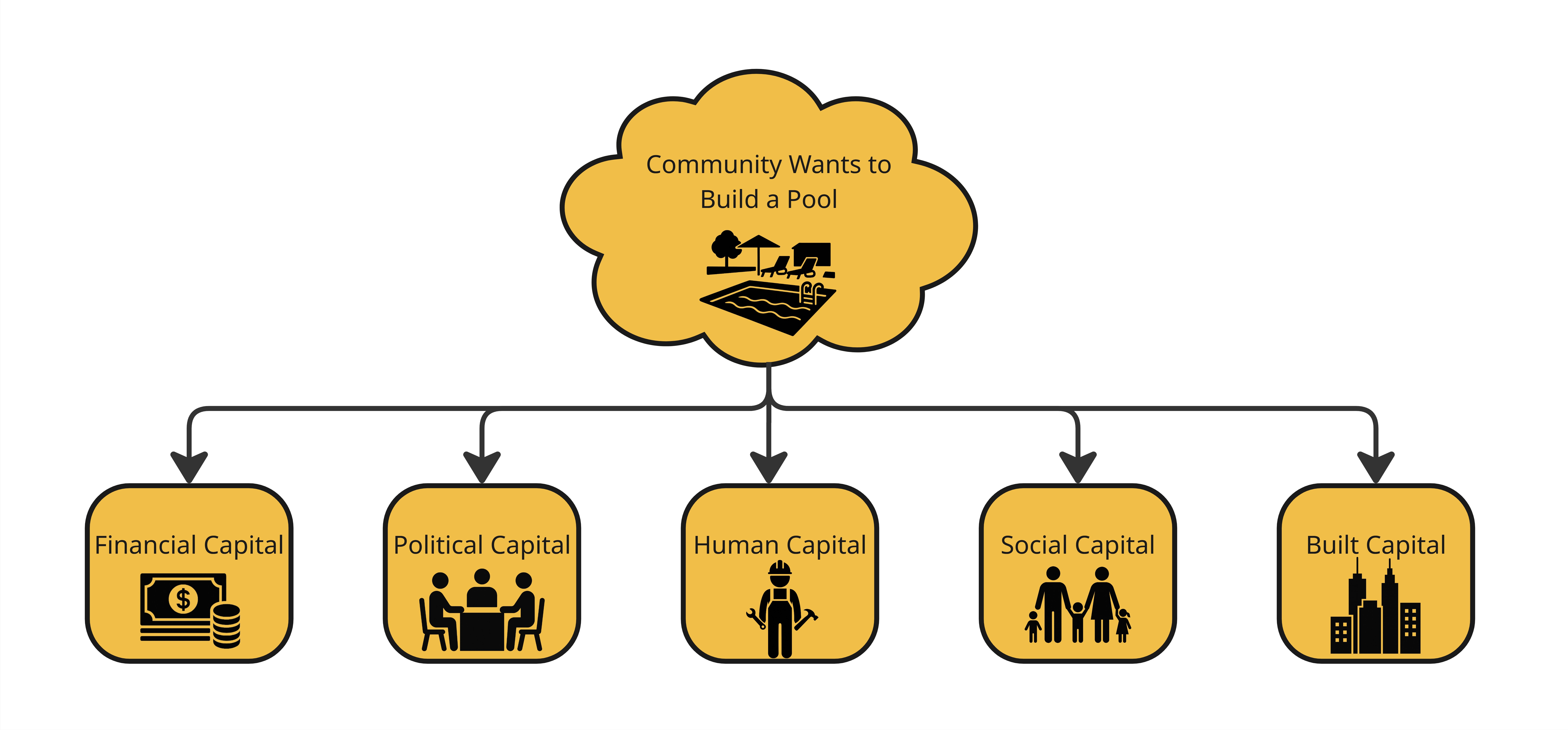
Imagine a town wants to build a public swimming pool.
To make it happen, the community needs more than just money it needs multiple types of capital working together:
- Financial Capital to fund the project through grants or donations.
- Political Capital to get permits and city approval.
- Human Capital for skilled workers and volunteers.
- Social Capital to rally support through clubs, churches, and networks.
- Built Capital in the form of land, plumbing, and materials.
What makes a community strong?
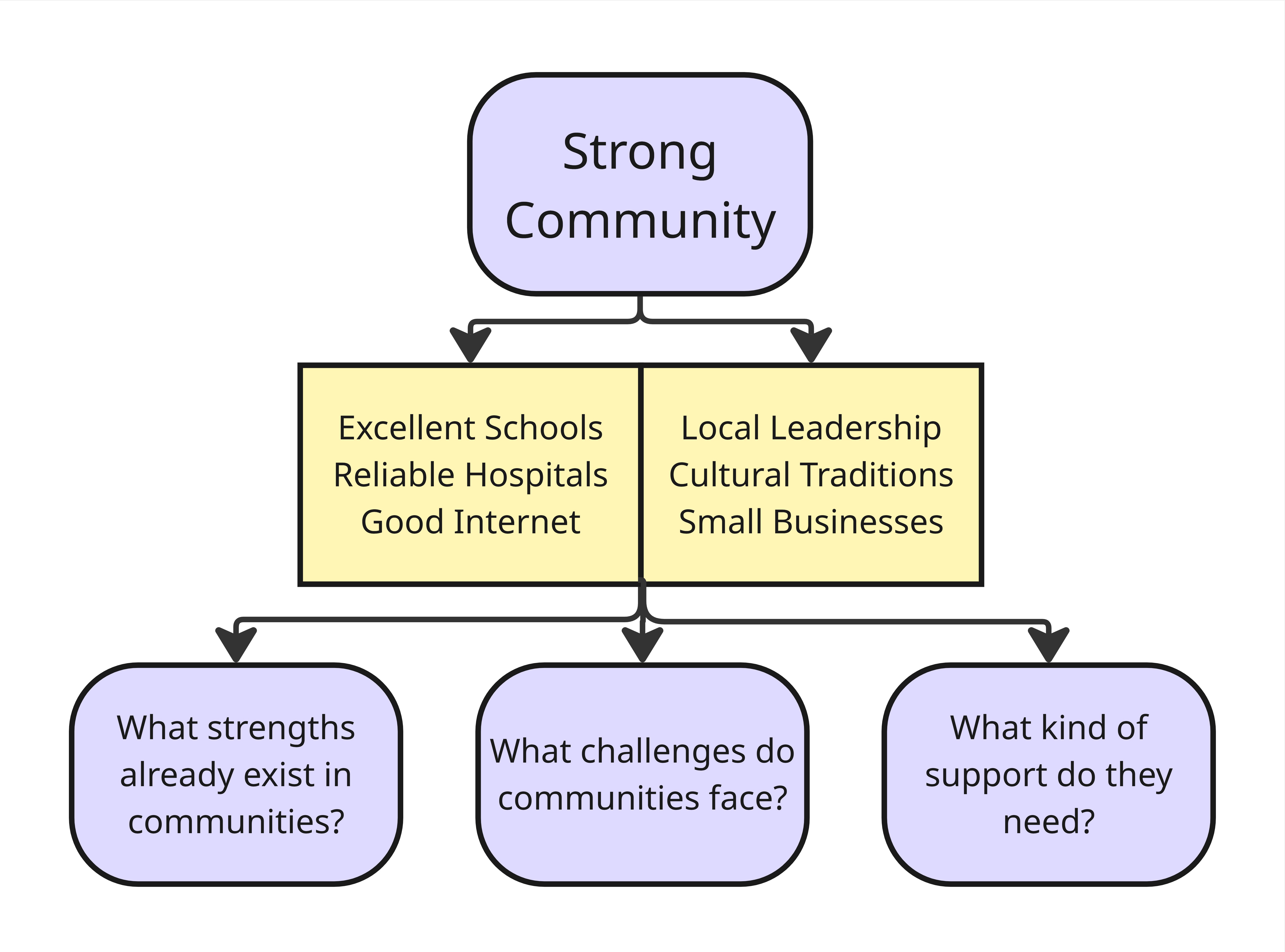
A Closer Look at County Strengths and Challenges
Iowa’s counties are all different. Some are doing well in one area but struggling in another. For example:
Rural counties often have strong community life, with high voter turnout and lots of local involvement. But they also tend to have poor internet access, which makes it harder to learn, work, or get healthcare online (County Health Rankings, 2023, Broadband Iowa, 2024).
Polk County has strong job opportunities and services, but housing is a growing problem. Many families spend too much on rent, and homelessness especially among older adults is rising (Axios Des Moines, 2024).
To help counties build on their strengths and tackle the challenges they face, our project asks three simple but important questions:
-What strengths already exist in this community?
-What challenges might be holding it back?
-Where could the right kind of support make the biggest difference?
Data Sources:
To understand and analyze communities across Iowa, we used public data from trusted sources. These include:
Why This Project Matters
Every county is unique. This project recognizes that effective solutions must reflect each community’s specific strengths, gaps, and priorities, not rely on one-size-fits-all assumptions.
Data brings clarity. Using trusted public data and the Community Capitals Framework, we offer a more complete and nuanced picture of each county’s conditions.
It helps leaders make smarter decisions. Communities, nonprofits, and agencies can use this information to better target resources where they’ll have the greatest impact.
It highlights what’s working. This project doesn’t just identify challenges, it also points to existing assets that communities can build on.
It supports more equitable outcomes. When planning is grounded in real local conditions, it becomes more effective, more inclusive, and more meaningful to the people it serves.
Who can use this information?
Extension staff working in counties to guide programming and outreach.
Nonprofits deciding where to invest in various community programs.
State agencies tailoring support based on the distinct needs of rural and metro counties.
Local leaders and planners seeking to understand why some counties are thriving while others are falling behind.
We have organized our research questions, analysis, and findings into three simple themes to easily communicate our insights in a structured manner.
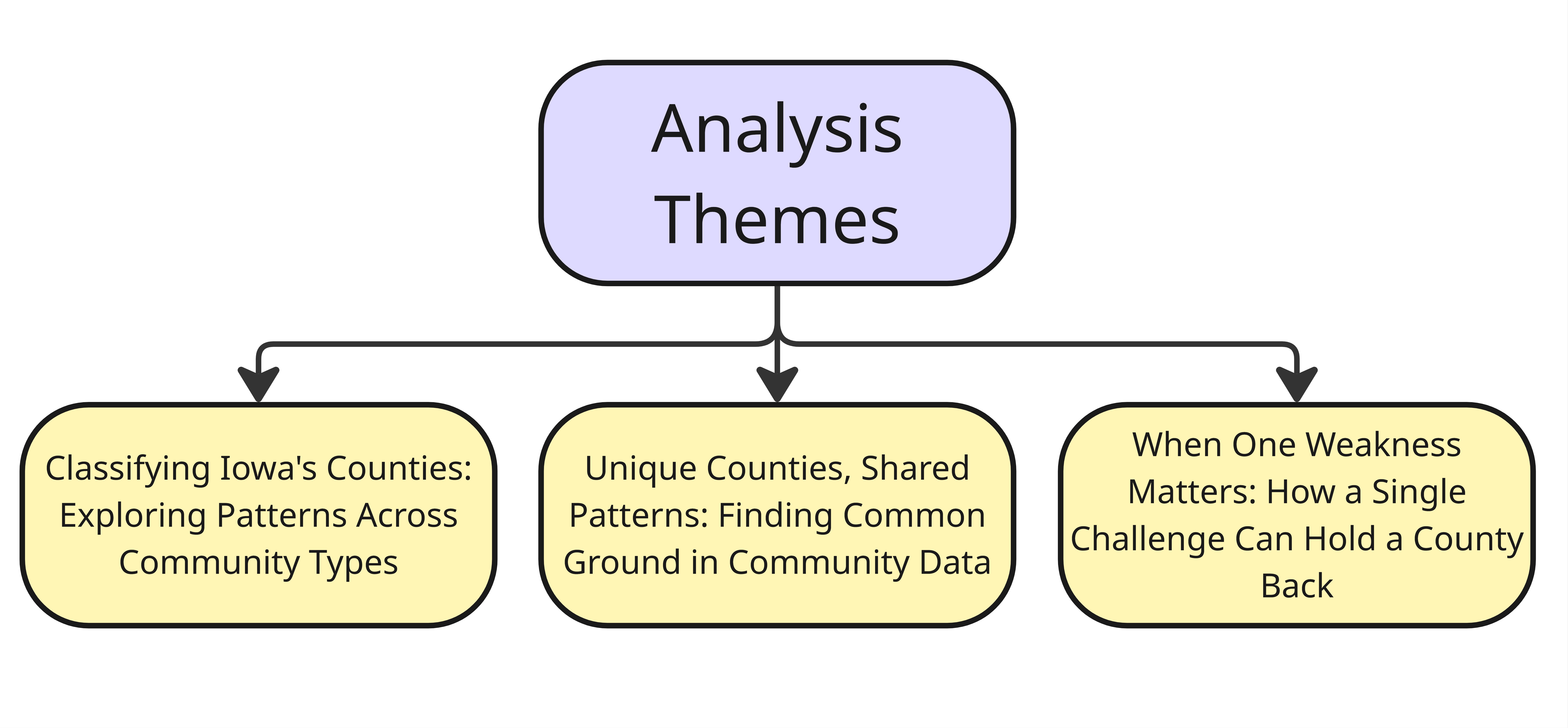
Theme 1: Classifying Iowa’s Counties – Exploring Patterns Across Community Types
Counties in Iowa differ by location, size, and economic function. Some are rural and isolated, while others are connected to urban centers or driven by specific industries like farming or manufacturing.
By classifying counties into meaningful groups, we can better account for these differences and explore how shared characteristics relate to different outcomes. This approach allowed us to analyze capital scores across several classification types and compare strength scores more directly between rural and urban counties. Grouping by type not only highlights diversity, but also helps uncover broader patterns that wouldn’t be visible when looking at counties individually.
How does capital vary across diverse community classifications?
Motivation
This question explores how levels of community capital vary across different types of communities in Iowa. Communities are diverse by location, population characteristics, regional relationships, and economic roles. To understand these differences, we analyzed Iowan counties through multiple groupings and classifications, including:
Economic Dependence
Geographical Regions
Peer Population Groupings
Metropolitan vs Micropolitan vs Nonmetropolitan
Urban vs Rural
Each of these classifications gave us a unique look into how simaler and different counties function and what capitals they thrive or lack in. While urban vs rural comparisons reveal broad differences in infrastructure and resources, additional groupings like economic dependence or geographical regions can highlight more nuanced trends. Recognizing these differences is important for understanding local context, which can guide more precise decision-making, funding priorities, and policy development tailored to the needs of different community types across Iowa.
Methodology
In order to do this analysis we followed a few straightforward steps:
1. Standardizing the Data
We calculated a percentile score for every county for each variable (like broadband access, number of fire stations, education levels, etc.). Each county’s score shows how it compares to others in the state. For example, a county in the 90th percentile for education has higher education levels than 90% of Iowa counties. Calculating percentiles was necessary due to variables having different units and scales.
2. Grouping Counties
Grouped counties based on the five classifications stated above.
3. Calculating Averages for Variables and Capitals
For each classification group, we calculated the average percentile score for each variable, giving a detailed view of how that group performs on specific community indicators, such as how urban vs rural counties compare crime rates. We also calculated overall scores for each type of capital by averaging the variables within each capital category, for example, how urban vs rural counties compare in overall social capital.
Findings
Economic Dependence
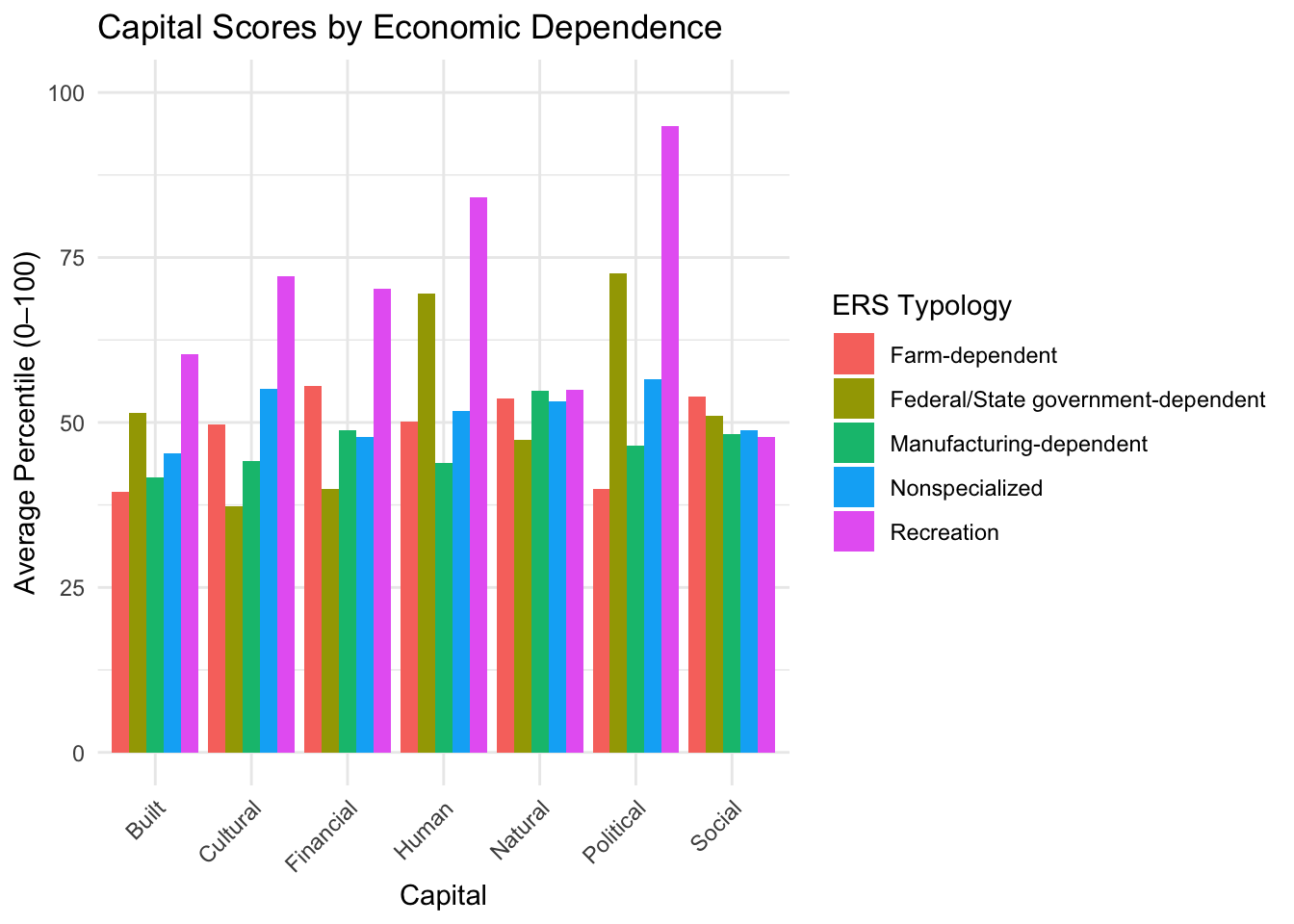
In this analysis, counties were grouped based on economic dependence, classified by the United States Department of Agriculture’s (USDA) Economic Research Service (ERS).
Farm-dependent: 26 counties
Manufacturing-dependent: 30 counties
Non-specialized: 39 counties
Federal/state government-dependent: 3 counties
Recreation-dependent: 1 county
The bar charts below compare overall capital scores by economic dependence. The chart on the left shows percentile score on a 0-100 scale, the chart on the right shows score as a percent away from the median in which we can see the largest deviations.
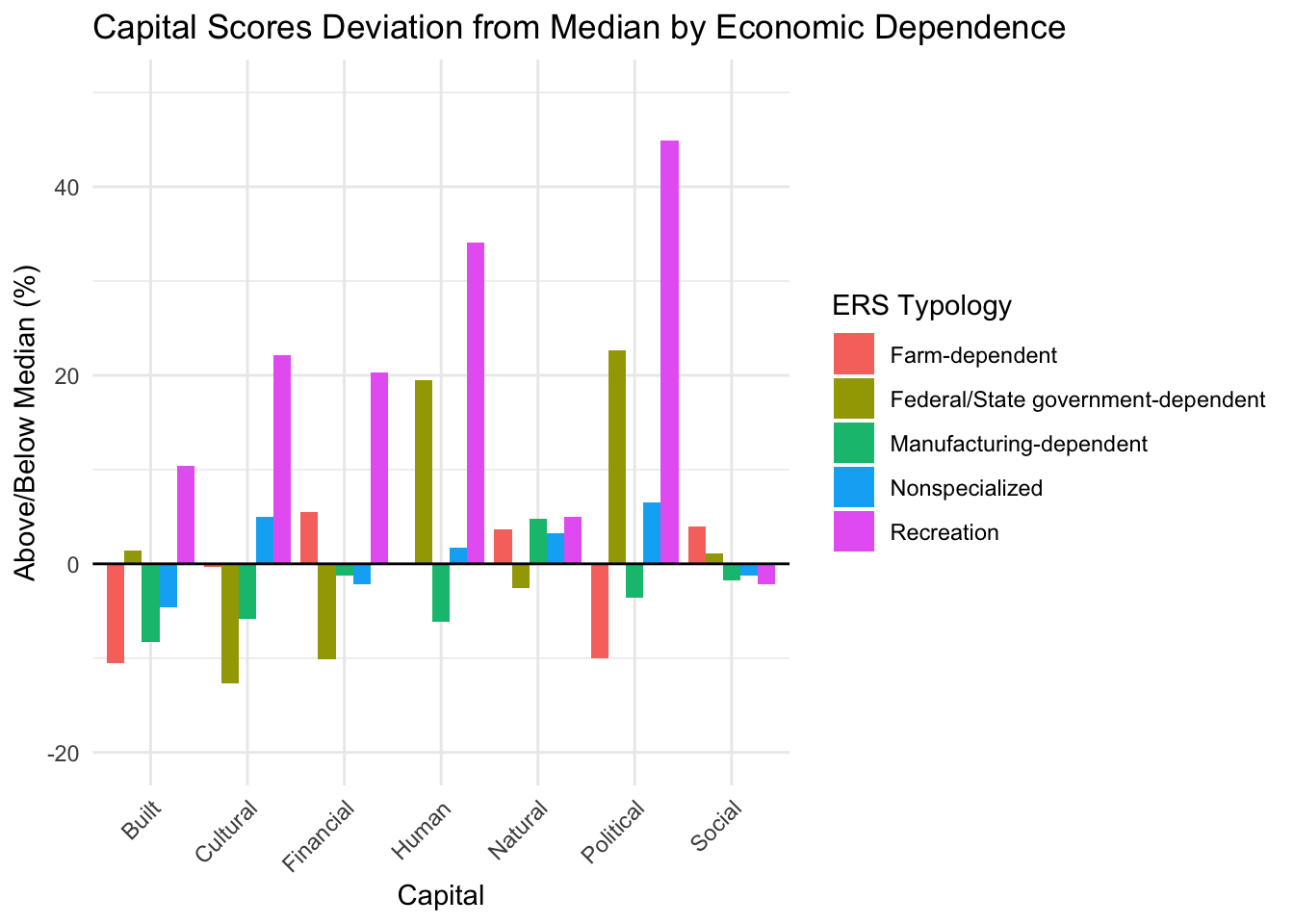
Recreation and federal/state government-dependent counties stand out with high scores in several capitals, but these groups include very few counties, making them more reflective of local conditions than broadly representative of their economic category.
Farm-dependent counties perform the highest in social capital.
Besides minor deviations, nonspecialized, farm-dependent, and manufacturing-dependent tend to stick close to the median.
Geographical Regions
In this analysis, counties were split into 9 different geographic regions, classified by the USDA’s National Agricultural Statistics Service (NASS)
Northwest: 12 counties
Northcentral: 11 counties
Northeast: 11 counties
Eastcentral: 10 counties
Central: 12 counties
Westcentral: 12 counties
Southwest: 9 counties
Southcentral: 11 counties
Southeast: 11 counties
The bar charts below compare overall capital scores by geographical region. The chart on the left shows percentile score on a 0-100 scale, the chart on the right shows score as a percent away from the median in which we can see the largest deviations.
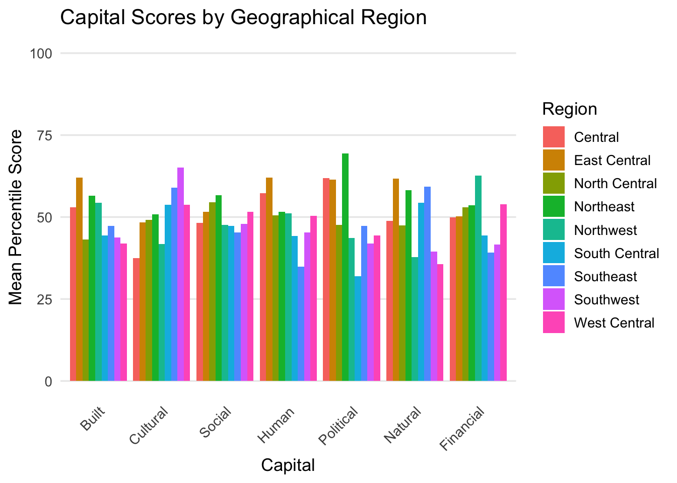
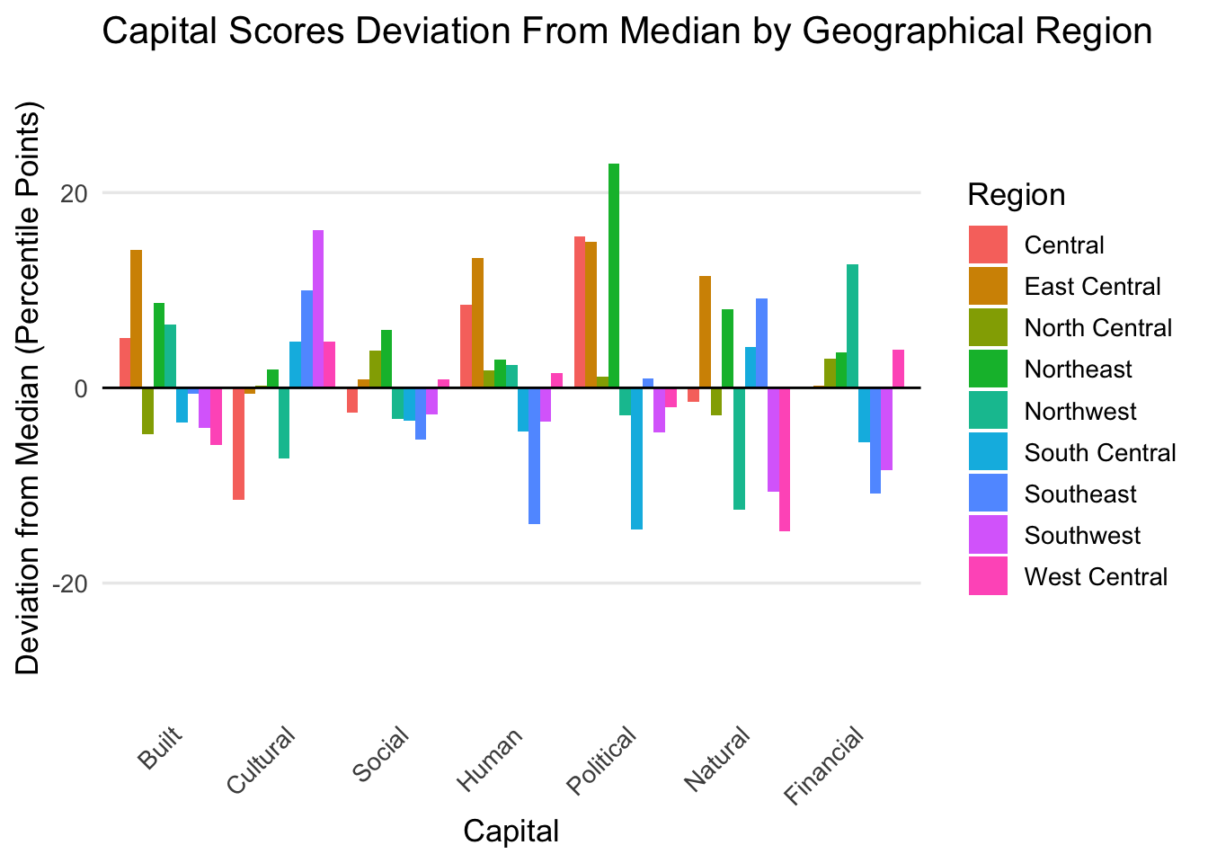
No single geographic region consistently outperforms or underperforms across all capitals; each shows its own mix of strengths and weaknesses.
Deviation from the median highlights regional outliers, such as Southcentral’s lower Political capital and Northeast’s higher performance in the same area.
This regional perspective supports targeted planning by showing that community strengths vary across Iowa, reinforcing the need for tailored, localized solutions.
Peer Population Groupings
In this analysis, counties were assigned a groupcode of 1-5 based on an Iowa specific classification system based on the size of the counties largest city and urban core influence.
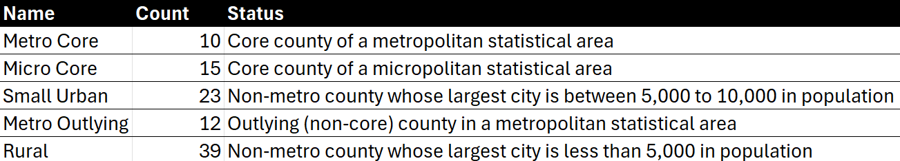
The line graph below compares the five classes of group codes across a wide range of community capital indicators, showing average percentile scores for each variable. The indicators are grouped by capital type.
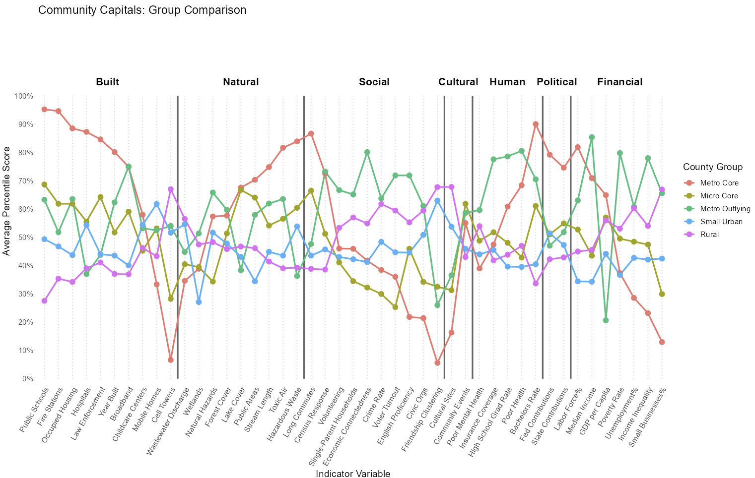
Metro core counties show the highest peaks and dips across capital indicators.
Micro core counties show simaler patterns to metro core counties, though with less dramatic highs and lows.
In contrast, rural counties display an inverse trend compared to metro core counties, performing higher in areas where metro core counties scores lower, particularly within many Social capital indicators.
Metro outlying counties show a more erratic pattern with high and low scores scattered across different indicators within each capital.
Meanwhile, small urban counties tend to show more stable, middle-range performance.
Metropolitan vs Micropolitan vs Nonmetropolitan
In this analysis, counties were designated as metropolitan, micropolitan, or nonmetropolitan based on based on the Rural Urban Continuum, classified by the USDA’s ERS. This classification gives counties a code of 1-9, with one being the most populated and in closest proximity to large urban cores/ hubs, and nine being the least populated and farthest proximity to large urban cores/ hubs.
Metropolitan (1-3 code): 22 counties
Micropolitan (4-7 code): 16 counties
Nonmetropolitan (8-9): 61 counties
The line graph below compares metropolitan vs micropolitan vs nonmetropolitan counties in Iowa across a wide range of community capital indicators, showing average percentile scores for each variable. The indicators are grouped by capital type.
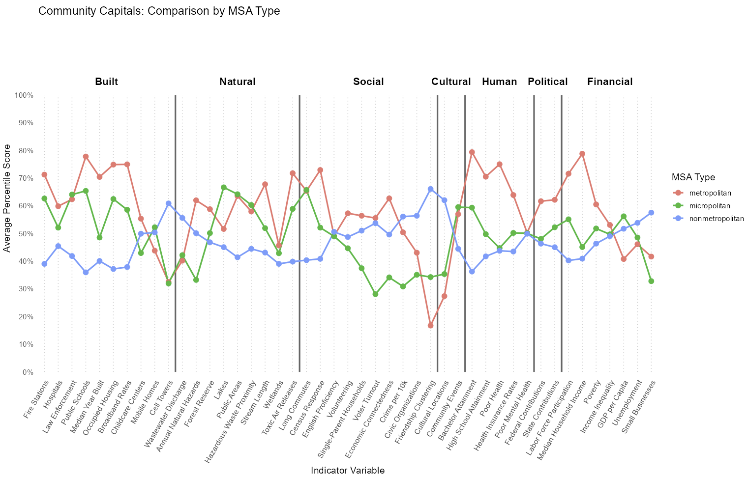
Metropolitan and nonmetropolitan counties tend to have an inverse relationship. If metro counties tend to score high on a particular indicator, non-metro counties often score lower, and vice versa.
Micropolitan counties tend to fall in the middle, with strong performance in some indicators such as access to public areas and low performance in some indicators such as voter turnouts and civic organizations.
Urban vs Rural
In this analysis, counties were designated as urban or rural based on a different slicing of the Rural Urban Continuum with only two categories.
Urban (1-3 code): 22 counties
Rural (4-9 code): 77 counties
The line graph below compares urban vs rural counties in Iowa across a wide range of community capital indicators, showing average percentile scores for each variable. The indicators are grouped by capital type.
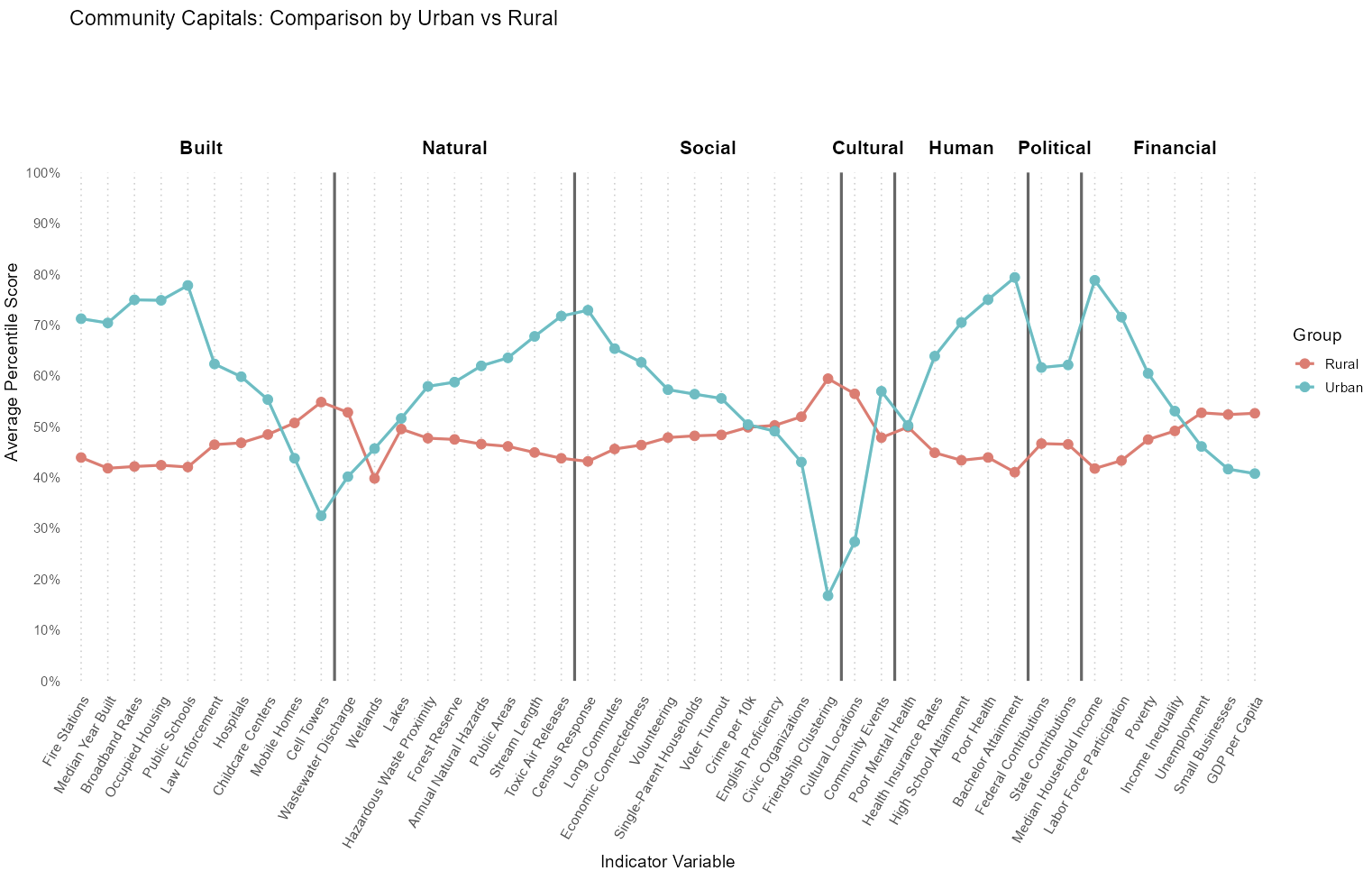
Urban counties perform higher in most capitals, particularly built, human, and political capitals.
However, this does not mean that rural counties are always behind. In fact, they perform better in several specific indicators in all capitals except human and political capitals.
Urban and Rural counties tend to have an inverse relationship. If urban counties tend to score high on a particular indicator, rural counties often score lower, and vice versa.
How do strengths vary across community classifications?
Motivation
We developed strength scores to provide a more focused comparison across counties. While the community capitals framework is useful for broader more conceptual understanding, many of the indicators we wanted to analyze cut across multiple capitals. By grouping select variables into targeted strength domains we were able to better capture more specific, measurable areas of strength or weakness.
Because the strength scores already narrowed the scope of analysis, we chose to keep comparisons simple by focusing on rural versus urban classifications. More detailed groupings were reserved for the capital score analysis, where comparing across multiple classification types (e.g., economic dependence) is more meaningful within a broader conceptual framework.
Methodology
In order to do this analysis we followed a few straightforward steps:
1. Standardizing the Data
We calculated a percentile score for every county for each variable.
2. Grouping Variables
We grouped variables to represent 6 different strengths based on relevant academic literature, established research frameworks, and policy tools to identify which variables best represent each strength. We selected indicators that are widely used, meaningful at the county level, and available across Iowa.
3. Box Plot Comparisons
Boxplots were used to compare strength scores between urban and rural counties because they effectively show the distribution, spread, and median of overall scores across two groups. Since we were interested in evaluating overall strength domains rather than focusing on individual variables, boxplots allowed us to quickly see how rural and urban counties differ within each strength area. This made it easier to identify patterns, outliers, and variability within each classification.
Human Strength Score Distribution
What it shows: This score reflects educational attainment, health status, language ability, age distribution, and access to food. High strength suggests that the county is doing well across these areas.
Variables: Bachelors Attainment, Disability Rate, Limited English, Seniors (65+), Food Environment Index
- Urban counties have higher median human strength scores than rural counties with fewer outliers and more consistent high scores.
- Rural counties show more variability in the spread of scores.
- Overall, urban counties tend to have a more educated and healthier population, with fewer barriers related to food access, language proficiency, or aging demographics.
Economic Strength Score Distribution
What it shows: This score reflects household income, employment levels, poverty status, housing types, income inequality, and business diversity. High strength suggests that the county is doing well across these areas.
Variables: Median Household Income, GDP per Capita, Employment Rate, Near-Poverty Rate, Multi-Unit Housing, Income Inequality, Small Businesses
- Urban counties have higher median economic strength scores than rural counties.
- Many rural counties perform above the urban median, showing that while the urban average is higher, several rural counties match or exceed that level of economic strength.
- Overall, urban counties tend to have stronger incomes, employment, and business activity.
Civic Strength Score Distribution
What it shows: This score reflects how engaged and supported a community is through civic life and institutions. A higher score suggests strong civic participation, access to higher education, and fewer family-related barriers that can limit engagement.
Variables: Census Response Rates, Civic Organizations, Voter Turnout, Single-Parent Households, Colleges per 10k
- Urban counties have higher median civic strength scores than rural counties.
- Civic strength is relatively balanced across county types, with rural and urban counties showing similar distributions despite some outliers.
- Overall, urban counties tend to have higher civic participation, access to higher education, and fewer family-related barriers.
Infrastructure Strength Score Distribution (10k vs sqMile)
What it shows: This score reflects how well a county is equipped to support daily life with infrastructure. A high score suggests strong access to essential services, reliable communication networks, and facilities that contribute to both safety and quality of life.
Variables: Hospitals per 10k, Fire Stations per 10k, Aging Infrastructure, Childcare Centers per 10k, Cell Towers per 10k, Convention Centers per 10k
Variables: Hospitals per sqMile, Fire Stations per sqMile, Local Law Enforcemnt per SqMile, Public School per sqMile
- Rural counties have higher median infrastructue strength scores than urban counties.
- Rural areas might benefit from population-to-infrastructure ratio, which helped us determine the need to assess infrastructure based on sq mile and not just population.
Stability Strength Score Distribution
What it shows: This score reflects how rooted and resilient households are in a county. A high score suggests communities with consistent housing, stable living arrangements, and a population that experiences fewer disruptions due to housing type or demographic turnover.
Variables: Owner-Occupied homes, Group Housing, Household Size, Racial Diversity, Mobile Homes
- Urban counties have higher median stability strength scores than rural counties.
- Rural counties show more variability, with several scoring both significantly higher and lower than the urban range.
- Overall, urban counties tend to have more rooted and resilient households.
Environmental Strength Score Distribution
What it shows: This score reflects environmental health, disaster risk, and natural land cover. High strength suggests that the county is doing well across these areas.
Variables: Cancer Risk, Air Pollution, Water Violations, Flood Frequency, Drought Frequency, Tornado Frequency, Forest Cover, Wetland Cover
- Rural counties have slightly higher median environment strength scores than urban counties, possibly due to higher exposure to pollution and greater environmental stress from development.
- Overall, rural counties tend to have lower levels of natural disaster risk and pollution, and higher natural land cover and environmental health.
Overall Strength Score Distribution
- Rural counties have higher median overall strength scores than urban counties.
- Overall, Iowa counties as a whole perform very similarly holistically, with most counties clustering near the median across multiple strengths combined. While there are notable outliers and some variation between rural and urban areas, the majority of counties show comparable performance when considering all strength scores together.
Motivation
When we have too many variables, it becomes difficult to see clear patterns or make sense of the data. Grouping counties by their overall patterns helps simplify this complexity, allowing us to summarize and interpret the information more effectively.
Methodology
Factor Analysis
Factor analysis is a statistical technique used to identify underlying relationships between variables by grouping them into factors that explain the common variance. In our context, we use factor analysis to determine if multiple related variables can be combined into meaningful composite measures.
The process involves:
- Examining correlations between variables
- Extracting factors that capture the most variance
- Rotating factors for better interpretability
- Determining which variables load onto each factor
- Creating composite scores based on factor loadings
This approach helps us understand whether variables like housing quality indicators or community engagement measures naturally cluster together, justifying their combination into single composite scores.
Though by using this method we risk oversimplifying the data and suffer loss of information.
Testing for Suitability
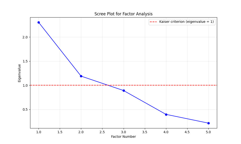
Before performing factor analysis, we need to assess whether our data is suitable for this technique. We conduct two key tests:
Bartlett’s Test of Sphericity: Tests whether variables are correlated enough for factor analysis (see Appendix for formula) Kaiser-Meyer-Olkin (KMO) Test: Measures sampling adequacy for factor analysis (see Appendix for formula)
The results are:
| Test | Statistic | Value | Interpretation |
|---|---|---|---|
| Bartlett’s Test of Sphericity | Chi-square | 178.59 | Variables are significantly correlated |
| p-value | < 0.001 | Suitable for factor analysis | |
| Kaiser-Meyer-Olkin (KMO) | Overall KMO | 0.479 | Bad sampling adequacy |
Scree Plot
Can we group counties by their overall patterns?
Motivation
Instead of grouping counties based on predefined labels like population size or economic role, we wanted to see what the data itself could tell us. By clustering counties based on their overall patterns of strengths, we can uncover new groupings driven by actual similarities in community conditions. This approach helps reveal hidden relationships that traditional classifications might miss and offers a data-informed way to identify counties facing similar challenges or opportunities.
Methodology
We approached this by utilizing two methods. Initially, hierichial clustering was used, but we encounter a problem if we use strength scores in the clusters: taking the average of an average can lead to a loss of information. So, we decided to approach this on a probability-based method which is LCA.
| Aspect | Hierarchical Clustering | Latent Class Analysis |
|---|---|---|
| Primary Purpose | Group similar observations based on distance | Identify hidden subgroups based on response patterns |
| Group Assignment | Hard assignment - each county belongs to one cluster | Probabilistic - counties have probability of class membership |
| Interpretability | Groups based on overall similarity patterns | Classes defined by characteristic response profiles |
| Best Used When | Exploring natural groupings without theoretical model | Testing theoretical models of community types |
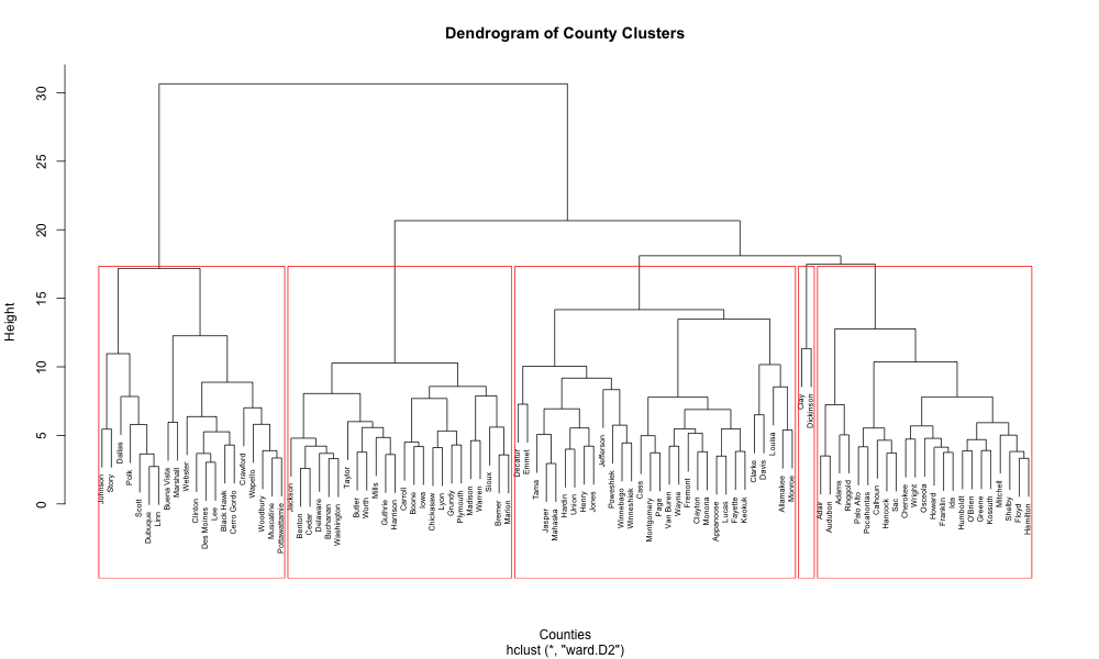
Cluster Analysis
Why hierichial over K-means?
Hierarchical clustering builds groups by gradually combining similar counties together. We chose this over K-means clustering because:
We don’t need to guess the number of groups: The method shows us the natural groupings in our data, then we can decide how many clusters make sense.
Better for different county types: K-means assumes all groups are similar in size and shape, but counties can have very different profiles. Hierarchical clustering handles this variety better.
Easy to interpret: Creates a tree diagram showing how counties relate to each other and which ones are most similar.
Consistent results: Always produces the same answer, unlike K-means which can vary each time.
This helps us identify meaningful county types and understand which counties have similar community strength patterns.
Imputing Data
We found 44 counties with missing data. To handle this:
- We clustered counties with complete data.
- Then we assigned the 44 counties with missing data to existing clusters based on their available data using Euclidean distance (see Appendix for formula).
- Finally, we filled in missing values using the average from each county’s assigned cluster.
Hierichial Clustering
Knowing the distance between each county, we split them into 5 clusters for easy interpretation using Ward’s linkage criterion (see Appendix for formula).
Strength Scores
For strength scores, we chose subset of variables that would represent each clusters/county by averaging out the variables selected in the subset.
However, we encountered a problem, same with factor analysis mentioned in the first question, there is a risk of the loss of information when combining variables into composite scores as for clusters we essentially are taking the mean of the mean. This simplification may mask important nuances in individual variables that could be relevant for policy decisions.
Classification
| Cluster | # Counties | Overall Score | Primary Strength | Main Challenge | Community Profile |
|---|---|---|---|---|---|
| Cluster 1: Environmentally Strong Rural | 23 | 54.32 | Environmental quality | Limited infrastructure | Rural with environmental assets |
| Cluster 2: Balanced Average Communities | 30 | 48.52 | Civic engagement | Economic development | Moderate across all capitals |
| Cluster 3: High-Performing Centers | 24 | 53.60 | Economic & human capital | Infrastructure gaps | Educated economic centers |
| Cluster 4: Struggling Infrastructure-Economic Indicators | 20 | 45.07 | Community stability | Severe infrastructure deficits | Most disadvantaged communities |
| Cluster 5: Environmental Outliers | 2 | 54.09 | Environmental excellence | Civic participation | Exceptional environmental conditions |
Geographic Distribution
Latent Class Analysis (LCA)
Latent Class Analysis (LCA) is a statistical method that identifies hidden subgroups (latent classes) within a population based on observed variables. Unlike hierarchical clustering, which groups observations based on similarity, LCA assumes there are underlying, unobserved categories that explain the patterns we see in our data.
Key Features of LCA:
Model-based approach: LCA uses statistical models to identify classes, providing probability-based assignments rather than hard clustering.
Handles mixed data types: Can work with both continuous and categorical variables simultaneously.
Probabilistic membership: Each county has a probability of belonging to each class (see Appendix for posterior probability formula), allowing for uncertainty in classification.
Interpretable profiles: Classes are defined by response patterns, making it easier to understand what characterizes each group.
Why LCA for Community Strength Analysis?
Natural groupings: Identifies county types based on their actual response patterns to community strength indicators.
Accounts for measurement error: Recognizes that observed variables may imperfectly measure underlying community characteristics.
Flexible modeling: Can accommodate different types of community strength indicators without assuming they follow normal distributions.
The model likelihood and information criteria (AIC and BIC) used for model selection are detailed in the Appendix.
Classification
| Class | # Counties | Primary Strength | Main Challenge | Profile |
|---|---|---|---|---|
| Class 1 | 22 | Economic prosperity | Environmental & built capital | Affluent, high economic capital |
| Class 2 | 5 | Civic engagement & education | Low built capital | Small, civically active |
| Class 3 | 21 | Diversity & education | Low built & environmental capital | Urban-like, diverse |
| Class 4 | 16 | Disability support & mobility | Economic hardship | Rural, struggling |
| Class 5 | 35 | Employment & services | Aging population | Rural, thriving |
Geographic Distribution
Findings
Clustering reveals new county types. Grouping counties by overall patterns of community strength uncovers similarities that aren’t visible through traditional labels like population or geography.
Each cluster has its own standout strengths. Be it economic power, environmental assets, civic engagement, or service infrastructure.
No single cluster dominates all strengths. Some counties have high economic or environmental strengths but face infrastructure gaps, while others show average performance across all areas.
Strength scores summarize key differences in clusters. The analysis used average scores across our strength dimensions to capture each cluster’s performance and guide interpretation.
Maps reveal geographic patterns. Spatial visualizations show how clusters and classes are distributed across the state, helping users see where similar community types are located.
Theme 3: When One Weakness Matters: How a Single Challenge Can Hold a County Back
Even when a county performs well in most areas, a single weak spot such as poor infrastructure, low civic engagement, or high inequality can limit overall progress. This theme explores how one underperforming domain can act as a bottleneck, preventing communities from reaching their full potential.
If we fixed one thing what would matter most?
Some counties are doing well in many ways but one big problem can hold them back. It could be a missing service, a basic need, or a deeper issue like inequality. Even when most things look good, one weak spot can stop progress. This theme shows how one problem big or small can affect the whole community.
Motivation
Understanding the different strengths and challenges of Iowa’s counties is essential for informed decision-making, policy development, and targeted community investment. Communities thrive when they are supported across multiple dimensions not just economically, but also in terms of human capital, civic engagement, infrastructure, environmental sustainability, and long-term stability.
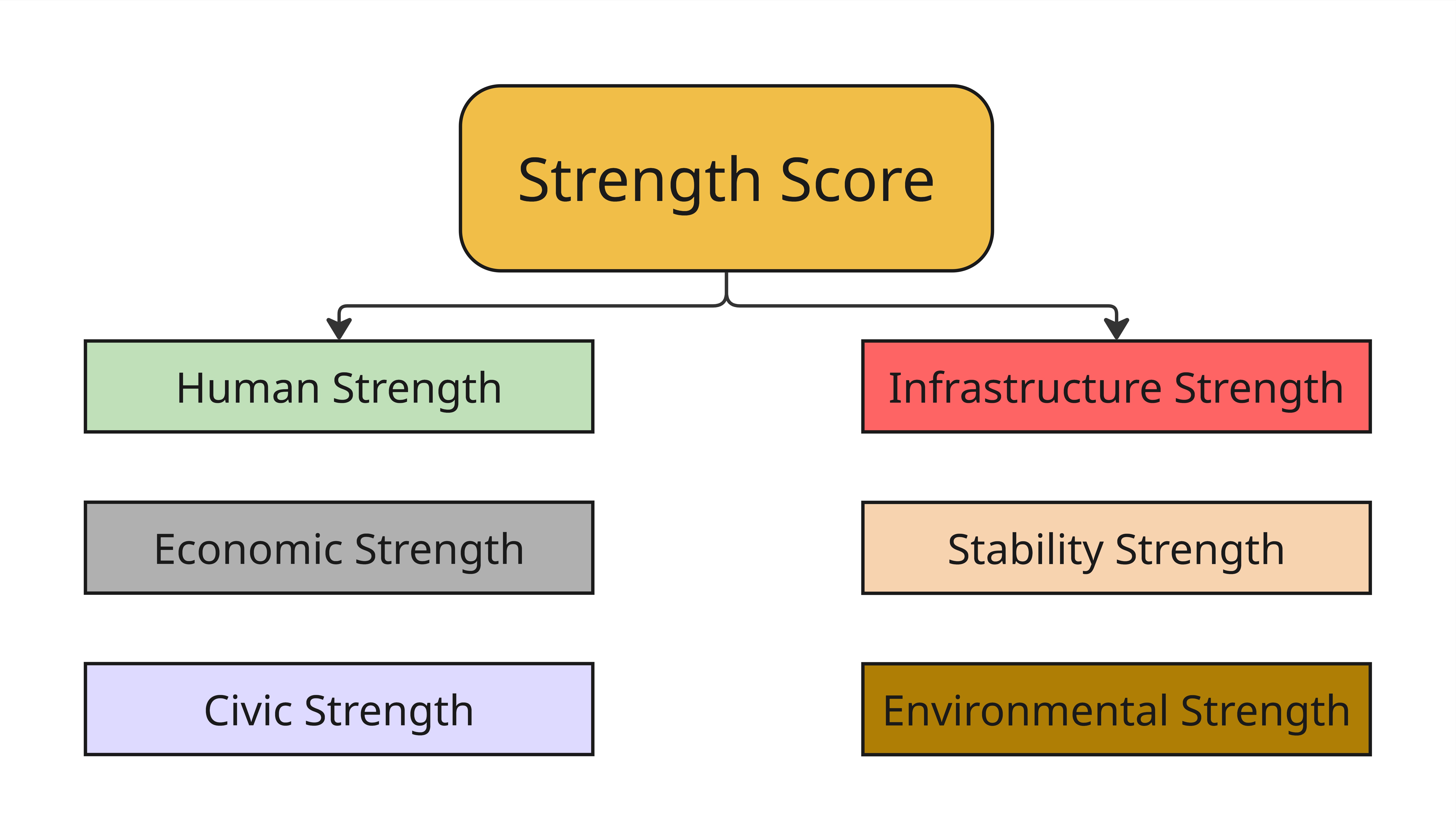
This analysis summarizes how each Iowa county performs across six key dimensions of community strength: human, economic, civic, infrastructure, stability, and environmental. Each score is based on percentile rankings of relevant indicators, allowing for easy comparison across counties and highlighting areas of relative strength or need.
Methodology
Each Strength Score represents county performance in a specific area, such as human capital, infrastructure, or environment.
Each score is based on 5 to 9 selected variables that reflect key aspects of that domain (for example, education level for Human Strength or air quality for Environmental Strength).
All variables were transformed into percentile scores from 0 to 100, where higher values indicate stronger performance. Variables representing negative conditions (such as poverty or pollution) were inverted so that lower raw values result in higher percentiles.
A county’s score in each domain is calculated by averaging the percentiles of all variables in that category.
Interactive charts allow users to view overall scores by strength area and explore individual variable scores for each county.
Interactive Bar Chart
This interactive chart shows how a county does across all strength scores. Users can explore how individual counties rank on each score and see which factors influence their performance in different strength areas.
Variable Comparison Chart
This interactive chart breaks down the specific variables used to calculate each strength score. Users can explore how individual counties rank on each indicator and see which factors influence their performance in different strength areas. We can use the filters to view data by county and strength type. This information can help a county identify where to allocate its funds or resources more effectively.
Performance Summary of Counties
While the chart above breaks down how counties perform on individual indicators within each strength area, the next section summarizes how these scores come together to reflect overall performance. Below, we highlight top and bottom counties, showing their strongest and weakest areas, along with the key variables driving those outcomes.
Click to view full county performance summary
Performance Summary of Top 5 Counties
Lyon County
- Strongest Area: Economic Strength
Lyon County performs well due to a high GDP per capita and a large percentage of small businesses. A low poverty rate (EP_POV) also contributes to its economic health.
- Weakest Area: Stability Strength
Weak Variable: Race Diversity
The county has low owner-occupancy and racial diversity, which may limit long-term social cohesion.
Sioux County
- Strongest Area: Civic Strength
High census response rate and a strong concentration of colleges and universities per 10k residents reflect strong civic infrastructure.
- Weakest Area: Infrastructure Strength
Weak Variables: Child Care Centers per 10k, Cellular Towers per 10k
These gaps suggest limited access to essential services and digital connectivity.
Madison County
- Strongest Area: Human Strength
Madison County performs well with high educational attainment and a strong food environment index.
Reason: Better education and food access support overall well-being and growth.
- Weakest Area: Infrastructure Strength
Weak Variable: Fire Emergency Stations per 10k
Limited emergency service access may affect public safety.
Adair County
- Strongest Area: Infrastructure Strength
Supported by a strong number of child care centers and cellular towers, indicating good service availability.
- Weakest Area: Stability Strength
Weak Variable: EP_CROWD
Overcrowding in households may impact quality of life.
Osceola County
- Strongest Area: Economic Strength
High employment rates, GDP per capita, and strong small business presence contribute to economic resilience.
- Weakest Area: Civic Strength
Weak Variable: Civic Organizations
Few civic groups limit opportunities for community engagement.
Performance Summary of Bottom 5 Counties
Wapello County
- Strongest Area: Stability Strength
Benefits from stable housing and fewer issues related to family structure or overcrowding.
- Weakest Area: Economic Strength
Low income, employment, and business activity point to economic struggle.
Des Moines County
- Strongest Area: Stability Strength
Performs relatively well in homeownership and racial diversity.
- Weakest Area: Economic Strength
Economic challenges include low income, job availability, and business growth.
Lee County
- Strongest Area: Environmental Strength
Strong forest coverage, good air quality, and flood resilience indicators.
- Weakest Area: Civic Strength
Low voter turnout and few civic groups reflect weak community participation.
Webster County
- Strongest Area: Stability Strength
High homeownership and group quarters support suggest stronger social foundations.
- Weakest Area: Infrastructure Strength
Lacks access to key services such as hospitals, child care, and telecom.
Clinton County
- Strongest Area: Stability Strength
Moderate success in homeownership and racial diversity.
- Weakest Area: Civic Strength
Civic disengagement reflected in low turnout and civic group presence.
Therefore, as we discussed, addressing even one factor such as improving the pct_bachelors (percentage of people with a bachelors degree) variable can lead to a higher Human Strength Score for Adair. The spiraling down trend is a possibility we are exploring. Cornelia Flora refers to this as ‘spiraling down,’ where one issue, like low education levels, contributes to a cascade of other problems. However, by targeting and improving that one factor, we may initiate a ‘spiraling up’ effect where one positive change leads to additional improvements across the community.
Exploring Patterns by Population Size
The county-level summaries above highlight specific strengths and weaknesses. In the following section, we examine whether counties with larger or smaller populations tend to perform better or worse in certain strength areas. This helps assess whether population size may be a contributing factor to structural advantages or challenges.
Among the top-performing counties, most belong to smaller population groups (Groups 3, 5, and 4), typically non-metropolitan or small metropolitan counties. These counties tend to perform well in economic and civic strength, often supported by strong local businesses and community institutions while facing challenges related to infrastructure quality and social stability, particularly in terms of diversity and access to services.
On the other hand, several of the bottom-performing counties fall under larger or industrial counties (Group 2). While many lower-performing counties are stable in housing and demographics, they commonly struggle with economic development and civic engagement, highlighting gaps in community participation and opportunity.
Once we pinpointed the weaker areas potentially holding a county back, we wanted to dig deeper: What might be causing these challenges? Are there hidden factors driving these weaknesses?
To explore these questions, we used an interactive bivariate scatterplot. This tool helped us examine the correlation between two specific variables, giving us clearer insight into possible underlying causes.
County-Level Relationships: Education, Civic Life, and Environment
Where do mismatches appear and what might explain them?
Based on literature reviews and the interactive app we explored the following relationships into more detail:
- Cropland vs. Civic Participation (negative relationship)
- Forest Reserve vs. Civic Participation (positive relationship)
- Natural Disasters vs. Civic Engagement (negative relationship)
- Income vs. Education (positive relationship)
- Education vs. Unemployment (positive relationship)
Motivation
This section looks at how education, civic life, and the environment are connected in Iowa counties. By exploring patterns in things like land type, natural disasters, and economic conditions, we can better understand what shapes community involvement and well-being across the state.
Scatterplots examining the relationship between land type, natural disasters, education, poverty, unemployment, and civic engagement.
We used literature reviews for example, Flora & Flora (2008) emphasize that natural capital offers more than ecological services it fosters place attachment and stewardship, which are key to civic life. This informed our look at the positive correlation between forest reserves and civic participation.
Similarly, Emery & Flora (2006) introduce the idea that crises can lead to community growth through “spiraling up” in capitals. Based on this, we explored how natural disasters relate to civic engagement.
Methodology
This section uses bivariate scatterplots to explore relationships between key social, economic, and environmental variables across U.S. counties.
For each pair of variables, a simple linear regression model was applied to estimate the direction and strength of association.
A 95% confidence interval band is included to show the uncertainty around the fitted trend line.
Plots include interactive features that display county-level details on hover, helping users identify patterns and potential outliers.
Land Use and Civic Participation
Cropland vs. Volunteering
Why this plot: This plot explores whether land use dominated by agriculture is associated with lower civic participation. Rural areas with more cropland may have fewer civic institutions, longer travel distances, or different social norms that influence volunteering behavior.
Interpretation: This plot shows a slight negative relationship between cropland proportion and volunteering rate possibly due to fewer civic institutions or travel distances. As cropland increases, volunteering tends to decrease modestly. However, the points are still fairly spread out.
Forest Reserve vs. Volunteering
Why this plot: This plot examines whether the presence of natural amenities like forests is linked to stronger civic life. The hypothesis, based on community capital theory, is that natural environments can foster place attachment and community stewardship, which may increase volunteering.
Flora & Flora (2008) state that natural capital provides more than ecological services; it enhances place of attachment and stewardship, which are foundations for civic life.
Interpretation: This plot shows a slight positive relationship between the proportion of forest reserve and volunteering rate. Counties with more forest reserve land tend to have somewhat higher volunteering, though the association is still weak and uncertain. This might reflect stronger place attachment, natural spaces help people feel more invested in their community.
Natural Disasters and Civic Engagement
Why this plot: This analysis tests the idea that frequent exposure to natural disasters might weaken or strengthen civic engagement. While some communities might mobilize and build stronger civic ties after crises, others may face disruption, burnout, or resource strain that reduce volunteering.
Emery & Flora (2006) explicitly introduce the idea that crisis can lead to community growth through spiraling up in capitals. After events like floods, communities often develop stronger civic coordination and cultural expression
Interpretation: This plot reveals a moderate negative relationship between natural disaster frequency and volunteering rates. As natural disaster events increase, volunteering appears to decline slightly. This could suggest that areas more frequently impacted by disasters may face barriers to sustained civic engagement, potentially due to recurring disruptions or resource strain.
Income, Education and Unemployment
Income vs. Education
Why this plot: This plot checks the widely accepted link between economic prosperity and educational attainment. Higher income often enables better access to education, and in turn, a more educated population tends to support a stronger local economy.
Interpretation: This graph shows a strong positive relationship between income and education. As income increases, the percentage of residents with a college degree also tends to rise, suggesting that higher income levels are closely associated with higher education across counties. This supports the idea that wealthier counties have more access to investment in education.
Education vs. Unemployment
Why this plot: This plot investigates whether higher education levels are consistently tied to lower unemployment. While this is often assumed, local economic conditions may complicate the relationship making it important to test rather than assume the pattern holds across all counties.
Interpretation: Surprisingly, this graph shows a very small positive relationship as education goes up, unemployment also goes up a little. However, the dots are very scattered, and the trend is very weak. This means other factors may be influencing unemployment rates more than education levels alone.
What role does inequality play in society?
Motivation
This question explores the role inequality plays in shaping community well-being across Iowa and helps reveal which counties experience the highest and lowest levels of inequality and in what forms. Inequality in society takes many shapes, from income gaps and limited educational access to health disparities and infrastructure vulnerability. To better understand how these inequalities affect overall well-being, we analyzed multiple domains of inequality and compared them with key well-being indicators across Iowa counties. We focused on five core domains of inequality:
Economic Inequality
What it shows: This score reflects income disparities and financial instability within a county. High inequality means wealth is not distributed evenly, and more residents may struggle economically.
Variables: index of income inequality, poverty, unemployment, gdp per capita
Education & Access Inequality
What it shows: This score reflects access to education and essential services like internet and language support. High inequality suggests that many face barriers to learning or information.
Variables: high school completion, english proficiency, broadband subscriptions, public schools
Health Inequality
What it shows: This score reflects disparities in healthcare access and exposure to environmental health risks. A higher score may reflect poor health outcomes and limited health infrastructure.
Variables: poor health, hazardous waste proximity, air particulate matter, hospitals, health insurance
Disaster & Infrastructure Inequality
What it shows: This score reflects a community’s vulnerability to natural disasters and housing insecurity. High inequality may mean older infrastructure and higher risk from climate-related events.
Variables: occupied housing, median year of built structures, annual drought events, annual wind events, annual hail events
Well-Being Indicators
What it shows: This score reflects overall quality of life, civic engagement, and public safety. A low score may indicate disconnection, distrust, or poor health and safety conditions.
Variables: volunteering, voter turnout, census response, crime incidents, poor mental health, poor physical health
By comparing these domains to well-being indicators, we can identify not only which types of inequality are most strongly tied to community outcomes but also which counties may need targeted support. Just as inequality varies across regions, so does well-being and understanding these patterns is essential for data-driven planning and more equitable resource distribution in Iowa.
Methodology
In order to do this analysis we followed a few straightforward steps:
1. Standardizing the Data
We calculated a percentile score for every county for each variable.
2. Grouping Variables
We grouped variables to represent well-being and the five inequality domains based on relevant academic literature, established research frameworks, and policy tools to identify which variables best represent each domain. We selected indicators that are widely used, meaningful at the county level, and available across Iowa.
3. Finding Correlation
We calculated a correlation matrix to tell us the relationship between inequality and well being as well as relationships between different inequalities.
4. Bar Chart Comparisons
We created two interactive bar charts to see county-level comparisons. The first chart displays each county’s average scores across all inequality domains and overall well-being, allowing us to observe whether counties typically experience challenges in a single domain or across multiple areas. The second chart breaks down those domain scores into their underlying variables, helping us identify which specific indicators are most influencing a county’s inequality domain scores.
5. Mapping Results
We created an interactive map to visualize all counties’ inequality domain scores at once. This allowed us to explore potential spatial patterns and identify whether certain types of inequality are concentrated in specific regions of Iowa.
Findings
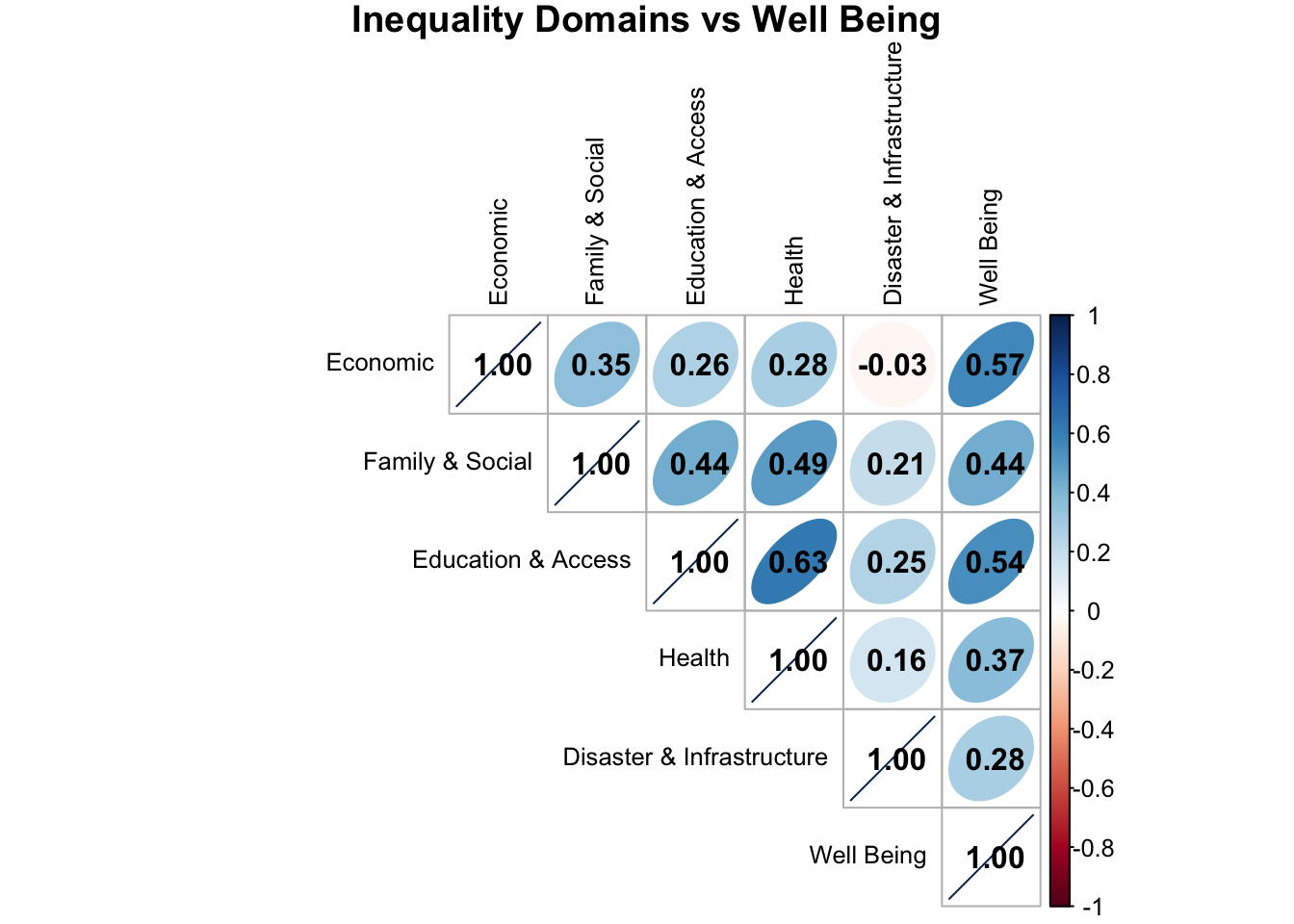
Correlation Matrix
The correlation matrix below illustrates that lower inequality is associated with higher community well-being. Each inequality domain shows a positive correlation with well being, meaning that as inequality decreases, overall well being increases.
Inequality & Well Being: Interactive Bar Charts
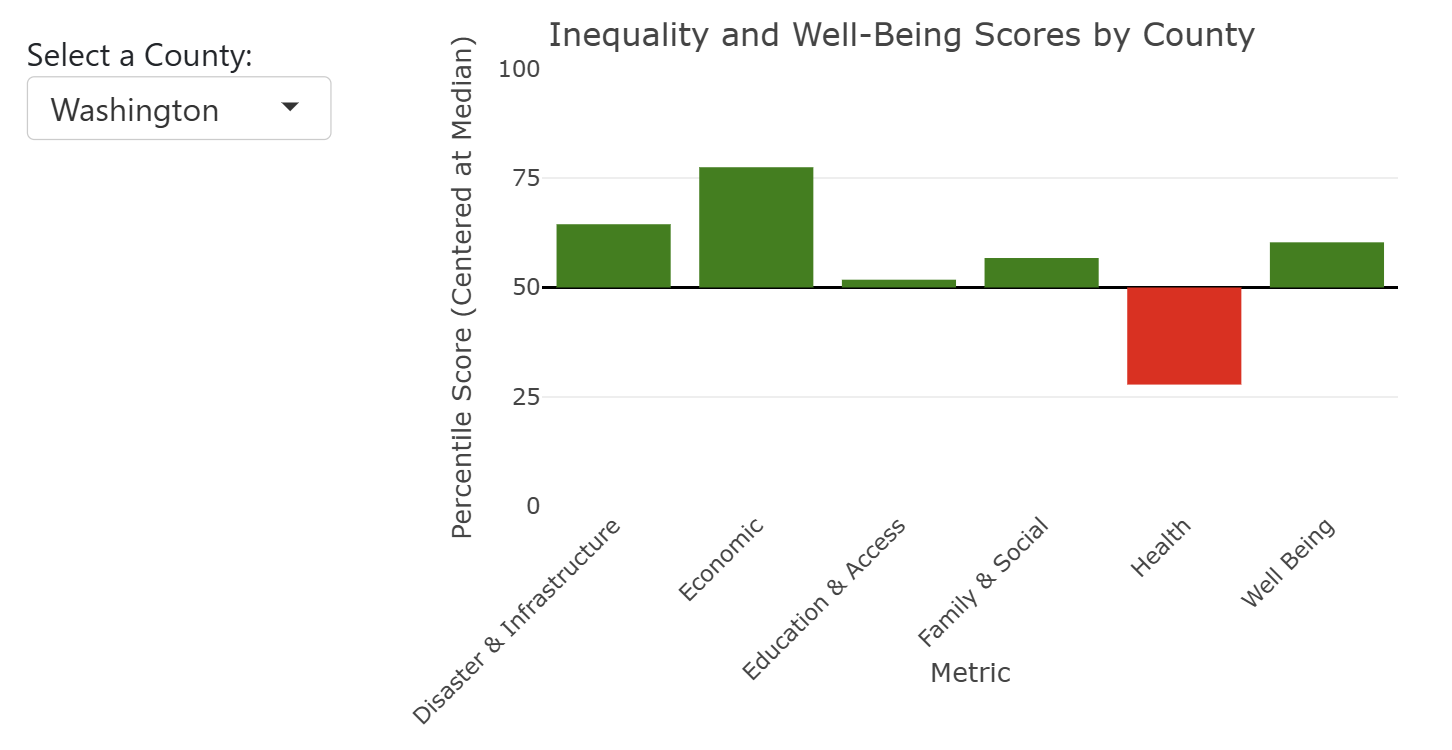
The interactive bar chart below allows you to view any counties inequality & well being scores. A upward (green) bar means this score is above the median of all counties, a downward (red) bar means this score is below the median of all counties and have higher or more inequality in this domain.
Variables Within Inequality & Well Being: Interactive Bar Charts
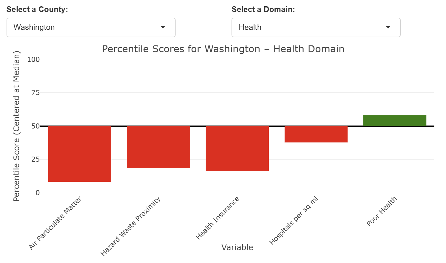
The interactive bar chart below allows you to see the variables within a specific inequality domain or well being score for any county. This allows you to see which variables are infuencing the overall inequality or well being score and can target areas of success or room for improvement.
Inequality & Well Being: Interactive Map
The interactive map below allows you to view all counties inequality and well being scores at once. A red color meaning high inequality or low well being and a green color meaning low inequality or high well being.
This analysis reinforces the idea that efforts to reduce inequality in these areas could lead to meaningful improvements in overall quality of life. As we discussed, addressing even one factor of health inequality in Washington county could cause a spiraling up effect where one positive change leads to additional improvements across the community. For example, improving health insurance rates or environmental health risks here could be crucial to improving well being.
Exploratory Work
We also explored additional areas of analysis, including:
- Grouping Counties based on Housing Conditions
- Interactive Radar Chart To Compare Capitals Across Counties
- Beliefs About Climate Change
- Comparing Built Capital Types By County
- Principle Component Analysis
Grouping Counties based on Housing Conditions
Can we group counties by their housing conditions to see which ones are doing well and which ones need more help?
Motivation
Housing problems look different in different places. Some counties have old homes, others have high rent or low internet access. By grouping counties based on similar patterns, we can better understand who needs support, what kind of support they need, and where resources can make the biggest difference.
.png)
The Three Models We Used
.png)
We used three cluster models—A, B, and C—to see how different sets of housing variables changed county performance. Each model gives a slightly different lens:
Model A: Housing Infrastructure Model
Variables:
Median home value
Median year built
Percent with complete plumbing
Percent with broadband access
Why This Model:
Captures the physical condition and service quality of homes—good for identifying infrastructure strengths.
Model B: Affordability & Stress Model
Variables:
Median home value
Median year built
Housing cost burden (EP_HBURD)
Poverty level (EP_POV150)
Crowding (EP_CROWD)
Why This Model:
Adds economic strain to the picture—useful for detecting places where people might live in stable housing but still face financial hardship or overcrowding.
Model C: Economic Pressure Model
Variables:
Median home value
Median year built
Housing burden
Crowding
Unemployment (EP_UNEMP)
Multi-unit housing (EP_MUNIT)
Why This Model:
Brings in labor market risk and unstable housing types—helping identify counties at long-term risk even if their housing stock looks okay on paper.
What We Built
.png)
We created dashboard that clusters Iowa counties into housing tiers using real data and three different models. Each model captures a different angle of the housing picture—ranging from infrastructure quality to economic stress. The dashboard lets users:
Explore how counties fall into Tier 1 (Strong), Tier 2 (Moderate), or Tier 3 (Needs Support)
Click any county to see its strongest and weakest housing indicators
View a choropleth map that shows how a single variable (like plumbing access or rent) compares across the state
Track how counties move between tiers when different types of risk are considered.
Why We Built This
Our goal was to:
Let local leaders see strengths and challenges together
Make it easy to compare counties across different housing factors
Help decision-makers target the right kinds of support in the right places
-Key takeaways:
Each model tells a different part of the story. Some counties stayed stable across all models. Others shifted depending on the risk factors we included.
Stable performers: Counties that stayed in Tier 1 across models had newer homes, high broadband access, and low housing burden.
High-risk counties: Some remained in Tier 3 across all three models—suggesting long-term housing instability. Counties that stay in Tier 3 require long-term structural investment
Interactive Radar Chart To Compare Capitals Across Counties
We made an interactive radar chart to easily compare counties across all capitals in one view. It helps us see what capitals each county does well in, where it is falling behind, and where it might learn from others. It’s a quick way to find both strengths and needs.
Beliefs About Climate Change
Are beliefs about climate change related to education, political engagement, or risk?
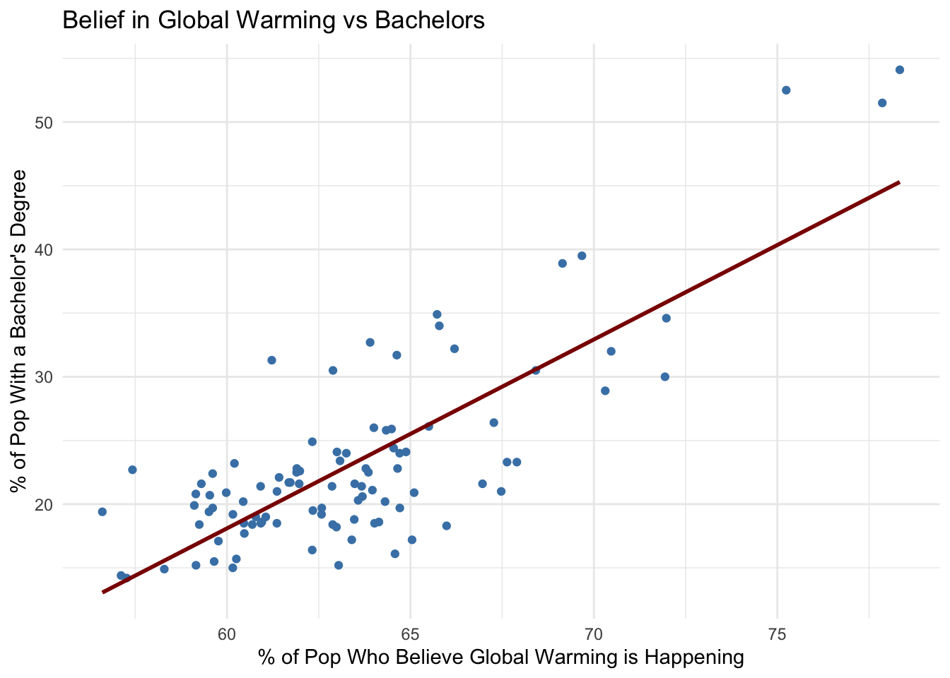
Do counties with higher levels of college educated population have higher beleifs in global warming?
- Counties with the highest percent of population with a bachelors degree also appeared in the top counties of climate change belief.
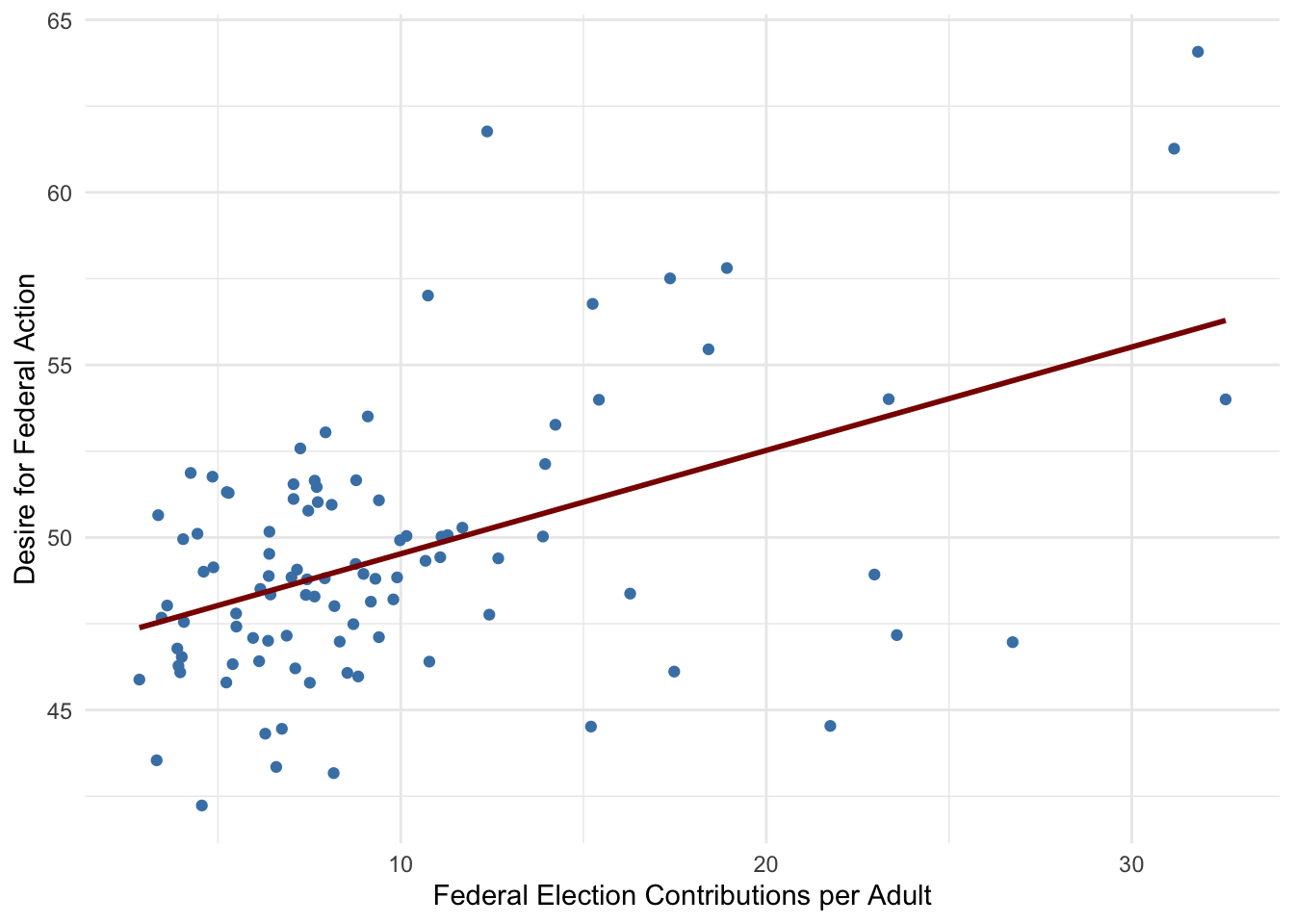
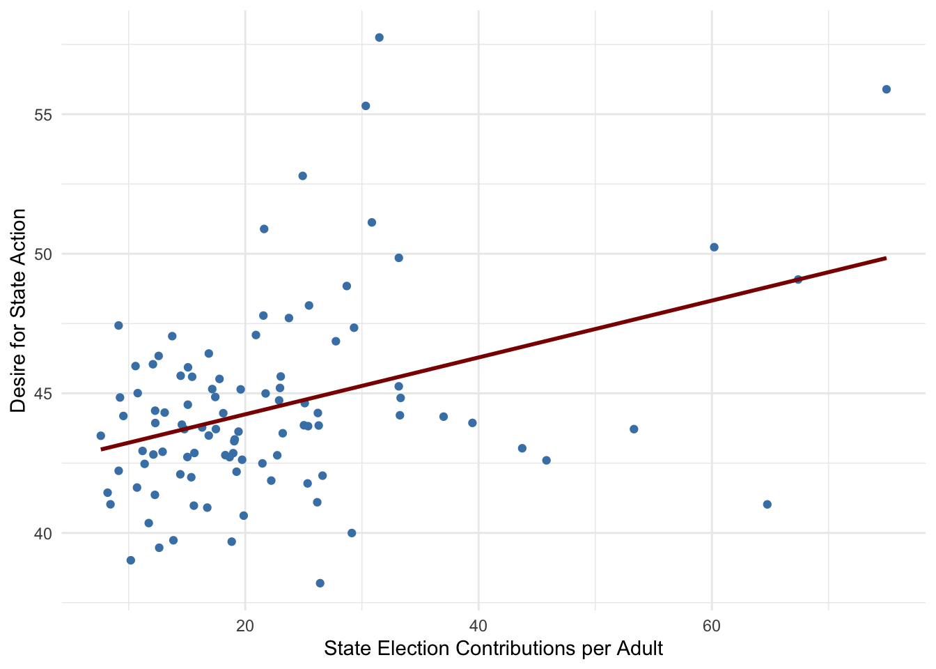
Does higher political engagement (election contributions) correlate with greater demand for government action on climate change?
- Positive Relationship: Counties with higher per-capita election contributions (state or federal) also tend to have a larger share of the population demanding action on global warming. This suggests that areas where people are more politically engaged financially may also be more climate-conscious or politically motivated to push for environmental policies.
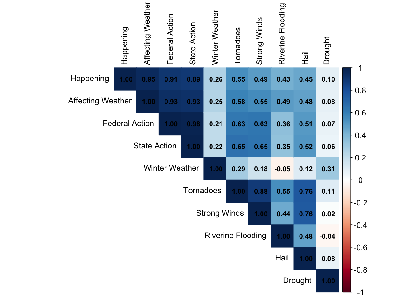
Do counties with higher expected annual loss ($) from natural hazards believe global warming is affecting the weather?
- The correlation between the percentage of the population who believes global warming is affecting the weather and the expected annual loss ($) from tornadoes, winter weather, hail, strong winds, flooding, and drought is moderately positive. This suggests that in counties where climate-related disasters cause greater financial damage, more people tend to believe that global warming is influencing weather patterns.
Comparing Built Capital Types By County
Built Capital refers to the physical infrastructure and constructed assets that support daily life in a community such as schools, hospitals, emergency services, and communication towers. This analysis measures and compares the density of key built infrastructure across counties, using two different lenses:
Per square mile, to assess how infrastructure is spatially distributed
Per 10,000 people, to examine infrastructure availability relative to population size
By calculating percentile-based scores, we can identify which counties are most or least well-served in terms of built infrastructure, and explore patterns that may relate to geography, rurality, or population density.
Methodology
Built Capital is measured using 11 types of infrastructure (e.g., schools, hospitals, emergency services, towers).
Two metrics are used: infrastructure per square mile and per 10,000 people.
For each variable, counties are ranked using percentile scores (0–100), where higher means more infrastructure.
A county’s Built Capital score is the average of its percentiles across all variables.
Scores are visualized through interactive charts and tables to highlight top and bottom performers.
Built Capital (per_sq_mile) by County
Variables used: Convention Centers, Fire and Emergency Stations, Hospitals, Local Law Enforcement Locations, Sports Venues, Private Schools, Public Schools, Community Colleges, Colleges and Universities, Mobile Home Parks, Cellular Towers
Click to view Top and Bottom Counties by Built Capital (per sq. mile)
Top and Bottom Counties by Built Capital
The following counties rank in the top 10 for Built Capital, scoring above the 50th percentile (median of all counties) based on infrastructure density (per square mile).
| County | Built Capital Percentile |
|---|---|
| Polk | 99.8 |
| Story | 88.7 |
| Black Hawk | 87.8 |
| Johnson | 86.6 |
| Linn | 85.4 |
| Dubuque | 85.1 |
| Scott | 81.7 |
| Wapello | 75.5 |
| Woodbury | 72.1 |
| Dickinson | 64.0 |
The following counties rank in the bottom 10 for Built Capital, scoring below the 50th percentile (median of all counties) based on infrastructure density (per square mile)
| County | Built Capital Percentile |
|---|---|
| Adams | 7.3 |
| Ringgold | 7.4 |
| Audubon | 9.8 |
| Davis | 10.5 |
| Keokuk | 10.5 |
| Taylor | 10.6 |
| Ida | 11.2 |
| Adair | 12.0 |
| Wayne | 12.2 |
| Lucas | 12.4 |
Built Capital (per 10k) by County
Variables used: Convention Centers, Fire and Emergency Stations, Hospitals, Local Law Enforcement Locations, Sports Venues, Private Schools, Public Schools, Community Colleges, Colleges and Universities, Cellular Towers
Click to view Top and Bottom Counties by Built Capital (per 10k)
Top and Bottom Counties by Built Capital
The following counties rank in the top 10 for Built Capital, scoring above the 50th percentile (median of all counties) based on on population density (per 10k people)
| County | Built Capital Percentile |
|---|---|
| Palo Alto | 63.6 |
| Decatur | 62.2 |
| Dickinson | 57.8 |
| Emmet | 54.6 |
| Page | 53.5 |
| Winnebago | 49.6 |
| Hamilton | 49.5 |
| Ringgold | 48.0 |
| Pocahontas | 47.9 |
| Cass | 47.6 |
The following counties rank in the bottom 10 for Built Capital, scoring below the 50th percentile (median of all counties) based on population density (per 10k people)
| County | Built Capital Percentile |
|---|---|
| Dallas | 16.0 |
| Marshall | 16.0 |
| Warren | 18.4 |
| Muscatine | 18.9 |
| Des Moines | 19.1 |
| Mahaska | 19.8 |
| Tama | 21.7 |
| Clinton | 22.3 |
| Pottawattamie | 23.5 |
| Cerro Gordo | 23.8 |
Principle Component Analysis
| Aspect | Factor Analysis | Principal Component Analysis |
|---|---|---|
| Primary Purpose | Identify latent constructs that explain variable relationships | Reduce dimensionality while preserving maximum variance |
| Underlying Assumption | Variables are caused by underlying factors | Variables are linear combinations of components |
| Interpretability | Factors have clear theoretical meaning | Components may lack clear meaning |
| Best Used When | Testing theoretical models of underlying constructs | Data compression and dimensionality reduction |
Principal Component Analysis (PCA) is a way to simplify data by combining related variables into fewer, more meaningful components. It finds the directions in your data that capture the most variation.
The key differences from factor analysis include:
Purpose: PCA aims to reduce dimensionality while preserving maximum variance, whereas factor analysis seeks to identify underlying constructs.
Components vs Factors: PCA creates components that are linear combinations of original variables (see Appendix for formula), while factor analysis identifies latent factors that explain variable relationships.
Variance Explanation: PCA components explain decreasing amounts of total variance, with the first component explaining the most variance (see Appendix for variance calculation).
The process involves:
- Standardizing variables to have equal weight
- Computing the covariance matrix
- Extracting eigenvalues and eigenvectors
- Selecting components based on eigenvalues > 1 or cumulative variance explained
- Interpreting component loadings to understand what each component represents
For our community strength analysis, PCA can help us:
- Identify which variables contribute most to community variation
- Reduce the complexity of our dataset
- Create composite indices that capture the most important patterns in the data
This approach is particularly useful when we want to create summary measures while retaining the maximum amount of information from our original variables.
Findings
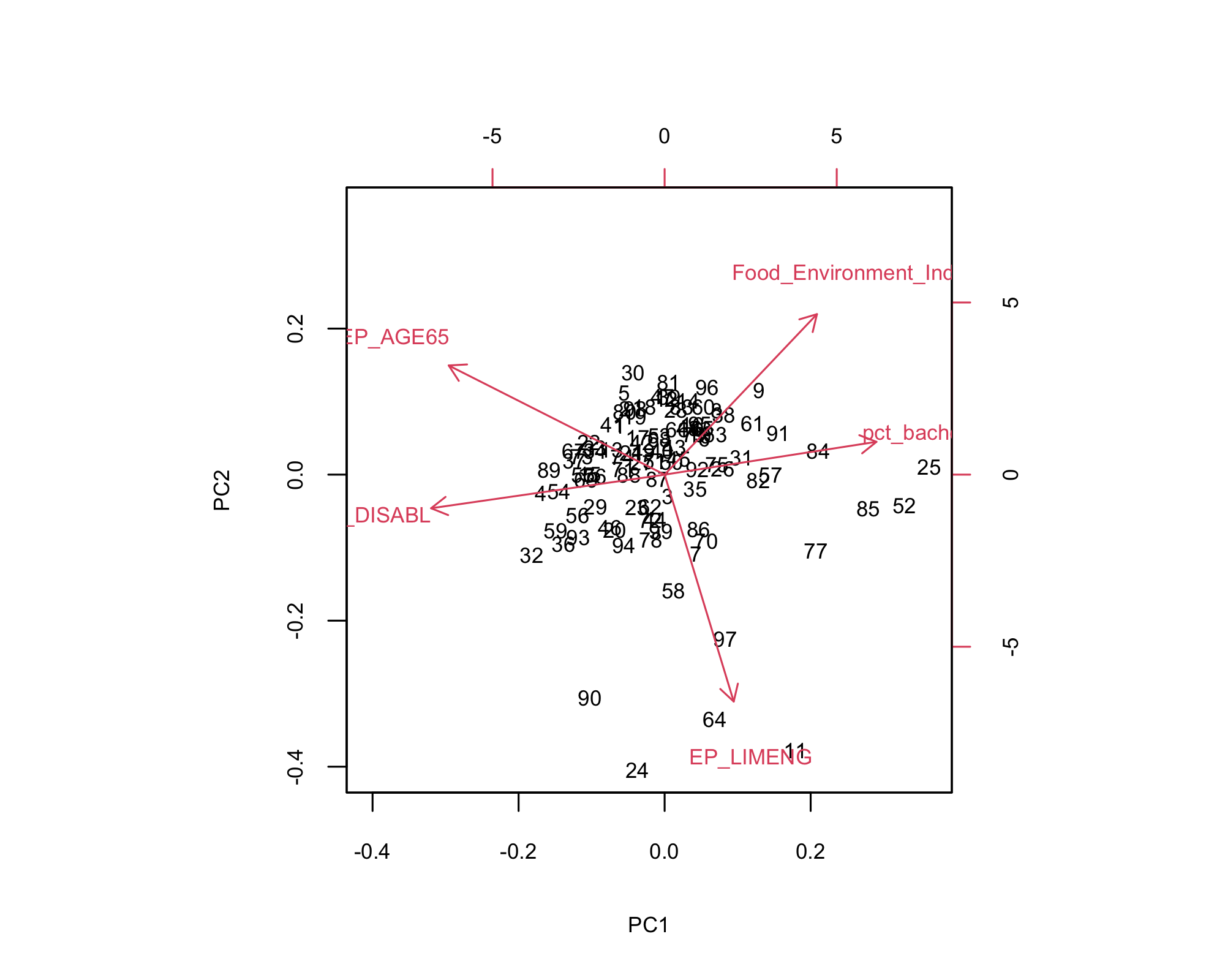
- Right side (PC1): More bachelor’s degrees and food environment index.
- Left side: Higher disability and elderly populations.
- Bottom-right: Higher language isolation.
- Crawford, Emmet and Wapello: Populations with more vulnerability.
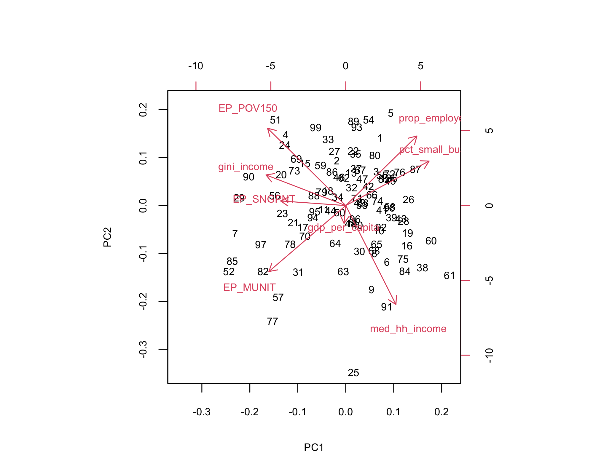
- Right side (PC1): Higher income, employment, small businesses.
- Left side: More poverty, public assistance, and income inequality.
- Bottom-left: Multi-unit housing and economic stress.
- Top-right: Strong economies (e.g., Audubon, Davis).
- Right side (PC1): More colleges per 10k.
- Top (PC2): High census response.
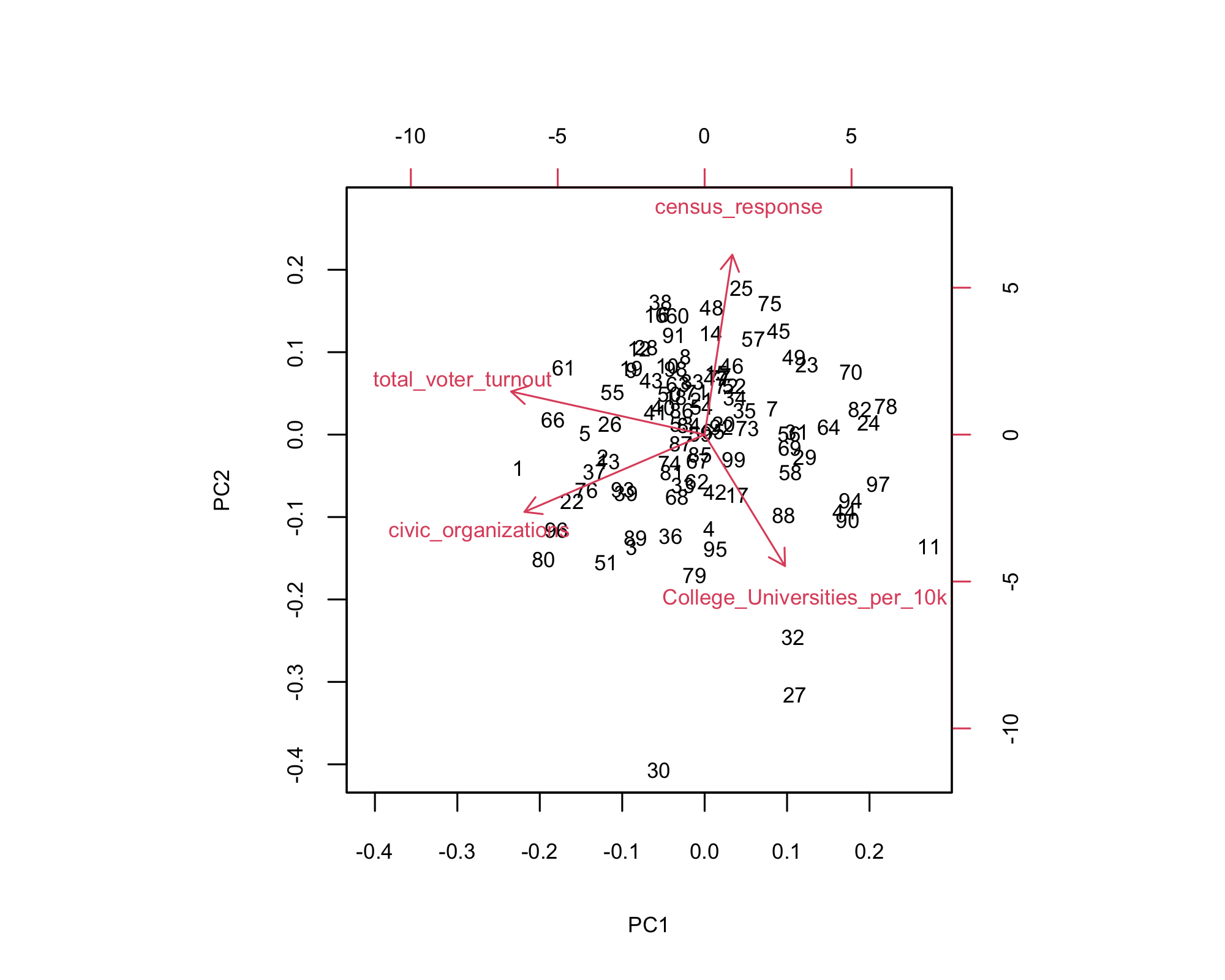
- Left side: More civic orgs and voter turnout.
- Outliers: Decatur, Dickinson, and Emmet stand apart with distinct civic profiles.
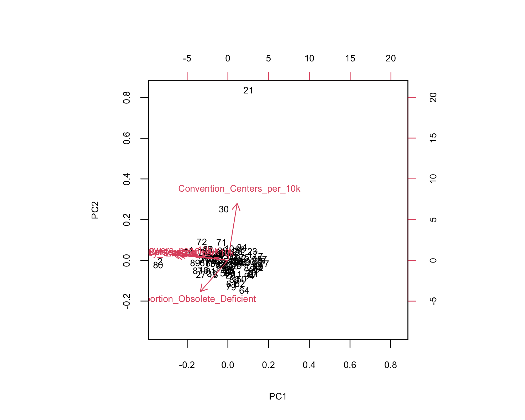
- Top (PC2): More convention centers per 10k — especially county 21.
- Bottom-left: High proportion of obsolete/deficient structures.
- Most counties: Clustered near center, indicating balanced infrastructure.
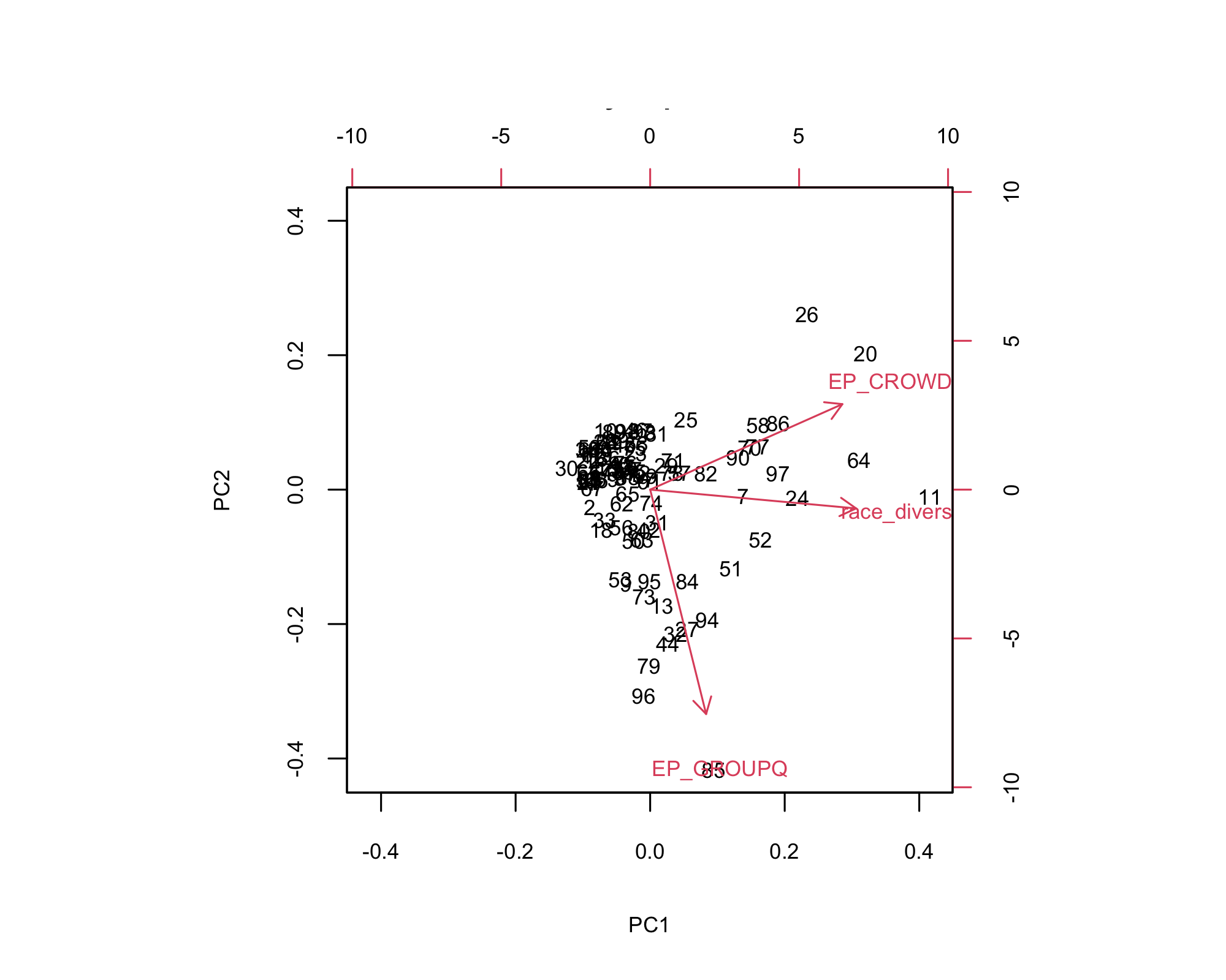
- Right side (PC1): Higher overcrowding (EP_CROWD) and greater racial diversity
- Top (PC2): More overcrowding—counties with acute crowding pressures
- Bottom (PC2): Greater share of group‑quarter housing (EP_GROUPQ)
- Cluster center: Most counties sit near the origin, showing moderate stability across metrics
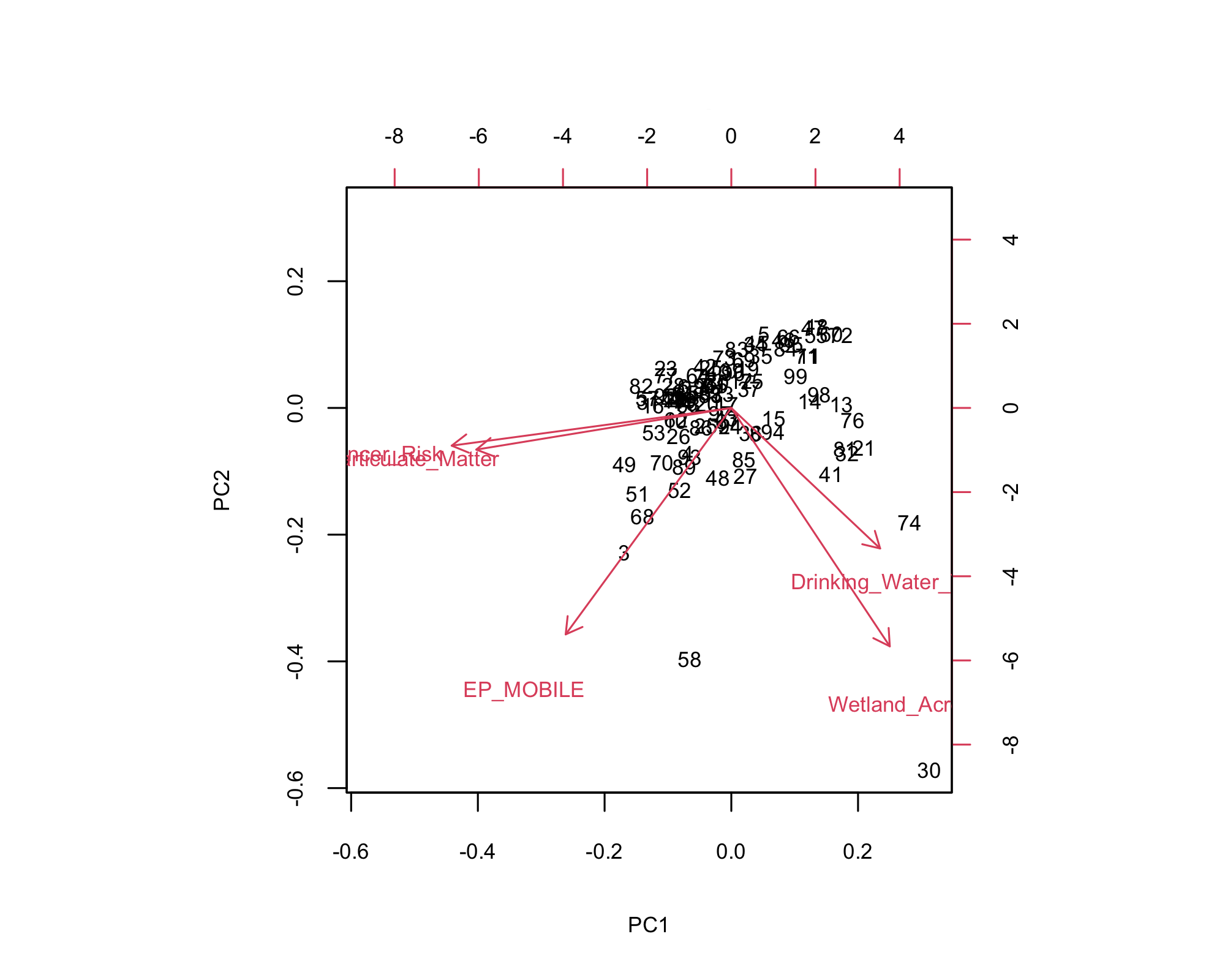
- Right side (PC1): More wetlands and better drinking water quality.
- Left side: Higher flood risk and particulate matter.
- Bottom: More mobile homes and environmental exposure.
- Allamakee and Louisa: Environmentally distinct.
Limitations
Capital scores, strength scores, and inequality scores do not factor in the influence of surrounding counties/ locations outside of Iowa.
Capital scores, strength scores, and inequality scores are limited by the specific variables included in their calculation. As a result, interpretations should be made with caution, recognizing that other important factors that did not exist in our data may not be captured.
Most of our analysis reflects a snapshot in time based on the most recent available data. It does not capture how counties are changing or improving over time.
Conclusion: One Iowa, Many Stories
No two counties in Iowa are the same and that’s exactly the point. Some have strong schools, others have deep community ties or rich natural resources. This project wasn’t about finding the best county. It was about understanding what each place already has, what it’s missing, and how we can support it better.
What We Delivered
Strength Scores for all 99 Iowa counties across six key areas: Civic, Economic, Human, Environmental, Infrastructure, and Stability
Place-Based Patterns showing how classifications like rural vs. urban, metro, nonmetro, and micropolitan counties tend to follow different trends across the seven capitals
Clustering Analysis group counties with similar strengths and challenges, making it easier to compare them and understand what kinds of support they might need
Interactive Maps and Dashboards that make it easy to explore patterns, gaps, and opportunities across the state
Targeted Support Priorities that point to the kinds of investments like broadband, housing, or child care that could make the biggest difference in each county
Next Steps
-Build a County-Level Resilience Index Combine multiple Variables across capitals into a single Resilience Score to identify which counties are best equipped to handle shocks (like economic downturns, climate events, or health crises).
-Time Series Analysis to see if counties are improving or falling behind. Create progress maps to show which counties are moving up or down in key capitals.
-Study Policy Impact See if certain programs (like broadband grants or Main Street programs) improved capital scores over time.
-Ground-Truthing Use local stories to validate or challenge what the numbers show.
Acknowledgement
We would like to thank our advisor, Bailey Hanson, for her ongoing guidance and support throughout this project. We are also grateful to our coordinator, Harun Celik, for his insights and encouragement, and to Professor Samuel Mindes and Ben Jacobs for their continued support and feedback.
References
Click to view the References
- Flora, C. B., & Flora, J. L. (2008). Rural Communities: Legacy and Change (3rd ed.). Westview Press. https://www.routledge.com/Rural-Communities-Legacy-and-Change/Flora-Flora/p/book/9780813349717
→ Foundational source for the Community Capitals Framework.
- Emery, M., & Flora, C. B. (2006). Spiraling-Up: Mapping Community Transformation with Community Capitals Framework. Community Development, 37(1), 19–35. https://doi.org/10.1080/15575330609490152
→ Introduces the “spiraling up” effect when capitals work together.
- Sherrieb, K., Norris, F. H., & Galea, S. (2010). Measuring Capacities for Community Resilience. Social Indicators Research, 99(2), 227–247. https://doi.org/10.1007/s11205-010-9576-9
→ Explores metrics to assess community resilience and capital-based readiness.
- Aldrich, D. P. (2012). Building Resilience: Social Capital in Post-Disaster Recovery. University of Chicago Press. https://press.uchicago.edu/ucp/books/book/chicago/B/bo13100801.html
→ Shows how trust and networks are crucial for disaster recovery.
- Putnam, R. D. (2000). Bowling Alone: The Collapse and Revival of American Community. Simon & Schuster. https://www.simonandschuster.com/books/Bowling-Alone/Robert-D-Putnam/9780743203043
→ Classic text on the decline of civic engagement in America.
- Tickamyer, A. R., Sherman, J., & Warlick, J. L. (2017). Rural Poverty in the United States. Columbia University Press. https://cup.columbia.edu/book/rural-poverty-in-the-united-states/9780231172233
→ Examines structural inequality across U.S. rural communities.
- Norris, F. H., Stevens, S. P., Pfefferbaum, B., Wyche, K. F., & Pfefferbaum, R. L. (2008). Community Resilience as a Metaphor, Theory, Set of Capacities, and Strategy for Disaster Readiness. American Journal of Community Psychology, 41(1–2), 127–150. https://doi.org/10.1007/s10464-007-9156-6
→ Defines resilience and its components in applied community settings.
- Glanville, J. L., & Bienenstock, E. J. (2009). A Typology for Understanding the Connections Among Different Forms of Social Capital. American Behavioral Scientist, 52(11), 1507–1530. https://doi.org/10.1177/0002764209331524
→ Explores different types of social capital and how they affect communities.
- Besser, T. L. (2013). Resilient Small Rural Towns and Community Shocks. Journal of Rural and Community Development, 8(1), 117–134. https://journals.brandonu.ca/jrcd/article/view/836
→ Case-based analysis of how rural towns handle community shocks.
- Fabrigar, L. R., & Wegener, D. T. (2012). Exploratory Factor Analysis. Oxford University Press. https://global.oup.com/academic/product/exploratory-factor-analysis-9780199734177
Appendix
Click to view the Appendix
Factor Analysis
Bartlett’s Test of Sphericity
\[\chi^2 = -\left[(n-1) - \frac{2p + 5}{6}\right] \ln|R|\]
where: - \(n\) = sample size - \(p\) = number of variables - \(|R|\) = determinant of the correlation matrix
Kaiser-Meyer-Olkin (KMO) Test
\[KMO = \frac{\sum_{i \neq j} r_{ij}^2}{\sum_{i \neq j} r_{ij}^2 + \sum_{i \neq j} a_{ij}^2}\]
where: - \(r_{ij}\) = correlation coefficient between variables \(i\) and \(j\) - \(a_{ij}\) = partial correlation coefficient between variables \(i\) and \(j\)
Principal Component Analysis
Principal Component Calculation
\[PC_k = \sum_{i=1}^{p} w_{ik} \cdot x_i\]
where: - \(PC_k\) = \(k\)-th principal component - \(w_{ik}\) = loading of variable \(i\) on component \(k\) - \(x_i\) = standardized value of variable \(i\)
Variance Explained
\[\text{Proportion of variance explained by PC}_k = \frac{\lambda_k}{\sum_{i=1}^{p} \lambda_i}\]
where \(\lambda_k\) is the eigenvalue of the \(k\)-th principal component.
Hierarchical Clustering
Euclidean Distance
\[d(x_i, x_j) = \sqrt{\sum_{k=1}^{p} (x_{ik} - x_{jk})^2}\]
where: - \(x_i\) and \(x_j\) are two observations - \(x_{ik}\) and \(x_{jk}\) are the values of variable \(k\) for observations \(i\) and \(j\)
Ward’s Linkage Criterion
\[d(C_i \cup C_j, C_k) = \sqrt{\frac{|C_k| + |C_i|}{|C_k| + |C_i| + |C_j|} d(C_i, C_k)^2 + \frac{|C_k| + |C_j|}{|C_k| + |C_i| + |C_j|} d(C_j, C_k)^2 - \frac{|C_k|}{|C_k| + |C_i| + |C_j|} d(C_i, C_j)^2}\]
where \(C_i\), \(C_j\), and \(C_k\) are clusters with sizes \(|C_i|\), \(|C_j|\), and \(|C_k|\).
Latent Class Analysis
Model Likelihood
\[L(\theta) = \prod_{i=1}^{n} \sum_{c=1}^{C} \pi_c \prod_{j=1}^{J} f(y_{ij}|\theta_{jc})\]
where: - \(\pi_c\) = probability of belonging to class \(c\) - \(f(y_{ij}|\theta_{jc})\) = probability density function for variable \(j\) in class \(c\) - \(C\) = number of latent classes - \(J\) = number of observed variables
Posterior Probability
\[P(C_c|Y_i) = \frac{\pi_c \prod_{j=1}^{J} f(y_{ij}|\theta_{jc})}{\sum_{g=1}^{C} \pi_g \prod_{j=1}^{J} f(y_{ij}|\theta_{jg})}\]
This gives the probability that observation \(i\) belongs to class \(c\) given the observed data.
Information Criteria
Akaike Information Criterion (AIC)
\[AIC = -2\ln(L) + 2k\]
Bayesian Information Criterion (BIC)
\[BIC = -2\ln(L) + k\ln(n)\]
where: - \(L\) = maximum likelihood - \(k\) = number of parameters - \(n\) = sample size